DESIGN  |  ILLUSTRATION  |  ANIMATION  |  WRITING  |  FILMMAKING  |  MUSIC  |  GAMES
Showing posts with label logo. Show all posts

Feller's Baking Company

I developed an identity for a wholesale baking company. This project had an extremely tight turnaround time - the business had to get running in only a few weeks' time - so I got to work quickly.

After giving me an overview of his new business, the owner's only design suggestion to me was a request to use brown and cream. Though I had to make the "cream" color a little darker so that it could stand on its own, I presented six concepts using that color scheme.

The first concept uses thick letters that felt hearty, like freshly baked loaves of bread. I added the cutouts in the letters of "Feller" to suggest the slashes made in the tops of baked goods to release heat. I also created a few smokey shapes in the same blocky style as the typeface, and added a bottom line with end points matching the letters' serifs:

Concept two combines two friendly fonts - one with a prominent, rounded serif, and the other a script that worked well at a small size. I had to tweak a few of the script letter shapes - the lowercase N's originally looked more like U's. I then created a badge-like shape to contain the "Feller", and added some cream rays emanating from behind that shape:

The third concept uses a stencil face for a more rustic feel. I created an image of a cupcake in the same handmade, scratchy style as the text:

The fourth concept is more formal, and uses only type and design elements for an emblematic approach. I also added a bit of a 3D feeling to this concept:


Concept five has a simple, all-type approach. I combined a tall, naive-style typeface with a thicker stencil one. I also reduced the first "E" in "Feller" to fit in the "the", carefully slicing out sections of its vertical bar rather than just squashing the letter, which would have distorted the its shape.

The sixth and final concept uses the same rough-looking font for all of the lettering. I combined some of the letters to create a more unified look:

The client chose the fourth concept - he liked the strong emblematic feel, and liked the fact that this approach had the feeling of a motorcycle company's. But there was one change - the company's name would now be "Feller's" instead of "Feller". I recreated the main shapes, adding the apostrophe S. I had to shrink the height of the top shape to accommodate it.

Because the client liked that dimensional, almost metallic feeling of this concept, I amped it up by adding additional 3D effects to the background of the top shape, and to the letters in "Baking Company". This is the final, full color version - ideal for signage, presentations, advertising, and other uses where colors are unlimited:


I also prepared a simple two-color version of the logo. This might be used for packaging, vehicle signage, letterhead, or other printing processes where full color printing isn't available or financially feasible:

And I also prepared a single-color version of the logo and presented it in a number of colors, on both black and white backgrounds. These versions might be used on product labels, fax templates, invoices, checks, and other instances where the logo does not need to be prominent, and where color printing may be limited or unavailable:

Vital Market Research

I was asked to develop a logo for a small market research firm working exclusively for pharmaceutical companies. The client wanted the company's identity to represent confidence, experience and professionalism, but it also needed to be slightly whimsical and not too stuffy – a worthy challenge for any designer.

And there was a bonus challenge - the client's first name is "Vita" and her last name begins with an "L", so she cleverly named her company Vital Market Research, with "Vital" being a combination of her first name and last initial. She suggested that if this could be emphasized in the design, it would make a nice Easter Egg for her clients.

The initial round of logos contained five samples, all in a bright orange and a desturated bluish-purple color scheme. The first concept used an implied word bubble at the top of the shape, indicating the voice of the customer. The tail of the word bubble split the "Vita" and "L" in the name, providing the clue to the hidden meaning of the firm's name:


Concept two was more fun and retro - "Vital" was laid out in a custom-designed typeface, with an image of a rounded boiling flask (I did my research) next to the text portion of the logo:


The third concept was the most formal due to its centered layout. The orange triangles emanating out of the center of the "M" created a megaphone/speaking mouth effect - another representation of the role served by the firm – gathering information from customers and conveying that data to pharmaceutical companies:


Since many pharma companies have all-text logos, the fourth concept I presented was a type-only logo. I created a custom face for the "VMR" and set it next to the firm's full name. The angles on both sides give balance to the layout:


The fifth concept used a futuristic font and a segmented capsule pill to illustrate the concept of market analysis:


The client reviewed the first round of concepts and selected the first logo as the one to develop further. She asked that we modify the color scheme – the orange and bluish-grey were too close to the colors of an existing pharmaceutical company. The client also requested that I present alternate typefaces as well as additional ways to emphasize the word bubble element:


For the next round of revisions, the client asked that the lime green be changed to a more subdued color – I chose with a 50% gray. We also explored additional shape and font combinations, and added a version of the logo with rounded corners:


After reviewing her options, the client went with a version of the logo with sharp corners, an additional top shape, and the original typefaces:


Hopefully one of her clients will pick up on that Easter Egg.

Video Productions by David


I'll have to post a more complex logo design project soon, because some of the recent ones I've selected - like this one - were really simple.

A local videographer found me and asked me to develop a logo for his company. He had a very specific idea in mind: since his name is David, and his company is named after him, he wanted a representation of Michelangelo's statue of David, facing to the side, looking into a video camera. He also knew he wanted a subdued color, and he referenced one of my other logo designs in terms of the style - he wanted a simple, high-contrast representation of David and the camera.

And that's what he got. He gave me these images of camera for reference on the style he wanted to show in the logo:


And I used this image of the David statue for reference:


Before I did the final rendering of the image, I composed a rough layout for the client, so he could see the basic layout and approve that before I got into the more detailed work of rendering the image:


When he saw this, he was generally happy - he liked the formality of the layout and typeface - but he asked that the colors be reversed, and that the camera be placed on a tripod. I then worked out this version of the logo, in three color variations:

He liked the blue, but he had one minor request - he wanted the camera to be a little bigger - so it didn't look so much like a consumer-grade camcorder. Here's the final logo - it's a subtle change, maybe a 105% increase on the camera image:


And that was it... until we started working on the website. Once my client saw the above logo in the original website layout - positioned in the traditional upper-right location - it looked "off" somehow - he thought it might look more natural if David were look at the text, so we switched the locations and changed the layout a bit, removing the color boxes.

Here's the web version:


Video by David website - click to visit.

The original logo was still used on business cards, brochure, and other marketing materials.

The website was laid out in DreamWeaver, integrating a header and navigation bar I developed in Flash. My client provided the images and sample video files... which should probably be updated to Flash Video and integrated into the site, but at the time he preferred Windows Media Player files. Yeah... it might be time to check in with him for an update.

Check out www.videobydavid.com

Microindie


Microindie Records is (as you would guess) a small, home-run record label that specializes in smallish runs of great records and CDs. I came to know the label's owner Mike back in 1995, when, under a different label (Drive-In Records), he put out my former band cuppa joe's 7" single -which I mentioned in a roundabout way in a previous post)

Mike created Microindie as an offshoot to Drive-In in the early 2000's, and in 2005 he asked me to design a logo for the label. Being a small label, they didn't have a huge budget, so this was the kind of logo project where I do all the exploration work on my own, and give the client a final design - which Mike was fine with. I still did lots of sketching - I just didn't follow through with the alternate concepts, and didn't have get those concepts in shape for a client to see them.

I think Mike suggested, or even specifically requested, a vinyl record coming out of an envelope - or maybe not. But either way,it seemed logical way to go - the label does a lot of mail order work. So here's what I came up with:


Yep - record coming out of envelope. Lo-fi typefaces, and a little ruler-like line with tic marks, to indicate the micro-ness. I gave him the full color version, one-color version (seen here in all-brown and all-black variations), and a grayscale verison. I'm not sure if he used any of the versions besides the full color, but hey - at least he had them available.

This was a two-color logo - I picked out the browny-orange color and only used tints of that color and black. Were this logo ever used in offset printing, with spot colors, that would allow the extra tints (which kind of register as different colors) to be printed at no additional cost. That'a real long shot, though - but as I've discussed before, using this kind of setup really unifies the logo nicely, color-wise.


Tray card for the bearsuit CD "Cat Spectacular". Yes, Microindie does
more than
just records.


Mike was really pleased with the logo. He had a couple releases in the pipeline already, and I'm pretty sure the first release was the one above - an album by a British band named bearsuit. It was cool to see the piece in print, especially so soon after I designed it (a few weeks or so) - and I get nice little care packages of CDs from the label every so often. Free stuff is good.

TuxScout


Final logo. Click for larger version.

This project is from the same client who I'm developing the Xipwire logo and website for - he might describe himself as a "serial entrepreneur" (an admittedly overused term), as he's developed several web-based businesses over the past few years - including five we've worked on together.

TuxScout, which is no longer in operation, was a web-based resource for Linux developers. If you're not familiar with Linux, it's an open-source operating system, and its mascot (all OS's should have a mascot) is a penguin. Therefore, most products and services having to do with Linux incorporate a penguin in some way. It's not necessary, but in researching the project it felt like anything non-penguin would be a mistake.

My client, who would be programming the website himself (as he always does), asked me to design a logo and website layout for TuxScout, with emphasis on friendliness. Here's what I came up with...


As you can tell from the top of this post, this was ultimately the winning concept. I was going to attempt to be dramatic and show this one last, but instead I decided to present the four options in the sequence the client saw them. It usually turns out that the first concept I show is the winner - I wonder if that has more to do with me showing what I perceive to be strongest first, or a client's predilection toward what they see first?

Regardless, the client liked the speedy quality of this one best, but he had some change requests: a little more of a 3D look (like the second concept, below), removal of the rear fin (for streamlining purposes), larger text and repositioning the text away from the penguin's belly. The dimensional effect definitely took this away from being a typical corporate logo (as you can see above) and into more of the friendly mascot/character realm (as you can see at the top of the post) - I still don't know that I prefer it either way, and though I often fear that the subtleties of a 3D version might be diminished in other uses (like when printed small on a business card), it wasn't an issue here as I don't think any typical corporate collateral was ever created.

On to the unused options:


This was even more of a mascot, and damn - he's fat. The font is fun (maybe too fun) and the gradients throughout give this one a CGI-generated look. The client liked that look, but wanted it applied to the more dynamic figure and pose in the final option.


A departure - an old-school pixel-based character. This might have appealed to the Atari-loving Linux developers, but ultimately my client thought it wasn't totally representative of the look and feel he was going for. I did find a use for it, eventually, which I'll show at the bottom of this entry.


And this one - a completely 3D isometric view. Maybe I was playing Zaxxon right before I came up with this one? I think the client liked it more than me, only because it was so different, but in the end its odd angle might have proven too difficult to integrate into the website, so it was not selected. Looking at it now, I feel like I should have kept all features cubic - those round eyes and conical beak are just too different from the rest of the shapes.

Once the tweaks were made to finalize the logo, I developed a website layout that my client put together himself. This was the sixth and final iteration, though it's not a screenshot of the actual site (which I don't have), so all the text was just temporary to give a feeling for how things could look. From what I recall, the final site didn't stray from this layout very much - the text size may have been reduced a bit, though. "Friendliness", again, was the theme here.


And so the site went live, had a lot of activity in the beginning (especially in the Job Market area, which was the meat and potatoes of the site), and then it slowed off and eventually died, and my client took it down. Such is life in the internet world. It's a pity it didn't really take off so it could still be around today, and I could post a link here. Now you just have to use your imagination.

When looking through the unused logo options, I really thought I could make use of that pixel penguin. I actually posted it to Zazzle but used "Linux" as a keyword tag, and they deleted my product. That was dumb of me - I've considered re-posting it without the tag, since the image alone has nothing to do directly with Linux (I just wanted to attract those developers), but I didn't want to get in trouble again (they may keep records of such things) so I instead posted it at CafePress and Skreened, now targeting the many penguin lovers of the world. I know they're out there... somewhere...


Pixel Penguin shirt on Skreened

MMC Lifestyle Coaching


This logo project came from a woman who had started her own lifestyle coaching consultancy. You want to improve your career, your social skills, your love life? You call her, and she helps you create a plan, then works with you over the course of several weeks or months to execute that plan. At least she did - it looks like the website is no longer live.

My client wanted her business's logo to show the qualities of strength, growth, power and potential (makes sense, right?). The company name, as you may have guessed, was based on her initials. I did some sketching and type work in Freehand, and came up with five original concepts for her:


This first one was a little impractical - that hard edge on the right, where the "M" and "C" hit, creates a nice opportunity to work with the negative space on other uses (business cards, letterhead) but without something to the right to give it balance, it looked too heavy on the right - and with something to the right, like the "Lifestyle Coaching" descriptor, it was too linear and would take up too much space or require it to be significantly shrunk to be used.


This second option came from some sketching. I sketched a kite, then drew two lines symbolizing gusts of wind lifting it up (get it? potential and growth?). The gusts were initially a second color and they looked harsh and heavy (I'm pretty sure wind is not supposed to be heavy) so instead I cut them out of the kite shape, adding little serify-shapes at the kite's edges to give the gusts a little more emphasis. The client liked it - she also pointed it, it looked like three cats. Nothing wrong with that, though.


This third concept was a pretty straightforward representation of power - probably a bit too straightforward, and either the client or I (can't remember), after reviewing it, felt it looked too masculine. It probably needed more subtlety, too.


This one was meant to show growth - I was thinking of Best, that chain of stores that went out of business about ten years ago. It's nearly impossible to find a logo - googling "best" plus "retail" or "store" just brings up lots of "Best Buy" images. But I remember seeing that logo when I was younger and thinking it was weird - each letter was a little bigger than the next. Then I read an interview with the designer, who said that was meant to show the quality of "best" - the "T" was the largest, and therefore (I assume) the best letter in the logo. Never noticed that before. I think it worked better here, with the two M's - the second M was the improved version of the first. That kind of left the C stranded, though - and the colors wound up being too feminine. I could have changed the color scheme, but that wasn't necessary because the client liked this concept most of all:


That doorway in the space between the serifs won her over, and this is the logo she chose. I was cool with it - I think it represented her company best (ha ha). Her only request was to darken the blue, which I did (see the top of the post). And then we were off to the races (never spoke or typed that phrase before - it feels weird).

After we finalized the logo, she applied it to the website (which I didn't design), and I developed business cards and a letterhead template for her. Here's the card:


Such a formal logo seems to require, to me at least, a centered treatment. Or, at least, you can't go wrong with centering. As I always do, I provided her with logo files of different file formats, resolutions, and color styles - a two-color version and an all-black version. I believe she used the all-black version for t-shirt embroidery, though she had it stitched in white on blue shirts, which looked pretty sweet.

When I opened my Zazzle store a year ago, I started looking at all of these unused logo options I'd created over the years. Since the client only pays for overall development and the buyout of the final logo, but not the unused options, I'm free to use these as I please - and I have. The type-based logos obviously are too specific to work, but the image-dependent concepts were cannibalized for business card templates and other products.

I think Zazzle's strongest feature is its ability to allow customization to its products through a very user-friendly interface. And while that feature works well on t-shirts, hats, bags, and other promo-type products, I find it's most useful on business card templates.

The way it works is, store owners like me set up card templates. I upload, size and position the image, then set up the lines of text I'd like to include. The typeface, color, size, position of the text are defined by me as well. Finally, the templates are tagged with keywords like "growth", "strength", "potential" - words appropriate to the design that help potential customers find a template that suits their needs.

Once a customer finds a card template they like, they fill in their information in a form field and the thumbnail of the card is updated on the fly. This is very helpful - the customer instantly sees exactly how their final card will look. If it's allowed by the store owner, they can delete text fields, move and resize the logo, pick a different typeface and color - but my experience is, most of the users trust the design and use it pretty much as is. If they were interested in designing their own card, they'd probably have done that instead. Maybe they even tried to do so in Word - if they did, my guess is they ran away screaming.

There's an ethical debate in the design community about these kinds of templates. Some designers say that providing custmoers with pre-made options that they can buy in (for example) 100-pack for as little as $20 or $30 plus shipping (the price depends on the percentage the store owner sets - I set mine at 30%, in case you're curious) impacts the need for design services. Horse pucky, I say - I can virtually guarantee you that anyone paying such a tiny amount for a card with a pre-made logo is not going to consider spending upwards of $2000 for a full identity design. It's inconceiveable (just watched The Princess Bride last week - couldn't help it).

As an example, my biggest seller by far is a fitness logo targeted at personal trainers - sometimes I sell a couple batches per day. I very much doubt that a personal trainer working out of a gym with a handful of clients, is going to want or need to contract the services of a designer for their logo and identity system. Maybe a few superstar trainers will go that route, or those expanding their services - but for the most part, the people who use these templates are happy with something that looks nice and represents them well.

The downside for these customers is that anyone else in the world - even their competitor in the same city - could be using that same template. And they don't have the ability or right to use the logo anywhere on their own - they're only purchasing the finished cards - nothing more. If they were to scan the card and use the logo? Well, for one it would look horrible. And it would also be a legal violation of my rights. That would be bad - I hope it never happens, though I doubt I'd find out about it if it did.

And not to toot my own horn, but I haven't seen anyone else use a Print On-Demand site to create a full line of customizable products with the same images, as I've done. Maybe I just haven't run across them yet, but I do a lot of browsing on Zazzle. Each of the logos in my Business Products product line is available on t-shirts, baseball caps, canvas bags, mugs, keychains, buttons, mousepads (do people ever get tired of giving away mousepads?), and the card templates themselves. This way, a small business owner can get a few customized shirts for themselves and their employees (if they have them), or they can buy the other items for office use or for promotional giveaways. It works out nicely - I've spent many hours setting up all of those templates, but now they're available for purchase - and I have sold quite a few. Passive income is nice.

So here are two of the unused designs from this project, transformed into business card templates. At this point, I've sold a few of the lightning bolt template, but none of the kite. Maybe it's too abstract for people, even though I mention the wind gusts in the item description. Perhaps I should market it to cat lovers instead.


Kite/Wind Business Card Template
on Zazzle


Lightning Bolt Business Card Template
on Zazzle

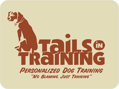
Tails in Training


This logo was created fairly quickly, and without any other options presented to the client, who had a very low budget to work with as well as a very tight timeframe. In a case like that, I do the exploration work on my own, but the client never sees it - they only get one concept with minimal adjustments allowed. Less money = more control; less time = less prep work shown to the client. In many cases, this works best - and the alternative for the client is they'd be creating their own logo (probably in Word or Paint) or using some clipart, or even not having a logo at all (which sometimes isn't the worst case).

The client wanted earth tones (makes sense - dogs are pretty earthy) and a less formal look, so I used a font that had a cut-out kind of quality, and rendered the dog in similar rough shapes. I went with three colors on the main logo (something I rarely do - I'm typically a two-color guy) to give me a little more to work with the shapes in the dog illustration.

Color break, with tagline and slogan. This shows the client, and any
vendor they work with (most commonly, offset printers) how many
spot colors were used, and where they're located.

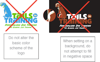
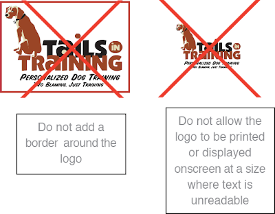
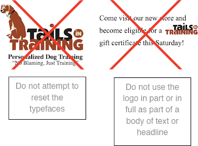
I developed a four page set of guidelines for this logo's usage, which you can view here as one long image (you may need to click once to zoom in). Because many of the logos I do are for startups, who will rarely be printing the logo using offset printing (some web-based businesses may never print the logo at all), I rarely produce these guidelines. But they are helpful, even if a big chunk of it is just a listing of what not to do. Some people need that most of all.


From page 1 of the logo guidelines - think of these as the logo "no-no's".

I'm always amazed, even after all the years I've been working as a designer, at the things people will do to a logo - especially people who've paid for that logo's development. I'll come off sounding like a jerk here, but I'm going to speak freely: if your instinct when working with a logo is to stretch it out horizontally or vertically to fill empty space, to cut it up, to change the colors around, to put it on a crazy background or stick it inside a shape - then you shouldn't be working with the logo. Or at the very least, you should consult a designer for some strict guidelines, and then follow them to the letterœ. Trust me, the best logo in the world will look like crap if you stick it into Word or PowerPoint, then grab one of those side handles and pull it across the page to become your header. And when people view it, they'll think less of your company instantly - whether or not they can articulate why they feel that way - and you've lost.

I'm often disappointed when I see what small businesses do with their logos. Better to not have a logo at all then to have something that degrades the image of your company each time it's used. I don't want to get too negative here, but I'll say this: working with an experienced designer will benefit your company's image in ways that you may not immediately recognize, but will pay dividends in the future. If you can't afford to hire a designer to develop your logo, check into consulting options - if anything else, for possibly a few hundred dollars, you might have someone to keep your worse instincts in check.

And since I mention Word and Paint above, I'll add this: you can't develop a logo in Word, or Paint - not even Photoshop. I mean, you can - but you shouldn't. It will be a problem in the future, if your business is to grow. You need a vector-based logo, developed in Adobe Illustrator or a similar vector-based design application. I'll tackle the reasons why in a future post, but trust me - it is a necessity. I've been hired by firms who started out with a raster-based logo, created at 72 ppi in Paint or Photoshop, and asked me to create a vector-based version. And usually, most often even, it's more time-consuming and expensive to do it that way - you have to accurately match fonts and precise shapes in a very tedious way.

As with anything, spend more time and money up front and you'll do better in the long run. When I was a younger designer, I was nicer to clients and potential clients about this. Now I'm not - I'm very direct, and I smack them around a little when I think they need it - which is often. Melodramatic as it may seem, I've seen too many people suffer over the years because they made poor decisions early on, based on money, and no one stepped in to tell them the downside to those decision. Even though as the designer I have a vested interest in getting clients to spend more money, and it may look like I'm trying to upsell them, I don't hold back - whether they use me or someone else, it'll always be an improvement over creating the logo themselves. I can live with that.


One-color version on colored background. I provided a separate version
of the logo for one-color uses like this. Besides making all the elements
one color, some shapes are removed, and pieces that overlap in the
full-color version (like the text) are given space between them. Just
printing the full-color version in grayscale wouldn't look anything
like this.


Two-color version on colored background. This version offers a little
more natural variation - the words are in two colors, so no space is
needed between them.

Back to this logo: here's one benefit of vector-based design right above. If you had created a logo in a raster-based program like Photoshop, with all the shapes and color on one layer, you would experience hell if you wanted to change the colors. You can select colors and alter them, but all the little edges would get messy and ugly. And if you wanted to lay your logo on top of a colored background, as I've done above, you'd have to cut out all the white and you'd end up with similar edge nastiness. Using Illustrator, I created color variations in literally seconds - just swapping out one color for another. It's really beautiful and efficient - when anyone who's tried to do something like this on their own sees me working in Illustrator, they say things like, "Oh man - that's how it's supposed to be done!" and also, "You won't believe how long it took me to do that - and mine still looks bad!" Vector is good.

So check out those guidelines to see all the rules and color options I provided. In the end, once the logo was handed over, the client immediately decided to drop the image of the dog altogether and just use the type. What a world!