DESIGN  |  ILLUSTRATION  |  ANIMATION  |  WRITING  |  FILMMAKING  |  MUSIC  |  GAMES
Showing posts with label characters. Show all posts

The Camp Out - A Jabloo Adventure

I've just finished writing and illustrating a storybook using my Jabloo characters. The story is aimed at kids 3 to 6. You can read The Camp Out online.


I created the Jabloo gang back in 2006, and this was the first story I conceived for them. There's something about the camping out in the woods that's always evoked the idea of creativity for me - maybe it has something to do with telling stories around the campfire, though I don't think I've ever done that.

Since each of the Jabloo characters represents a different creative art (filmmaking, music, acting, writing, and visual art), The Camp Out is about them creating a piece of art - in this case, a monster movie. Yubi, with his video camera, is at the center of this creation, but each of the other characters contributes to the movie as well.

The story was designed as an "adventure" - meaning, it's not an introduction to the characters, so we jump right into their camping excursion. Kind of like an episode of a continuing television series rather than a one-shot, stand-alone show.

I worked backwards with the layout of the book, using Shutterfly's Photo Book sizes as the basis for my design. I went with a 7x9" book, so I opened up Freehand (the now-outdated piece of vector creation software that I used to create Jabloo - and still use daily) and set up a 7x9" document with a bleed area.

It's nice when the hard work is already done!


Much of Jabloo was already created - the characters with different hand and mouth positions, fonts, colors, even many of the backgrounds in The Camp Out (for the as-yet-to-launch online, interactive version of the story) so I was able to move into the book's creation quickly. I'd spent months analyzing the layouts of my son's books (which contained every imaginable style of layout) and decided on a full-page image every page (with a few exceptions - the first page and a two-page spread), and a limit of two sentences of text contained within a white arc at the bottom of each page.

Dig those crazy vectors!


I put the story together in a fairly haphazard way - writing a few pages, putting the illustrations together (which could take hours or days - even with many of the elements already created), adding a few more pages, changing the sequencing. The story itself is 24 pages, with a few additional non-story pages at the front and back.

I wrestled a bit with how much story detail to include - especially when it came to the movie the characters are putting together. I wound up showing only an indication of the story they were telling. The two-sentence limit on each page was a good natural limit, forcing me to only hint at the monster movie. The reader's imagination adds the details. I think that works nicely. It's a story about creating art, not about the creation itself.

Since Freehand is no longer a current program, and copying/pasting into Photoshop isn't viable (gradients get messed up, and there are other issues), I went through a tedious process of maximizing the Freehand pages on my 30" monitor, grabbing screenshots and shrinking them to get smaller, high-resolution images for printing. Of course, after doing this I found plenty of small things that needed revising or correcting, so I had to repeat the process for many pages. It was still a worthwhile compromise for being able to work with the beauty and elegance of Freehand.


I had a few hiccups when I began assembling the book in Shutterfly. When I was writing and laying out the book, I didn't set the pages up as two-pages spreads, so some of the images (especially the backgrounds) looked awkward when placed side-by-side. For example, some of the hills in the background seemed to run into each other, making the pages seem like they were meant as two-page spreads (that didn't quite align properly) - but with the same characters on each page. So adjustments had to be made to the backgrounds as well.


The next stage was assembling a readable version of the book online. I could have gone with a more straightforward gallery, but the effect of side-by-side pages would have been lost. I found a Picasa-based template online and, after plenty of technical issues, got the online version up and working.

The final printed book from Shutterfly looked great. The only minor drawbacks are a white area on the left of the cover (presumably the digital printing would flake off where it bends back) and the fact that you can't print a back cover (unless I missed that option), so the back of the book is plain white with a UPC code on it. But the printing itself looked great, as I expected from previous Shutterfly orders. And as much as I consider myself a digital kind of guy, I have to admit a piece like this feels different when you can hold it in your hands.


Read The Camp Out now - preferably with a kid or two.

Interactive Creature Maker prototype


Click above to play . Click on a piece once to grab it - then drag it so the blinking dot is laying on top of one of the dots on the body - then click again.

Wow - I totally forgot I did this. This little piece was an experiment when I was working on my project Jabloo, trying to find my way. At first I was thinking along the lines of an interactive world where you created your main character (like a lot of other game - Spore, most directly) and then use that creature to navigate a world.

I didn't get far before I decided to change directions, but I did work out a little system in Flash to allow the user to pick up a body part and lay it on one of the articulation joints. The interactivity is a little odd - instead of clicking and holding (really, dragging) you click once to grab, click against to release. If you're on a joint, it secures to the body - if not, that piece goes back to its original spot. If you drop a piece on a joint that's already holding a piece, that piece gets replaced.

You can also change the global colors of the piece - I had to make the shadows transparent so that they show through to whatever the main color is behind them. Each joint on the body has an optimum rotation angle, so the pieces always snap to a logical position. And the shadow has to be a generic shape - with a 2D application like Flash, there's no realistic way to make the cast shadow of the creature reflect all the body parts the user chose.

Well, have fun with it. Sorry there's no background, or animation or anything more than some random body part assembly. If I ever add to the piece, you, blog reader, will be the first to know.

Simmer Down


Simmer Down with Sharon. Click for the full animation.

Another half-completed idea. I created this in 2004, not long after meeting Sharon, turning her real-life career as a pastry chef into an animated mockery. Not really. But it was a fun little experiment in creating an animated version of the woman who would become... my wife (I tried to make that sound dramatic)


Umberto, the irrepressible spatula with the overdone Italian accent.
I did the voice, and I'm 100% Italian, so it's okay - I cannot get in trouble
for the ethnic stereotyping.

And yet, it's really more of a rough idea awaiting completion, which will hopefully happen someday. The lip synching for Sharon is rough - I just created some semi-random movement and never got around to finalizing it. In fact, the sound is a clipped, giving it a static quality when the sound peaks. Blech. The theme song was done in Easy Beat, a program I used for music recording pre-GarageBand, so it's pretty weak. And Phillipé the Whisk is only shown in the intro - the scene ends abruptly and he's not even shown. Poor Phillipé.

I did enjoy voicing Umberto, brief as his lines were, and his interactions with Sharon seemed pretty funny. And I like the way the kitchen "set" turned out. So I'll consider this post a kick in the butt to revisit this project someday and at least get one episode done. Then Phillipé can finally have his moment in the spotlight.

Mistha Bleedsworthy - Storyboards


I did my first set of storyboards when I was in college. I was part of a screenwriting group, and our teacher was planning to head off to Germany to shoot a short film he'd written. Somehow it made sense for him to plan the project remotely, locating cast and crew (pre-Internet) by telephone, newspaper and letter-writing, and then fly to another continent to actually shoot the film - a fifteen-minute black and white art piece, with only two non-language-specific words spoken. But hey, it's not my place to say whether or not this was logical - not then, anyway. Maybe the movie was just a ruse for him to sample some fine Teutonic beer.

Because I was a Graphic Design/Illustration major, this teacher asked me to develop storyboards for the film. I agreed - possibly because the film was titled "Watchman", one letter away from my favorite literary work, but also because it seemed like it would be a good experience - and it was. I still have the final pieces - I'll have to photograph them sometime. I say "photograph" because my teacher, the writer/director, insisted the storyboards be rendered on humongo 30x40" boards. He wanted the cast and crew to easily be able to reference the images while they were on set. Not a bad idea. I have a VHS copy of the final film - it was a moody, arty piece, kind of like Wings of Desire, but much more entertaining because it wasn't a pretentious piece of crap (uh oh).

The other interesting fact about those storyboards is that my teacher insisted that I draw them while he was present, so he could essentially direct me as I was working. That was pretty challenging. He requested very finished-looking renderings, so it was an especially long process with me going to his house in Philly for several weekends, drawing out multiple rough versions of each panel on a small sketchpad. Once he was happy with one of those roughs, I'd redraw the panel on the board using charcoals. Sometimes we only got through a few panels in one six or so hour day. Good thing it was a short film. I think he paid me $50 for the whole project - what was I thinking?! I didn't even get any of that beer...

Anyway, those movie storyboards are not the subject of this post, but the there's a very roundabout connection. When I joined that screenwriting group, I convinced another friend of mine (also a Graphic Design/Illustration major) to join with me. My friend Allen was and still is, the most creative person I know - and I know many creative people, trust me - but it just oozes out of this guy. While our teacher was enduring my in-progress screenplay about an assassinated American ninja who's brought back to life in the future (only to fight, of course, the ninja who killed him), Allen was presenting a concept for a screenplay called Mishta Bleedsworthy which our teacher absolutely fawned over. It was a well-deserved fawning.

Mishta Bleedsworthy was Allen's concept not just for a movie, but for an entire world. The story's titular (hee hee) character was a member of The Epitomes of Stuff - an unseen group of entities in a parallel universe composed of offices sitting on interconnected tiny planetoids. The Epitomes rule over different aspects of our world using their powers, all while working through their own dense bureaucratic system.


Exterior and interior shots of the Realm of the Epitomes of Stuff.

Willoughby Bleedsworthy (referred to as "Mistha" by his four-foot Chinese Cowboy assistant Neddy, who has a serious lisp) is the "Epitome of Doors, Gateways, Various Entrances and Exits, Holes, Paths, Bridges and Links, Both Tangible and Intrinsic" (Allen's description - pretty wild, eh?). He's part Willy Wonka, part Baron Munchausen with a bunch of other fictional characters thrown in. Besides Bleedsworthy and Neddy, the cast was filled out with Kishwa (Bleedsworthy's friendly anthropomorphic tie), the Epitomes' long-suffering Headmaster Szogfn, the identically-cloned Bettys who conduct communications in the Epitomes' realm (each using their own method - semaphor, finger painting, interpretive dance), and the tyrranical Epitome E.G. Wadsworth, who hatches plans to thwart Bleedsworthy and Neddy from beneath the fish bowl in which his head is imprisoned. Yes, the story was epic - so epic that it took over fifteen years for Allen to complete the screenplay (I believe he's working on a sequel now). The final document had a Monty Phython-like irreverence and was a blast of messy fun.

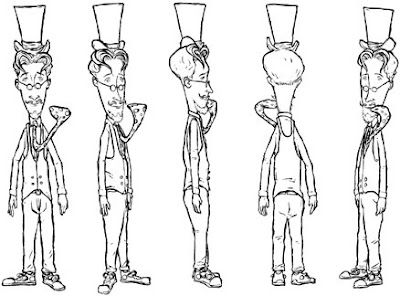
In the late 90's, while he was still working on the Bleedsworthy script, Allen surprised me by joining the U.S. Army - he's still enlisted. Right around that time, I was taking a traditional animation class. I asked Allen if I could take the Bleedsworthy concept and create a television series proposal from it, to use as a class project. He agreed, which was quite generous of him - this was his passion project. And besides being a writer, and a musician (I saw him learn to play the drums right in front of me once, over the course of a few minutes - it was like that scene from Close Encounters where we Earthlings learn to communicate with the aliens through music), Allen is an excellent cartoonist - he'd already rendered most of the Bleedsworthy characters on his own. I was a little nervous for him to see my renditions, which you can see here:


Character rotation, model sheet and prop sheet for Mistha Bleedsworthy.
His tie sticks out like that because it's alive!


He gave me permission to work up my own versions of the characters and environment, which I did over the course of about six months. I created model sheets, prop sheets, backgrounds, storyboards, a sample episode script, season overview and other materials. To my relief, Allen liked what I did with his project - I sent him drawings and other documents while he worked his way through basic training.

I then put together a package and sent it out to about fifteen production companies, who all responded by saying: no. Actually most of them didn't respond at all, or just gave their answer by sending my material back unopened with a form letter. I didn't cry, though - the idea of someone with no history in television or animation creating a full series, based on an original concept with no commercial tie-ins (comic book, novel, children's book) is beyond a long shot. But it was a great exercise - by the time I had everything completed, I had much more respect for anyone who's ever got a cartoon on the air.

So here are my Mishta Bleedsworthy storyboards for a couple interconnected scenes. You can click the image below to view them as one large image (sans dialogue or description), or view one panel at a time by clicking the interactive piece at the bottom of this post. Or don't click either - after all, I'll never know.


Click the image above for full storyboards in a new window... or click
below to view one panel at a time.

Woobner


Click for larger image. Do it. You know you want to
see more of the classy lady.

Woobner was a comic idea I created in the late 90's. I say "idea" because it was never completed, and I can't remember why. I had the first issue written, the first few pages drawn, inked the first couple pages and colored the first - not the best process. I guess I was going for a "proof of concept" - I wanted to make sure it looked good before I got too far into it. Stupid.


First page inked, no color. But you could have
figured that out on your own, couldn't you?

I do like the way Woobner looks now, though, so I wish I would have finished it - at least one issue. The story was about this freakish little character (named Woobner, of course - I stole the name from some co-workers at the time who made up the term as kind of an all-purpose insult - "You're acting like a Woobner!") who, for no clear reason, was very popular with the ladies (hmm... was I projecting my own fantasies?). His personality was a lot like Pee Wee Herman's, except he was bitter - bitter and jaded.

Even though he looked like a little elf with a skate rat's hairstyle, Woobner worked as a male model (comedy), but that was actually a cover for a his sideline as a spy. He was part MacGyver, part Austin Powers, with a little bit of Maxwell Smart thrown in for good measure. He also had a sweet girlfriend who kept him in line (surely more self-projection).


Panel detail. "Frig" was to be Woobner's catchphrase... even though
it's just a single word.

Before I began the project, I'd been in touch with an editor from Fantagraphics, a great independent comics company who published two of my favorite books at the time - Eightball (which spawned the movies Ghost World and Art School Confidential) and Hate. I think I'd sent this editor Science Geek, a zine my friend Doug and I put together (he wrote it, I illustrated it and laid it out), as well as some other black and white illustration samples.

The editor, whose name I can't recall, liked my work and sent me a nice handwritten note asking me for some examples of full comic stories. I'd done some short one- and two-page comics in black and white, but nothing longer. Woobner was designed to be a full-length example to show that editor.


Another panel detail. I must have been reading a lot of
Little Annie Fanny around this time.

I used my traditional pre-digital technique - brush-tip markers over pencils, photocopy (onto 11x17" 20 lb. paper, for this piece), and color the photocopy with Prismacolor markers. I also lettered the page by hand, using the same markers, which gave the words a nice integration into the rest of the linework.

During this time, I was still experimenting with the size I'd work at - specifically, how much larger than the final piece I'd lay out the page. Sometimes I'd shoot too large, and when the piece was reduced, the linework was a little too thin and too tight. Other times I'd start too small - too close to the final size - and I wouldn't have that extra little bit of space for the smaller details. Here I think I got it just right - the linework was just chunky enough for my liking.

The colors were less blended than I was shooting for, but for the most part, I like them, too. At the time I was working on Woobner, I was aiming for a totally smooth, modeled, Richard Corben kind of look, but the different levels of color now look charming and hand-created to me - a lot of digital colorists shoot for the same "imperfect" effect. The wet edge - where the markers hit each other - looks more pleasing to my eyes now than it did then. That's what an oversaturation of digital work does to you, I suppose.

Perhaps someday Woobner will live again - or at least, maybe the first issue will be completed. It could be a one-shot. Or a web comic. Or even a musical. Hey, if The Last Starfighter can be made into a musical, I think I've at least got a shot.

I Am All These Things And More


This piece started out as a client project that just didn't pan out. Once of the agencies I work with wanted to rebrand themselves, or really to create a secondary site that they could show to people in the video game industry that they were trying to woo as clients - a site that would be much more fun and irreverent than their existing site, which was traditional-looking and catered to their more conservative clients.

The agency described their plant to me, and I began working on the piece without any kind of formal agreement, which was not smart. It was a handshake kind of deal - "Here's what we'd like to do - an Otaku-influenced site - do you have anything you can show us in this style?" I didn't, but just thinking about it inspired me, so I started drawing in my favorite vector program, FreeHand. Within half an hour, I had a ninja, and I liked that ninja. I kept building from there.

I was working on my It Must Be Me book illustrations during this same period, and I enjoyed the challenge of working in that style - conveying the different characters in simple geometric shapes. Sometimes I feel almost guilty, creating pieces like this with so little detail - but whatever speed comes from the lack of complexity is often made up for in the time required to get the shapes that are there just right. I kept these colors desaturated as well, and I gave each of them a radial gradient in one or two places, to give their forms a sense of dimension. Background strips were added, each a little thinner than the characters' widths, so the six dudes could pop forward a bit.

And then nothing happened. The agency absolutely loved the images, which originally didn't have their descriptions beneath them. Each of the six characters were meant to be animated, and when clicked the backgrounds were to expand, bringing up one of six different areas of this new website. But the agency wasn't ready to commit to launching the new site (and as far as I know, three years later, they never did), and though I was disappointed, it was my fault - they were so enthused to get started, that I let myself get sucked in, moving forward without good reason. My bad.

A year or so later, I started putting up my Zazzle store, and revisited the image. I thought it would make a fun t-shirt idea, and since no one had paid for or used the piece, it was mine to use however I wished. I came up with the title "I Am All These Things And More" to tie the six characters together, added the descriptions below, and posted it for sale. I think I sold my first shirt in an hour. I should have known - people like ninjas, people like pirates, but combining those two characters with the other four seemed to be a winning combination. Lesson learned. It's now one of my top selling items. I've even sold one to someone named Esmaeil in Falun, Sweden. I hope he/she is wearing it - maybe even right now - and feeling like a Pirate, Clown, Viking, Robot, Ninja and Monster, all at once.


I Am All These Things And More on Zazzle