DESIGN  |  ILLUSTRATION  |  ANIMATION  |  WRITING  |  FILMMAKING  |  MUSIC  |  GAMES
Showing posts with label 90's. Show all posts

WCS Brochure


Brochure front and back exterior (top), and interior
spread (bottom). Click for larger image.

I used to a lot of print design in the 90's - brochures and booklets, full stationery systems (letterhead, envelope, and business card), ads for newspapers and magazines, book covers, DVD and CD packaging, flyers, posters and more. However, over the past ten years, that work has declined significantly - and the print pieces I do create these days are often handed over to the client for production.

I guess you can owe this decline to a couple factors. First, I trust you may have heard of the Internet. Many of the business I develop logos for these days are almost completely web-based - they still need business cards (I always use VistaPrint these days), but it's rarely worth their time to create offset-printed envelopes (if anything, they print their own labels) or letterhead (a Word template almost always suffices). Aside from those essentials, and some more straightforward business forms and documents (estimates, invoices, even fax cover pages!), these clients don't need much in terms of printing in the 2000's. For more specialty pieces, like display materials (large posters, banners, table tents) they're more than likely to hand the project over to a vendor who may have an in-house design department (or even a single designer) who can put together a design - and then it gets printed or produced under the same room. Who can argue with that kind of convenience? Not I. And small businesses are much more likely to advertise online than in more expensive print publications with longer lead times, less focused audiences and increased fees. What I said in 1993 still holds true: "The Internet is Good." (I never really said that in '93 - '96, maybe, but not '95).

The other factor is home-based printing. Up until the early 90's, consumer-grade printers either really sucked, or they were really expensive - sometimes both. But nowadays, you can get a more than decent inkjet, LED or laser printer for your home business for a reasonable amount of money, and produce your own printed materials in quantities too small for a commercial printer. Even brochures, booklets, and other material requiring specialty finishing (like folding, trimming, or binding) is achievable. If I were a teenager now, I'd have a publishing empire going full speed.

Detail from interior spread. Do you wish the text was larger, so
you could read it? If so, then you are a nerd.


Where am I going with this? The piece here, for a water consulting firm named WCS, was created about four or five years ago, when I was still getting a decent trickle of print work. As is often the case, the client did not have an unlimited budget, so they asked for a two-color piece. I designed the piece in Adobe InDesign, selecting a fairly straight blue spot color, which I used along with black. Initially I tried making the photos into duotones, which means they're created using a percentage of black and the spot blue - but (from what I remember) I was reminded of the crappy, cheap textbook photos of my youth, and so I went with all-blue photos - which are called "monotones", by the way - as if you couldn't have guessed that.

I didn't assist with the printing of the final piece - the client went through a few rounds of text changes (quite a few, as I recall), but once it was finalized, I handed over my InDesign files, as well as a .pdf, and they - I assume - took it from there. This was another of those nebulous projects where I never hear from the client again after my role is complete - I can only assume the client, or one of their vendors, went off and printed the final brochures. I hope they didn't get nutty with my source files and switch the photos back to duotones - that would hurt my feelings.

Indie Music Magazine Illustrations

In the mid-90's, I did a lot of black and white band illustrations for a few independent music/pop culture magazines. I'm not even totally sure which magazines each of these was for, but I believe most of them were done for Carbon 14, which still seems to be in existence (and has a now-coveted 3-character URL - impressive!).

These pieces were all done in a flurry, and I don't believe there was any payment involved other than one or two issues of the magazines in which my work was featured - which was fine back then, as I was still developing my style and getting used to doing this kind of work. Still, I had to turn these around quickly, and they were all illustrations of real people, which took me much longer to work out (though the average person wouldn't be familiar with these musicians' faces, so if they didn't look perfect, I doubt there would have been any protests).

Though the Internet was around back when I did these pieces, it was in its very early stages and I didn't have access - the magazines probably didn't, either. So since these were done essentially for free, and in a short timeframe, there was no approval process - I'd get 8x10" glossies of the band, possibly with photos of them in other magazines, and I'd sketch and then ink them with my brush-tip markers. Then I'd send the final pieces into the magazines, and they'd print them as-is. If only things were always so simple and direct.


A band called Sinkhole. I really like the way the guy on the left turned
out, though I think I'd be scared to meet him in person. I can't be sure,
but this may be the same band.


The Refreshments, who had one big hit in the mid-90's.


A cool little band named Betty Goo. I gooified them. The top
photo on this page is the one I used as reference, way back in '96.


Ben Folds Five. Get it - "Folds" - like in Poker? And I drew
them in playing card costumes? That's supposed to be clever, people.


From a computer advice column. The logo is
supposed to be shown on a mouse pad,
though I'm not sure it totally registers as one.
From Escargot zine.

As always, some turned out better than others. The one guy's arm below, drinking from the soda bottle, is particularly effed up - but I still take responsibility for them, and I resisted the urge to clean them up in Photoshop before posting them. That's got to count for something, right?

Hatch


Click for biggerness.

Another weird one. I was reading a lot of Moebius at the time I did this - sometime around 1993 or 1994. The influence is clear - I never really worked in this crosshatching style before or since. I usually avoid adding any kind of linear tone to my illustrations these days, though I did flirt with a horizontal messy line crosshatching style around this same time.

This piece was different, tough - I think I created it as a possible piece of art for my band cuppa joe - I can't remember if this was supposed to be a CD cover, a 7" vinyl single cover of something else. Regardless, I got a bit spacey (obviously), which was not too appropriate for our homegrown musical stylings, and the illustration never saw the light of day... initially.


Closeup of the illustration. Look at all the pretty, intersecting lines.

A quick aside about Moebius: In the early 90's, I was very much into him - as I still am, but I'd just discovered him then. And as he lived in France, I didn't expect I'd be seeing him anytime soon. However, at the end of my senior year of college, I decided to get my long hair cut off, so I went to a salon in a mall in central New Jersey (don't laugh) and asked them to give me what would be my "college graduation cut" - the shortest, most militaristic hair style of my life. It was also the longest haircut of my life, given by a guy who, ironically, had even longer hair than me.

Here's the kicker: while he was in the middle of my lengthy hair cut, my stylist and I were talking about art. This guy mentioned he was into comic books and asked me if I liked Moebius. I said yes (of course) and he looked at my curious and said, "Then man, I'm surprised you're not across the street seeing him! I'd be there if I wasn't working." Turns out Moebius - from frickin' France! - was making an appearance at the comic book store across the highway. I couldn't escape, though - I was mid-cut - and by the time I was finished and rushed to the store (five minutes away!), Jean "Moebius" Giraud was gone. I hate that story - I could have picked any other day to get my hair cut! Why then?!

So anyway... the reason I think this image was an alternate concept for my band's CD cover is the concept. The CD was eventually called Nurture - this was the actual cover I designed:


Actual Nurture CD cover. No crosshatching here.

You can see that either image works for the concept of "nurture", but in pretty different ways. And I was definitely locked into the same color scheme. I think the idea of such a sci-fi image just didn't work for our music - especially an image containing some nudity, allthough mild nudity (I was reading lots of Heavy Metal at the time - this is pretty tame by comparison). The other possibility, though, is that I did the alien-egg-hatching image after the CD came out, just riffing on the concept of nurture. Who knows? I can't remember. I also did a similar black and white image of a human woman breastfeeding an alien. I guess I was into aliens and motherhood back then.

For years the Hatch piece sat in my portfolio (a physical portfolio, pre-internet), most likely offending sensitive female art directors everywhere. Once I stopped using a physical portfolio, the piece pretty much disappeared. And then when I opened my online Print On-Demand stores, I decided it might appeal to some of the more spacey folks out there. I've sold a few mousepads and a couple t-shirts - here's one of them.

Check out the full
Hatch product line on CaféPress

USA Today Holiday Promotion


Click for larger image. You'll be able to see the doggie's nose in more detail.

I've shown examples of two fairly recent illustrations that I said I felt pretty happy with, in terms of using Photoshop and my Wacom Intuos graphics tablet. I mentioned that in the 90's up until around 1999 or 2000, I was using only traditional materials - brush-tip pens for linework, which was photocopied and then colored with PrismaColor markers. Then I plunged into the world of digital illustration in the late 90's, first using a $99 Wacom Graphire, which was still totally fine for my purposes. I was really happy with how close I could come to my traditional style, even after only a few weeks, but in retrospect I think I sacrificed some of the imperfect qualities of natural media (especially the coloring) in these earlier digital pieces.

I did the piece above in 2000 for an agency who were developing an online campaign for USA Today. They just wanted a simple illustration that would look good when reduced - a little scene that promoted the newspaper's doorstep delivery service. I did a sketch, it was approved, and I proceeded to create the digital rendering.


Detail of the lady's face. Pretty smooth colors - maybe a little too smooth?

It took me a few illustrations to get the right feel for creating linework with the Wacom. I also remember messing up many times, not locking layers and creating nice, solid black lines... in the sketch layer. I got over that pretty quickly. I like some random, chunky variation in my lines when working with a brush-tip marker, so it was fairly easy to replicate that feeling with the Wacom.

The only real issue I had was what I call (in my head) "pulling" - there are some directions that, when I'm inking on paper, don't feel natural when the page is oriented perfectly vertically, so I rotate the paper a bit to get into a better position. I can't do that with the Wacom, so I found myself at times (especially on big, round shapes) drawing some of the lines at the wrong angle (but one that felt oh-so-right), then cutting, pasting, and rotating that linework to make it blend. That was pretty painful - over time, I got better at making it work without using that technique.


Awwww! This guy was modeled after
my Mom's dog Bandit at the time it was drawn.


Coloring with the Wacom allows for a lot more experimentation, which is not necessarily a good thing. In the "good old days", I'd lay down color with my PrismaColor markers, which I knew intimately in terms of their blending qualities. In the very early days - say, up until 1996 or so - if I made a mistake, I'd have to live with it or start the coloring over. Then at some point, I had a computer with a scanner and I'd sometimes recolor part of a piece I wasn't happy with on a separate photocopy of the linework, then use Photoshop to meld the two pieces together. Ouch - that was even more painful.

By the time I was able to color digitally, it felt like taking the training wheels off - it was freeing, but possibly a bit too freeing. I was putting a lot of color elements on their own layers, allowing myself near-endless amounts of time to adjust colors. And that's time I did spend, tweaking things a bit, then tweaking other colors to fit the newly-adjusted elements... I was taking days on just color. Also, it was too easy to keep darkening and lightening without using different colors for the shadows and highlights, so elements weren't varied in hue as much as they would have been with markers.

Most significantly, I was able to create totally smooth color transitions, highlights, shadows and gradients, which winds up giving the piece a very airbrushed look. I liked that look back then, ten years ago - probably because it wasn't a look I could get with my markers - but now it looks too smooth and perfect to my eyes, especially when combined with my idiosyncratic linework. It wasn't messy enough, to put it simply. I remedied that over time, but this piece is a little to stiff for me.

Oh, and the lady has man-hands - I must have been watching Seinfeld when I was sketching this one out.


The offending digits.

So there you go - some self-criticism, just like you requested (not really). I have to use it in moderation, in case my clients begin reading this blog - I don't want to hurt anyone's feelings, especially anyone who hired me to complete a job - one they may still be happy with. I don't hate this piece (I don't expect I'll be posting anything here that I've come to truly loathe - those pieces do exist, though) but I think it could have been improved. That's a pretty common feeling when looking at old work, though. I am large; I contain volumes. And trebles.

Science Geek


Science Geek was a zine my friend Doug and I put out in the 90's. Doug and I were also both in the band cuppa joe during this time, but I guess we didn't feel like we spent enough time together so we joined on this project, too.

If you're not familiar with zines, here's the skinny: as you may have guessed, the word "zine" comes from "magazine", and that's what they often are: stripped-down, self-published magazines. The 90's were probably the golden era of zines - desktop publishing software and the widespread availability of copy shops like Kinko's really kicked zine publication into high gear, though by the end of the decade the Internet had diminished zine activity significantly. Why spend all that time and money printing these things, not to mention stocking inventory, shipping costs, promotion, and all the other hassles a physical object entails? Still, zines have their charms and they're still being produced - there's a certain satisfaction to holding something in your hand that was created with such care and craft.

Zines cover all kinds of subjects, though most are personal in nature. Doug started Science Geek while he was just beginning to work as a teacher, and used it as a forum for his writings on teaching, as well as a means to interview bands, review music and other zines as well (a common practice). For the first couple issues, Doug wrote his pieces, printed them out and cut-and-pasted the layout. He asked me to do a few illustrations and comics , which were reduced on a photocopier and worked in. Primitive times, kids.

Those issues were printed on 20 lb. copy paper, black and white only, and were stapled on the side. They didn't look super pretty, but what they lacked in polish they made up for (we hoped) in warmth and readability. Those early issues generated a lot of nice feedback. We had a post office in Trenton (the same post office involved in the 2001 Anthrax attacks, unfortunately) and fielded orders (usually with $3, postpaid, in cash) from there. We also sold issues at cuppa joe shows, and even at other bands' shows. We had no shame.


Then in 1995, Doug joined the Peace Corps and went off to Kenya. He asked me to handle Science Geek duties in the states while he was away, and I agreed. He wound up writing out the third issue on an old typewriter in his hut in Africa, mailing me the pages, which my mother or I would transcribe (we also recorded an album in this lo-fi manner!). I'd then do the illustrations and lay out the issue. It was a wild way to work, and certainly not the most efficient, but it was satisfying to see the printed issue and know what went into it. Doug's adventures in the Peace Corps, and just being in Africa, gave him a unique perspective as a teacher and writer, and we started to see some positive reviews at this point. We also managed to obtain international distribution through Tower Records and a number of other distributors by the time the third issue was available, which was both awesome and nightmarish as anyone who's dealt with distribution of any kind can attest.

That third issue had, for the first time, a color cover. By the fourth, we were using 11x17" paper and saddle stitching (stapling in the middle) so the zine looked and felt more like a "real "magazine. The fifth issue (cover shown above) was the best quality we'd produced, being laid out in (whoo-hoo!) PageMaker - and it was the last. All good things, you know. It was a satisfying thing to put together, but it was a ton of work each time - it took almost a full year to put out each issue, not to mention promoting the publication, working with advertisers (we sold ads to record labels, bands, and other zines) and mailing out issues. I think we just needed a break. I miss it, though - but I have enough copies of all five issues in my closet to keep Science Geek from feeling too far away.

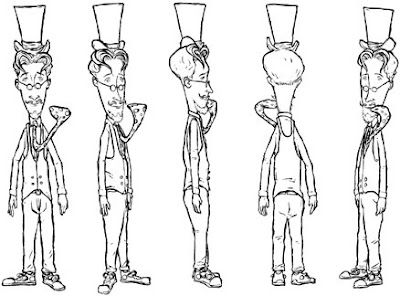
Here are a few sample images from Science Geek - band illustrations, comics, spot illustrations, and them some reviews and a sample story that Doug wrote when he was in Kenya. Enjoy. I'm sorry you can't hold them in your hands, like the real zine. Maybe print them out and fold the paper, to simulate their original format.


A couple illustrations of bands we interviewed - this one
is Small Factory...


...and here we have The Wedding Present in a more conceptual style.


A short comic about my mall bathroom experiences.


This is the kind of illustration we used to fill in
the empty space that often wound up in the backs
of each issue.

Illustration from an article about being the new guy
in the workplace.

Spot illustration from an article about an African witch doctor. Yes,
they are real.

Just another little spot illustration.


Click for larger image. This was Doug's prediction about
how he'd feel after returning from Kenya after two years.


Portrait of Doug as the uncoordinated American.


Click for larger image to learn some horrible things
about my childhood.


These were all real t-shirts Doug saw while in Africa. So now you
know where your cool, kitchy clothing goes after you donate it.

A few decade-old reviews...

“[Doug Larkin’s] writing is plainspokenly evocative, examining human behavior (much of it his own) with both a scientist’s reason and less objective qualities like insight and affection. If you’ve ever been on the fence about the value of zines, try Science Geek; fun and sweetly poignant, it’s enough to knock you on the right side.”
CMJ Monthly

“...totally great...Doug’s reviews and writing are without pretension and his enthusiasm for science is invigorating.”
Wind-Up Toy

“...what makes this zine so charming is Doug’s ability to make such a dreaded subject like science fun and interesting."
Carbon 14

“It’s a damn good thing that there’s a zine like Science Geek...huge and funny and even educational...the hands-down coolest thing since computational biology.”
Permission

“What a fantastic zine...sometimes you find a zine and it seems like the publisher created it just for you.”
Factsheet Five

Photo Wall
from Science Geek Issue 4
© 1999 Doug Larkin


The wall above my desk is covered with photos. About half of them are from home and the rest are pictures that have been taken here. Every time someone comes into my house, they are immediately drawn to them. In a way, it's really good because it always starts an interesting cultural exchange about family and friends. The two biggest draws are the family portrait and the picture of my family's snow-covered house. I always think that the Kenyans would be more surprised by the snow but instead they always make a remark about the size of the house. It's just a middle-class suburban home, but here they have nothing like it.

One day Miss Simiyu and Joanne the lab assistant stopped by and were looking at the pictures. Joanne paused in front of the family portrait and had me identify each family member. After I did, she kept staring.

Finally, she disengaged herself. "Ah," she said, "all you wazungu look alike".

Miss Simiyu tapped her playfully. "Shut up." she said, "They probably say the same thing about us!"

Another time Mr. Makokha was over looking at the wall. I had also hung up a card from my friend Diz on the far end. On the front of the card was a picture of Chewbacca, taken from a scene in the beginning of The Empire Strikes Back. Mr. Makokha came to the card and asked, "What is this animal here?"

"It's called a 'Wookie'. You don't have them here?"

"No, I've never seen them in Africa. Do you find them in your place?"

"They're not here? They must just be indigenous to America then."

"It looks like a mammal. Some sort of primate perhaps..."

"Yes, I think so." By the time he left, I'm pretty sure he knew I was joking.

For continuity's sake, when I got the Captain Kirk postcard from the classic Star Trek episode I hung it up underneath Chewie. My friend Joseph from the village fell prey to that one.

After he asked me all about Wookies, he pointed to the picture beneath. "What are those things called?" he asked.

"Those," I said shamefully, "are called 'Tribbles'."

Mistha Bleedsworthy - Storyboards


I did my first set of storyboards when I was in college. I was part of a screenwriting group, and our teacher was planning to head off to Germany to shoot a short film he'd written. Somehow it made sense for him to plan the project remotely, locating cast and crew (pre-Internet) by telephone, newspaper and letter-writing, and then fly to another continent to actually shoot the film - a fifteen-minute black and white art piece, with only two non-language-specific words spoken. But hey, it's not my place to say whether or not this was logical - not then, anyway. Maybe the movie was just a ruse for him to sample some fine Teutonic beer.

Because I was a Graphic Design/Illustration major, this teacher asked me to develop storyboards for the film. I agreed - possibly because the film was titled "Watchman", one letter away from my favorite literary work, but also because it seemed like it would be a good experience - and it was. I still have the final pieces - I'll have to photograph them sometime. I say "photograph" because my teacher, the writer/director, insisted the storyboards be rendered on humongo 30x40" boards. He wanted the cast and crew to easily be able to reference the images while they were on set. Not a bad idea. I have a VHS copy of the final film - it was a moody, arty piece, kind of like Wings of Desire, but much more entertaining because it wasn't a pretentious piece of crap (uh oh).

The other interesting fact about those storyboards is that my teacher insisted that I draw them while he was present, so he could essentially direct me as I was working. That was pretty challenging. He requested very finished-looking renderings, so it was an especially long process with me going to his house in Philly for several weekends, drawing out multiple rough versions of each panel on a small sketchpad. Once he was happy with one of those roughs, I'd redraw the panel on the board using charcoals. Sometimes we only got through a few panels in one six or so hour day. Good thing it was a short film. I think he paid me $50 for the whole project - what was I thinking?! I didn't even get any of that beer...

Anyway, those movie storyboards are not the subject of this post, but the there's a very roundabout connection. When I joined that screenwriting group, I convinced another friend of mine (also a Graphic Design/Illustration major) to join with me. My friend Allen was and still is, the most creative person I know - and I know many creative people, trust me - but it just oozes out of this guy. While our teacher was enduring my in-progress screenplay about an assassinated American ninja who's brought back to life in the future (only to fight, of course, the ninja who killed him), Allen was presenting a concept for a screenplay called Mishta Bleedsworthy which our teacher absolutely fawned over. It was a well-deserved fawning.

Mishta Bleedsworthy was Allen's concept not just for a movie, but for an entire world. The story's titular (hee hee) character was a member of The Epitomes of Stuff - an unseen group of entities in a parallel universe composed of offices sitting on interconnected tiny planetoids. The Epitomes rule over different aspects of our world using their powers, all while working through their own dense bureaucratic system.


Exterior and interior shots of the Realm of the Epitomes of Stuff.

Willoughby Bleedsworthy (referred to as "Mistha" by his four-foot Chinese Cowboy assistant Neddy, who has a serious lisp) is the "Epitome of Doors, Gateways, Various Entrances and Exits, Holes, Paths, Bridges and Links, Both Tangible and Intrinsic" (Allen's description - pretty wild, eh?). He's part Willy Wonka, part Baron Munchausen with a bunch of other fictional characters thrown in. Besides Bleedsworthy and Neddy, the cast was filled out with Kishwa (Bleedsworthy's friendly anthropomorphic tie), the Epitomes' long-suffering Headmaster Szogfn, the identically-cloned Bettys who conduct communications in the Epitomes' realm (each using their own method - semaphor, finger painting, interpretive dance), and the tyrranical Epitome E.G. Wadsworth, who hatches plans to thwart Bleedsworthy and Neddy from beneath the fish bowl in which his head is imprisoned. Yes, the story was epic - so epic that it took over fifteen years for Allen to complete the screenplay (I believe he's working on a sequel now). The final document had a Monty Phython-like irreverence and was a blast of messy fun.

In the late 90's, while he was still working on the Bleedsworthy script, Allen surprised me by joining the U.S. Army - he's still enlisted. Right around that time, I was taking a traditional animation class. I asked Allen if I could take the Bleedsworthy concept and create a television series proposal from it, to use as a class project. He agreed, which was quite generous of him - this was his passion project. And besides being a writer, and a musician (I saw him learn to play the drums right in front of me once, over the course of a few minutes - it was like that scene from Close Encounters where we Earthlings learn to communicate with the aliens through music), Allen is an excellent cartoonist - he'd already rendered most of the Bleedsworthy characters on his own. I was a little nervous for him to see my renditions, which you can see here:


Character rotation, model sheet and prop sheet for Mistha Bleedsworthy.
His tie sticks out like that because it's alive!


He gave me permission to work up my own versions of the characters and environment, which I did over the course of about six months. I created model sheets, prop sheets, backgrounds, storyboards, a sample episode script, season overview and other materials. To my relief, Allen liked what I did with his project - I sent him drawings and other documents while he worked his way through basic training.

I then put together a package and sent it out to about fifteen production companies, who all responded by saying: no. Actually most of them didn't respond at all, or just gave their answer by sending my material back unopened with a form letter. I didn't cry, though - the idea of someone with no history in television or animation creating a full series, based on an original concept with no commercial tie-ins (comic book, novel, children's book) is beyond a long shot. But it was a great exercise - by the time I had everything completed, I had much more respect for anyone who's ever got a cartoon on the air.

So here are my Mishta Bleedsworthy storyboards for a couple interconnected scenes. You can click the image below to view them as one large image (sans dialogue or description), or view one panel at a time by clicking the interactive piece at the bottom of this post. Or don't click either - after all, I'll never know.


Click the image above for full storyboards in a new window... or click
below to view one panel at a time.

Fossil Hunter


A hand-drawn illustration from a simpler time. This piece was for a feature article in "The Lapidary Journal", a gem and jewelry magazine, about the dangers that online fossil purchases were causing to the field of paleontology. Amateurs were purchasing fossils at high prices (they didn't know any better), and it was driving up the market. Who knew? I drew a dinosaur purchasing a bone via the internet, because that, my friends, is comedy.

This was one of the last illustrations I drew in a completely non-digital style. Back when this piece was done (the late 90's), I would mail the original art off to the magazine's Art Director, who would scan it, adjust colors, and send me back my original. That seems so quaint now, as does the idea of laying down color and not being able to adjust it ad infinitum on its own layer in Photoshop.


Look at all that sweet natural color variation from the markers.

Of course, because of the limited tweakability of the art, these analog illustrations were turned around much faster than they would be today. Back then it was sketch (and approval, or changes), line work, and color. Now the color stage can go on for days as I keep adjusting.

There are certainly many illustrators who still work completely on paper. Sometimes I envy their process. There's something to be said for committing something once and for all to the page. On the flipside, though, I was a lot more hesitant when selecting colors back when I worked this way - I used to do little color studies on another sheet of paper first. And I was much more likely to be unhappy with the final result in one way or another. I remember asking an Art Director if he could "make the green less green" on another piece. It's nice to have that level of control on my end now.

I'm not sure what dates this illustration the most - the big, beige monitor, the flip-out card Rolodex, or the image of a dinosaur eating fast food. Dinosaurs are much healthier these days than they were a decade ago. Thank The Discovery Channel for that.


Fossil Hunter on Zazzle