DESIGN  |  ILLUSTRATION  |  ANIMATION  |  WRITING  |  FILMMAKING  |  MUSIC  |  GAMES
Showing posts with label 80's. Show all posts

Create a Vintage Comic Look with ToonPAINT and Halftone for the iPhone


A vintage style comic panel created with ToonPAINT and Halftone.

I came across a cool one-two punch this week - a dynamic duo of iPhone apps that, when used together, create a neat vintage comic book/strip effect for photos.

The first app in this combo is ToonPAINT ($1.99 from Toon-FX). ToonPAINT lets you first convert your iPhone photos to black and white linework (with the option of a gray mid-tone) which you can then hand-paint directly on your iPhone screen.
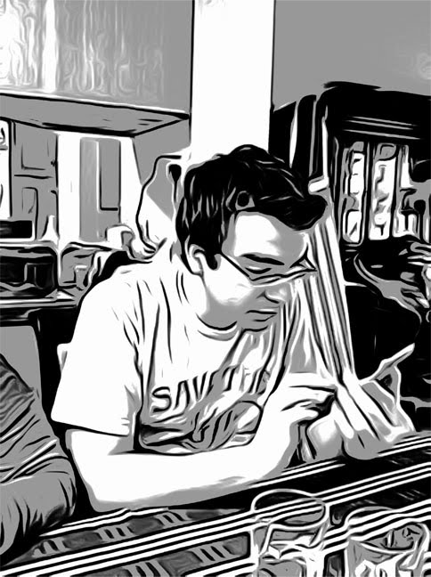

The original image.

Once you Load the image from your Gallery (you can also shoot directly from your Camera, if you choose), the image takes a few seconds to process as Inklines. The Shading controls in ToonPAINT's Inklines stage allow you to control the amount of black and gray areas in your image, as well as the amount of edges shown. You can also use the app's Size options to fine tune the Coherence, Edge Width and Edge Length.

I've found that the size of the subject in an image will determine what works best for these options - a closeup of a face, for example, might work better with wider edges, while a full body in an image can benefit from the XS settings in Coherence and Edge width. Play around with the options until you're happy with the look of your Inklines. You can also use the Pan/Zoom feature to zoom in and get a detailed look at your linework and tone.


Inklines from ToonPAINT.

Next, move onto ToonPaint's Paint stage. There's a slider to adjust your brush (or eraser) size, and a palette with a selection of eight colors. Once you select a color, you use your finger to paint over the Inklines. You can also use the Color Picker to modify the colors in your palette, and there's a a Pan/Zoom feature in this stage as well.

However, for my experiments in getting a vintage comic book look, I've bought an additional feature - Auto Color. It's a $.99 in-app purchase, and you buy it by clicking on the icon above the palette of the lovely lady, in color, with the flowing blonde hair. By using this tool, color from the original photo is automatically added back into the image, though in a limited range, giving the image a posterized style which works really well for what I'm trying to achieve.

You can still paint on top of the colorized image, with the hand-painted colors completely replacing the original colors - and, interestingly, if you use the eraser too after Auto Coloring your image, it only erases the hand-painted color - the original color remains, which can be helpful if you want to take your time modifying one specific object in the image.


The colored image from ToonPAINT - fully colored using the application's Auto Color feature.

I've found that high-contrast images with strong lighting yield the best results - no surprise, but getting the lighting right helps ToonPAINT handle the outlines and gray tone in a more naturally comic book-like way. If your outlines aren't bold enough, your final image will look less like a printed comic and more like a printed photograph (which Halftone alone can generate just fine on its own).

Once you're happy with your colors, click Done and you'll get to the Save/Share screen. Make sure to turn on the High-res Output option (hopefully whichever camera you've taken your original image with was also set to its maximum resolution) and then Save to your Photo Gallery.

Next, fire up Halfttone ($.99 from Juicy Bits) and click the camera icon at the lower left, then Choose from Album and browse to the image you just created with ToonPAINT. Halftone will generate a dot pattern within the image, and will also add a background texture and border - both settings which you can modify later.


For the sake of comparison, this is what the original image looks like when processed directly with Halftone and not using ToonPAINT first. Not very comic-y.

When your image has finished processing, click on the gear icon in the upper left. First, make sure Full Size is set to On, so you can preserve your image at the highest resolution possible. You can then experiment with the Blend Original and Process Original features, as well as the Dot Size (the primary setting you'll want to play around with) and Dot Strength (I've always kept mine at 100% - the default).

Click Done for now (you can always go back and modify those settings later), and click the Paper icon. You can pick from 20 different gnarly backgrounds that your image "prints" onto, as well as a plain white background (more on that option later) for a clean effect. Next, click the Layout icon, which lets you select from nine pre-existing panel layouts, varying the number and position of two different styles of captions. There's even a completely captionless, borderless effect.

You can then click on the Word Bubble icon to add up to five word bubbles. Click and drag the bubbles to reposition; click and drag the tip of the tail to change its length and direction (a particularly impressive detail); and click within the bubble to modify the text, style (traditional oval, "flatter" oval, rectangle, rectangle with rounded corners, exclamatory "pointy" bubble and thought bubble), and z-position (which bubble is on top of which other bubble, if they overlap within the layout). You can also delete the bubble you're currently editing from here. Click Done when you're finished, and the bubbles will auto-size very nicely to the amount of text you've added.

Back in Halftone's main screen, you can keep adjusting the elements in your layout. Though you can't reposition the captions, you can click within them to edit your text (you'll have to change the layout to delete them completely). There's also Font option that lets you adjust the global typeface selection and size (you choose from Small, Medium, and Large options).


Detail of the final image. Dig those funky wrinkles!

Again, fine tune the look of your piece until you've got things looking the way you want them, then click on the icon in the upper right of the main screen and Save to Album. Since Halftone doesn't have a Pan/Zoom feature, I recommend opening the saved image from your Photos app and zooming and and around to make sure the results look the way you want them to.

I loved the effect I got when I first combined these two apps - it reminded me of the independent sci-fi comics I read in the late 80's/early 90's, when comic production techniques and paper quality started to improve. The Pacific Comics (and later, Eclipse Comics) anthology series Alien Worlds came to mind - many of those stories featured art with strong linework and thick blacks, colored with the kind of fluidity that mainstream comics usually couldn't achieve when printing on the typical nasty newsprint that I don't remember seeing much past the 80's.

Using this technique, it's easy to imagine creating a full-size, printable comic by exporting the full-size final images, then composing the page layouts in a full (not iPhone/iPad) version of Photoshop (or InDesign, or Illustrator, or your preferred page layout program - preferably with adjustable guides so you're not laying things out by eye). The default panel dimensions are a bit wide for the traditional 6x9" comic book page 9x9 panel layout, but they fit almost perfectly on a US Letter-sized page, as long as you overlap the borders. Since it would look odd to see the same exact page texture repeated nine times on a comic page, you could select the plain white background in Halftone before saving your images, and if you still wanted that aged effect on your page, you could put together your panel layout in Photoshop, create or buy your own background textures, then set them up as Multiply layers in Photoshop so that they cover your full page.


Letter-sized comic book page using two images. The paper texture repeats (though this can be dealt with), and the large panel is out of proportion.

I confess that I've also tried using Adobe Photoshop Express between the ToonPAINT and Halftone steps, to adjust the Exposure, Contrast and Saturation settings of the image created by ToonPAINT. This is helpful in general, in achieving a certain look (adjusting the Contrast of an image so blacks become dark grays, which really gives the panel an aged look) - and may be necessary if you're putting together a number of panels into a single comic strip or page, and want them to all look consistent.

And speaking of Photoshop Express, what if you don't want a static nine panel layout for your comic book page? Maybe you want a panel that stretches across the width of the page? Well... I don't see it happening. Yes, you can use Photoshop Express to crop the original image (or the ToonPAINT version), but when you take it into Halftone, all of the elements - background texture (if you use it) panel and word bubble border, text and dot pattern size - will be out of proportion, because you'll have to enlarge the final image to make it fit into the layout. Sure, you could shrink the Font and Dot Size in the outsized panels to try to match the look of the other panels, but that's going to take some work - and you can't enter those values numerically, so you'll be winging it every time you perform that task. And you'll have to visually eye-up the size you're cropping to every time. And if you were thinking of stitching two panels together side-by-side, you'll have to deal with manually matching up the dot patterns in each image. I'd have to say a versatile comic page layout is beyond what these two apps can comfortably do at this point - and that's fine.

Out of the box, ToonPAINT and Halftone are a great way to use your iPhone to create images that seem ripped from an old, printed comic page - all for under $5. I'm planning on putting together a short comic book story (and if my son were a little older and more cooperative, I probably would have at least one page finished at this point), so expect a trial run sometime in the near future.


An image created with the Edges setting in ToonPAINT set very high - this gives the image a more painted feel.


The boldness of the linework on this image, combined with the high contrast in the original photo, give the final panel a strong comic book look.


The different page textures in Halftone can make the image look like it was printed on aged newsprint, cardboard, and other wrinkled, ripped, and otherwise-distressed materials.

Balloon Buster


Balloon Buster game. Click to play in a new window.

I decided to create this game purely as a self-promotional piece. I was getting more Flash game work around 2005, and I wanted to have an example of a simple online game that I created to show potential or existing clients, as a way to demonstrate my abilities. I decided to leverage an existing animated version of myself that I'd already been using on my www.stevespatucci.com website, so as to give myself a little head start on the game.

This pea-soupy green is my favorite color, and as it was already the color of my animated self's shirt, I decided to stick with it and let it dictate the color scheme of the game. That may sound lazy, but with an open-ended project like this, every limitation helps move things along.

I worked out the concept - a retro-style shooting game where you throw water balloons at me, Steve, disguised (in some cases, poorly) as different characters - real people, archetypes and fictional characters - in the windows of a building. You have to hit the Steves while the windows are open. And, you get a bonus if you hit the floating slice of key lime pie (a prize also determined by the color scheme).

I made up a couple more rules: I couldn't alter the cartoon of me lying underneath the disguises - I could only elements on top of it. And, I would only work in the existing color palette. I just started brainstorming, and worked out way more characters than I expected - I actually had to add more levels to the building to accommodate them. Since there are four characters on each level of the building, sometimes I'd think I was done... then I'd realize there was one more character I just had to include, and I'd add that character in... then I'd have to add three more to fill out the level. It should go without saying that the game took longer to complete than I anticipated because of this pattern - maybe a month total.

Here are all the characters, from top left to bottom right:
• magician
• party guest
• spaceman
• beatnik
• clown
• Indiana Jones
• Peter Criss (from Kiss)
• generic superhero
• Roman gladiator
• redneck trucker
• 1920's accountant
• soldier
• Robin Hood
• Fidel Castro
• Frankenstein's Monster
• pirate
• old-timey aviator
• devil
• Hannibal Lecter (from The Silence of the Lambs)
• Tin Man (from The Wizard of Oz)
• Rebel fighter pilot (from Star Wars)
• Kermit the Frog
• Amish guy
• The Pope
• chef
• Jason Voorhees (from Friday the 13th)
• Mickey Mouse
• Austin Powers
• Albert Einstein
• pilgrim
• Storm Shadow (from G.I. Joe)
• The Statue of Liberty
• Salvador Dali
• Batman (Christian Bale movie version)
• Chinese man
• The Cat in the Hat
• nun
• viking
• Napoleon Bonaparte
• Alex (from A Clockwork Orange)
• Sherlock Holmes
• George Washington
• old timey bowler-wearing guy
• late 60's John Lennon
• 50's greaser
• Marvin Martian
• Rorschach (from Watchmen)
• Andy Warhol
• Harry Potter
• Rastafarian
• court jester
• Willie Nelson


Closeup of the game. That's me as Indiana Jones, Peter Criss
from Kiss, a redneck trucker and a 1920's accountant.

I developed the basic game engine in Flash fairly quickly. At first the fact that the balloon you're throwing covers up the screen briefly (as it's a first-person view) felt wrong or confusing, but after a little test-playing I liked it - it only blocks your view for a brief moment, and it adds to the challenge - if you just keep shooting, you won't see where the characters are on the board.

Someone who played it asked me once where "you" (the player") are - it's not shown (since you're in "your" head) but in the instructions, it says you're in a hot air balloon. I guess I was really into balloons when I developed the game.

I created three levels - the harder the level, the quicker the descent, and the more the building moves side-to-side. The theme song, created in GarageBand, is meant to emulate early 80's game songs - simple, repetitive, and low-fidelity.

Oh, and there's a little bonus - if you hit every character you get a little surprise at the end of the game. I'm not telling what it is - you'll have to complete it (at any level) to see it.

After developing Flying Spaghetti Monster - The Game, I knew that if I posted the game file to one of the online gaming sites (that all "share" the game file generously), it would be all over the Internet in days. And it was - which is what I wanted (all part of my master plan). When I track hits to my websites, I get a few hundred a week from Balloon Buster - and mostly from all the other sites that host it (and not my own). Granted, I believe they're mostly from people looking for more free games, but occasionally someone does inquire about my game design services. There's no such thing as a bad link, I always say (not really, though I do believe it).

As with all of these games, some people said it was fun, some said it was boring, and some people cursed me out and called for my death... anonymously, of course. Ho-hum. If I created a game featuring 25 levels with different gameplay on each level, and hundreds of characters, weapons, backgrounds - people would say it's too complex to play online. I may sound jaded, but feedback for online games is some of the most pointless feedback you'll ever read. Here are some of the highlights from one of the many online sites that host the game:

"wow, that game was good.............NOT!!"
#6 anonymous (3 weeks ago)

"this a effin bullshit this game is"
#5 anonymous (8 months ago)

"this is really bad"
#4 anonymous (8 months ago)

"gay"
#3 anonymous (8 months ago)

"ur a f*kin pleb"
#2 anonymous (2 years ago)

"this the the gayest sh*t i have ever seen"
#1 anonymous (3 years ago)

I just wish the #2 anonymous person would have been more clear - am I the pleb, or one of the other comment-givers? It really bothers me.............NOT!!

And a few positive pieces of feedback, not surprisingly from NewGrounds, probably the best (and maybe the oldest) online gaming portal, where people usually try to be constructive in their feedback:

"Nice job on the art, your use of green is really nice. The controls were great too, which made the game more addicting than it really is. Music went nice with the theme. You definitely have talent. Keep up the great work =]"

"Fun game you have here, the 'CONTROLS' were nice and smooth, and the shooting was good, the color tone could have had a mixture and more color but it was still cool, a fun and addictive game, so nice work, keep it up..."

"it was a neat little game. a bit easy and repetitive, but it was fun to play and it had a good concept to it and your efforts in this one were good too."

I know. It's more fun to read the negative stuff. I agree.

After all that fantastic feedback, click here to play Balloon Buster.

Jabloo - An Introduction


Jabloo is the biggest project I've ever undertaken, and for that reason, I'll be breaking it down into a bunch of different entries, each focusing on different aspects of the project (which is still far from fully launching).

I had the idea for the then-unnamed project in 2006, after reading Seth Godin's Free Prize Inside (more on that book later). I started thinking, in a purely analytical way, that I'd benefit from creating a project that exploited what I believe to be my strongest skills - vector character design, animation and Flash programming.

A lot of graphic designers don't have strong Flash skills, and even if they do their programming abilities are often limited. Something about the freedom of art, and the unforgiving nature of code, don't seem to mix often or well. But I was a Commodore 64 programmer in middle and high school (a badge of honor forever, even though I never got past BASIC back then) and entered college as a Computer Science major, with the plan to develop my own video games. Not a good idea, as I quickly realized the video game industry had already begun moving away from the lone programmer/graphics/animator/music guys I admired from the Atari 2600 and Commodore 64 realms, and each separate discipline was being broken down to different people with different (very different) skills. I found myself sitting in classes with high-functioning science and math guys with an understanding of the deeper aspects of computing that I knew I'd never approach (I'm still not clear on stacks and heaps), so I moved on over to the Graphic Design major, which was a much better fit. Still, though, I had the foundation of programming in me, and it only took another ten years to actually be able to use that skill set again - in Flash.

Back to 2006: I started to think about the different things that were inspiring me at that time. I'd recently read an interview with the Homestar Runner guys, detailing how their fun little project had moved from a diversion they worked on in their spare time to a full-time business that sustained them and a couple employees, all based on the products from their growing product line. That's very impressive in the online world - unprecedented, maybe, at least in this area (an original animated series). They even turned down opportunities for a Homestar Runner television series because they didn't feel they'd have the ability to control the quality of the website's content and a TV series at the same time. I'd have loved to see a Homestar show, and I admired their integrity, but I was especially impressed that they had the focus to foresee where their primary efforts should go - into their online presence, which they could completely control. They really were truly living off their creation - which is about as silly as it gets, by the way. Awesome.

And as this nebulous idea for some kind of interactive, animation-centered project continued forming, I thought of the things that inspired me from childhood as well. My wife Sharon had recently bought me a Captain Zoom CD because I'd told her about the Captain Zoom flexi-disc I had as a kid. These cheaply-made records contained the same fun little song that was made special by the fact that the fictional Captain would sing your name several times throughout the tune. That personalized quality was impressive - they had a library of hundreds of names, and in pre-digital days, that must have been an incredibly labor-intensive process. But the benefit was, kids got to hear their very own name in their birthday song, and they loved it (check out some of the fond memories this site has collected). So that was swirling around now, too - "individual name spoken by a character". Remember that.

I also kept thinking about a personalized children's book my aunt had ordered for me when I was about six or seven. The way it worked was, you ordered this book and sent in your child's first name, age, and a few other facts about them, and in a month or two, you had (from what I recall) a fairly nicely printed, bound book, with the child's name inserted throughout. The story also contained other facts ("Steve went into the jungle with his favorite toy - his Pet Rock!"). I know the book my aunt choose for me featured me, Steve, following my new friend "Evets" through a jungle environment, to get to a birthday party. Get it? They flipped the name around. But that means, I would guess, some kind of primitive computer was involved.

As a pre-teen (the last time I can remember still having that book), I decided they must have printed the pages blank, with no text, first - the final text had an almost typewriter quality. The text was clear, but left very slight indentations in the page. I'm sure that's the best they could do in that decade. The problem with these "personalized" books, though, was the fact that they could never show you, the actual kid, in the illustrations. You were always a hand or leg peeking out from behind a bush or rock or something - colored a brownish-peach (they didn't want to betray race by showing a specific skin color), not looking fat, thin, feminine, masculine, toddlerish, older or anything else specific. So the fun was limited. I don't even remember if they had a variable for the gender - I think the book may have avoided personal pronouns completely - "Steve ate Steve's favorite food in Steve's back yard!" - or maybe not. Either way, you really had to use your imagination in the 70's. I began looking around online for some of these bits of 70's ephemera, but I was never able to find one of those original books (though there are, of course, plenty of modern versions). Still, that concept was swirling too - another instance of "child's name in the story", like the Captain Zoom song.

Another favorite memory from childhood was the Choose Your Own Adventure book series. If you're not familiar with them, they were very popular Young Adult books that had stories whose plots you could vary by making a choice at the end of each section. You'd read about how you, maybe as a knight or space explorer or just a regular kid in way over your head in some nutty situation, were stuck in some situation, and then at the bottom of the page would be at least two options: "If you want to betray your friends and run into the cave, go to page 31. If you'd rather not be such a jerk, go to page 37." Not really like that, but hey - you had options.

Before I'd even played Zork or any other text or graphical adventure on a computer, I loved the story possibilities the Choose Your Own Adventure books gave you. In fact, the only thing I ever "stole" (from a library, though) was one of these books. Shame. It's not that I just wanted to have the book - I wanted to possess the story possibilities it contained (if that makes sense). So that added one more swirling childhood memory as I worked on my "big idea" - it's nothing new in the online world these days, but the idea of a story that a child could control, and explore, making each visit slightly different - I wanted that to be part of whatever it is I was planning.

In the midst of all this thinking, Sharon and I went to Grounds For Sculpture in Hamilton, NJ. It wasn't my first trip there, or even the first time we went together, but being in this creatively-inspiring place - specifically, hanging out in their water garden on a cool summer day, being spritzed from a fountain when the wind pushed a little harder, let my brain really open up, locking in on the overall tone I wanted for my project - that warm childhood feeling of friendship, adventure, exploring, creativity - and having unbounded fun.

And I'll leave it there for now. Lots of ideas swirling, looking for a home - a home which would eventually have a very silly name: Jabloo (rhymes with "canoe", by the way).

Attract Mode


In the past few years, I've had a growing fondness for the arcades of my youth. I think this first started when I found a Flickr photo set (sadly no longer available) with a massive batch of slides (yes, actual physical slides) that someone scanned after finding them in a dumpster. The images documented a collection of classic 70's and 80's arcades in all their glory, and it got my heart a'poundin'.

Those images from the dawn of video games inspired me to write One Big Pixel, which actually made me feel even more of a longing for that special time. It's kind of sick to be affected like that by your own thoughts, isn't it?

And then they tore down the Malibu Grand Prix in my home town of Mount Laurel, New Jersey. "The Malibu", as my childhood friends and I called it, was a chain from California that opened in the early 80's, and combined car racing with a full-on arcade. "Race Our Cars, Play Our Games" the building's sign invited. I liked the cars, but I lived for the games - and the environment itself. I have full sense memories of that place - bursts of video game-generated lights, testosterone-fulled sound effects, even the smell of the pizza in the little food area is still a part of me. When I wasn't at The Malibu, I was thinking about it.

There was a communal quality to arcades back then - they were a destination, not a momentary diversion. I longed to have my high scores listed on games - that was a goal. And with enough determination and quarters, players back then stood a chance of beating a game - a very satisfying thing that doesn't happen much nowadays. Eventually most games were designed to get as many players simultaneously competing as possible, forcing them to keep pumping in quarters to continue. I found that to be much less satisfying.

All of this culminated in my writing what I planned to be a short screenplay, but which eventually went to 32 pages - a very awkward length for a short. Initially I planned to keep the locations limited and shoot it myself, but eventually the story seemed to demand scenes contained in a large video game warehouse/repair shop/arcade, and I gave in. Now the scrip=
feels more like the pilot for a television series, which isn't a bad thing, but doesn't make it especially marketable. Art for art's sake, I suppose.

I named the story "Attract Mode", after a video game's self-demo, designed to attract players - and there's a second meaning, too: the main character, Joel, is trying to woo a lady - something all gamer nerds dream of. Here's the logline:

"A disgruntled package delivery driver uncovers a never-released, before-its-time video game and plots to use it as a means to bring back the classic arcades of the 1980's."

I got to do a lot of research (ask me what a "pinout" is sometime), and even gathered up some circuit boards for possible future props. They're in my basement if you want to borrow them.

I did what seemed natural to me in developing the script, which is taking constant breaks to create logos for the movie's title as well as for the other entities in the story. Creating the fake game and company names was especially satisfying, because I think those names mostly suck in works of fiction. I don't know how many stupid sitcoms in my youth had kids talking about "Chomp Man" or "Star Battle" or crap like that. My names are better. Or if they seem sucky, it's intentional - a lampoon, if you will.

I developed a bunch of logos for auto-inspiration (it's not what you think) and also to help keep things moving, in case I wind up filming this myself. For the main Attract Mode logo, I kept the feel very 80's-rainbow-sh, with the kind of Star Wars-inspired font that dominated the era including the extensions on the left and right. I did some heavy modifications to the font, adding notches to connect a few letters and tighten it up horizontally (specifically, the two T's, and the C and T) and recreating the R entirely (the original one was too rounded). So far, it's served its purpose nicely.

This is the logo for Devastar, the Maguffin of the story - it's the catalyst that sets the plot in motion. I designed it as a marquee, the transparent piece that's mounted at the top of the video game cabinet and lit from behind. I used another early 80's-style font (though the story takes place in the present, the fictional game was created in the 80's) and simple 3D effects combined with gradients, all rendered with super-saturated colors. Inspirations: Xevious, Sinistar, Defender.


Hittami is the fictional company that developed the Devastar game in the story. I used a rounded typeface that was also popular in the 80's. The little incomplete notch really makes it work for me. A logo like this, in practice, would change colors frequently for different applications, so it's got a simple treatment - solid fill with a moderately-thick outline to differentiate it from the background. Name inspirations: Nittoh, Konami, Namco, Capcom, Taito.


The Secret Layre is the hub of video game activity in the story. I modeled it off the real TNT Amusements fairly close to me in Southampton, PA. I've even considered trying to secure that as a location to shoot the film (I dream big). Check out the site - their half-hour infomercial, which runs on local cable channels, is a bold masterpiece of the format. The wide range of services TNT offers (video game sales, repair, rentals, on-site parties) inspired me to give those same attributes to the fictional Secret Layre. In my story, this place has stayed fairly current - hence the clean, modern (though retro-spacey) font and logo layout.


I even wrote a main title them for the project, as well as some additional music. Using GarageBand, I only worked with sounds and instruments that were era-appropriate, and I reduced the bit rate to give more of an 8-bit feel. If you're "of age", listen to hear instrumental inspirations from Space Invaders, Dig Dug, Pole Position, Reactor and more.

Listen to the Attract Mode Main Title:


And of course, there's the script itself. Link below:

Attract Mode

I did get a couple requests from the Short Scripts section of InkTip, a screenplay promotion site, but I haven't heard back from any of the production companies that asked to read the screenplay. Maybe it's for the better - it's a big project, but I don't know if I could hand this one off for someone else to produce. My 12-year-old self would be forever betrayed, and I don't know if I could live with that.

JoyStik Magazine a.k.a. Nerdbait


(click for larger image)

This is just plain embarrassing. I was a deeply devoted video game fanatic in the early days of the phenomenon - and without question, that's exactly what video games were in the late 70's and early 80's - a worldwide phenomenon. So much so that I subscribed to two video game-oriented magazines (maybe the only two at the time) - Vidiot (VIDeo + idIOT) and JoyStik. And on more than one occasion, I wrote letters to them (composed on a typewriter, mailed in an envelope - those kinds of letters), but only one got published.

The thing about this letter is, I knew before I was finished writing it what had happened - the power pellets (you may call them "energizers") had blinked off when they took the photo. I was twelve, but I wasn't stupid. Well, not niave in the ways of video games, anyway...

But I couldn't pass up the opportunity to be a part of an actual video game magazine (!) so I continued writing, believing that they'd be likely to publish the piece. It worked, as the image testifies - and my blatant butt-kissing must have helped solidify my placement.

My wife Sharon loves the "I am a serious gamer" line. She's got me there. And couldn't I think of a different adjective for "great" in the first sentence, instead of using it twice in a row? Sheesh! It's not like I didn't own a thesaurus.

I don't have a scan of the next page with the continuation of the article, but the magazine went on to school me in the art of photography and how video games aren't static. But in a nice way. And what's really funny is the fact that I found this as a .pdf when I googled myself (don't even act like you don't do that) - the entire issue was scanned and indexed (manually, I assume) along with many other issues - perhaps the magazine's full run. Someone out there is as much of a Jostik fanatic as I was.

I remember when this came out, I saw a kid in my middle school lunchroom reading the magazine. I was so excited - my first brush with fame! I walked by him, and he looked up at me, squinting with disbelief, and said, "Spatucci, you're an idiot. You didn't figure out how they took this picture?!" I squirmed out of answering him. This was not reaction I'd been hoping for. Crap.

One Big Pixel?!


When I was a young lad, my grandmother would wax nostalgic about the dawn of radio - the big invention of her time. She would talk about how much she and her family anticipated the weekly shows, how the neighborhood would discuss the events that took place in those early radio serials, and how exciting it was to be informed of national news via radio waves, and not the medium which she considered to be old-fangled - the newspaper.

With much the same sense of wonder, my parents would remember the invention of television. Tales of the neighborhood gathering at the home of that one early adopter who took the plunge and purchased a set - a few inches wide, in a cabinet three times its size - abounded. It was a heady time for them, and they spoke of it with an enthusiasm that was still fresh a few decades later.

But as a jaded young technofile, I was far from impressed by all of this. I was born in 1970, and came of age in the spacey-futuristic late 70's and early 80's. Like everyone else of my generation, Star Wars permanently altered my views. I wanted my future and I wanted it now - shiny metallic clothing, wrist communicators and moving sidewalks could not come too soon for me. I considered myself to be a man (okay - boy) on the edge, and old-fashioned things did not have a place in my world.

So radio was not amazing; it was a given. Television, similarly, was an entitlement. Video games, however - that was an invention of my time. Primitive arcades were around when I was very young, but the first home consoles - specifically, the Atari 2600 - came a few years later. I was eight when that magical device was delivered to the world - just old enough to remember a time before The Atari, and that made me appreciate its presence all the more.

My pre-teenage friends and I devoured all of those early games - Combat (of course - that one came with the system), Missle Command (straight from the arcades), Yar's Revenge, Dodge 'Em - and Adventure. Adventure was a very special game - it was one of the first visual adventure games, and it contained the very first Easter Egg - the secret dot that programmer Warren Robinett buried deep in a dark maze, which allowed intrepid Adventurers to unlock a secret room and discover his name. Joy of joys.


Following detailed instructions in Atari Age magazine, I found the dot and beat Adventure on a day when I was home sick from school. That day was over twenty years ago, and yet I can still taste its delicious victory. Yumminess.

In the intervening decades, video games became more sophisticated. Resolution increased, sound improved, and then everything went all 3D (and eventually, MMPORPG) - good luck finding a simple, fun 2D game that you can beat in less than a three month expedition. I've purchased and played many of these games, and some I've really enjoyed - but in all honesty, I would have to admit that none of them are truly special to me - not like those old Atari cartridges.

Not long ago, my nephews and I were discussing video games - they'd discovered Atari through the Atari Classics - the joystick that sells for about the price of one of those early Atari cartridges, yet contains ten games (that's progress for you). After hearing much about these games, my nephews only noticed big pixels, minimal color pallettes, and crude sounds. Adventure was especially laughable to them - "You're just one big pixel!" they defamed. They were decidedly not impressed, and they couldn't understand why people of my generation spoke so highly of these games.

I took the defensive position and I told my nephews that they had to look at it from the point of view of a kid who didn't have video games in their home - and then suddenly did. For people my age, it was a thunderbolt in the middle of our collective childhood. We had to use our imaginations to bring those big pixels to life, and so we put ourselves into the games. That's why we love those old games so much - we were part of them, and they were part of us. Corny but true.

Though they endured speech with a reasonable amount of teenage respect, my nephews weren't won over. I did hear a certain familiarity in my own pleas, though - the irony of my defense of the dated technology was not lost on me. Grandma - I hear where you're coming from.

And my nephews - and all younger gamers today - please remember: someday you too will be fondly recalling today's technological innovations through magenta-colored glasses. Don't get cocky, kids.

(like the icon? buy the shirt!)