

Showing posts with label design. Show all posts
Showing posts with label design. Show all posts

The Jim Henson Company Proposed Website Redesign
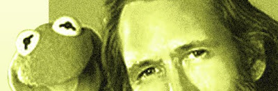
Here's something weird - about a year ago, I visited the Jim Henson Company website, and I was not pleased with what I saw. I'll get more in-depth on Jim in the future, but suffice it to say, he's a a hero of mine - maybe the only person I look up to or idolize, and not just as an artist, but as a human being. So when I saw the Henson.com (it's since been redesigned), I just didn't feel it was worthy of the man or his legacy.
The layout back then was simple, but inelegant, and broken in many places - links didn't work and images were missing. And for some reason, whoever put the site together (in previous and current versions) likes using Jim's "Henson" signature truncated at the top of the page. I do not approve.
The whole site is very 90's - it's not elastic in its layout - the content sits in one narrow area in the center of the page, no matter how wide the window is. The Flash elements have no smooth transitions (something Flash is ideal for), and I swear the frame rate on the Flash elements is too low (probably at the default of 12 fps) - an error that screams amateur. I'm not usually so critical of others' work, but this is Jim Henson here - maybe no site could ever be good enough for me, but I know it could be better than this.
Archived versions of Henson.com

Click image for larger view.
Page Two Concept | Page Three Concept
So I did something a little wacky: I created some static layouts for a redesign, found the contact information for the company's Marketing Manager, and sent him links to my work with a short e-mail saying that I'm a designer, an admirer of Jim Henson, and I'd like to improve the site.
I kept the layout very simple, leaving the full Jim Henson signature intact and (after finding a vector version of the official Kermit image/logo) extracting the true Kermit color for the background. I found a few images and treated them with the color as well.
And... I never heard back from them. Or not "back" - I just never heard from them. The current redesign of the site went up a few months later - probably with no connection to my e-mail or proposal - as much as I'd like to believe I shamed them into reworking the website, I'll assume they were already planning the update. It was a step or two in the right direction, but still a long way from what a Jim Henson website could and (in my opinion) should be.
I believe this is the first time I ever did this - proposed a redesign for a company (especially a big company) out of a combination of disappointment at the current site and enthusiasm for what it could be. I doubt I'll ever try something like this again - not because it didn't work out, but because there's really only one Jim Henson, after all.
WCS Brochure

Brochure front and back exterior (top), and interior
spread (bottom). Click for larger image.
I used to a lot of print design in the 90's - brochures and booklets, full stationery systems (letterhead, envelope, and business card), ads for newspapers and magazines, book covers, DVD and CD packaging, flyers, posters and more. However, over the past ten years, that work has declined significantly - and the print pieces I do create these days are often handed over to the client for production.
I guess you can owe this decline to a couple factors. First, I trust you may have heard of the Internet. Many of the business I develop logos for these days are almost completely web-based - they still need business cards (I always use VistaPrint these days), but it's rarely worth their time to create offset-printed envelopes (if anything, they print their own labels) or letterhead (a Word template almost always suffices). Aside from those essentials, and some more straightforward business forms and documents (estimates, invoices, even fax cover pages!), these clients don't need much in terms of printing in the 2000's. For more specialty pieces, like display materials (large posters, banners, table tents) they're more than likely to hand the project over to a vendor who may have an in-house design department (or even a single designer) who can put together a design - and then it gets printed or produced under the same room. Who can argue with that kind of convenience? Not I. And small businesses are much more likely to advertise online than in more expensive print publications with longer lead times, less focused audiences and increased fees. What I said in 1993 still holds true: "The Internet is Good." (I never really said that in '93 - '96, maybe, but not '95).
The other factor is home-based printing. Up until the early 90's, consumer-grade printers either really sucked, or they were really expensive - sometimes both. But nowadays, you can get a more than decent inkjet, LED or laser printer for your home business for a reasonable amount of money, and produce your own printed materials in quantities too small for a commercial printer. Even brochures, booklets, and other material requiring specialty finishing (like folding, trimming, or binding) is achievable. If I were a teenager now, I'd have a publishing empire going full speed.

Detail from interior spread. Do you wish the text was larger, so
you could read it? If so, then you are a nerd.
Where am I going with this? The piece here, for a water consulting firm named WCS, was created about four or five years ago, when I was still getting a decent trickle of print work. As is often the case, the client did not have an unlimited budget, so they asked for a two-color piece. I designed the piece in Adobe InDesign, selecting a fairly straight blue spot color, which I used along with black. Initially I tried making the photos into duotones, which means they're created using a percentage of black and the spot blue - but (from what I remember) I was reminded of the crappy, cheap textbook photos of my youth, and so I went with all-blue photos - which are called "monotones", by the way - as if you couldn't have guessed that.
I didn't assist with the printing of the final piece - the client went through a few rounds of text changes (quite a few, as I recall), but once it was finalized, I handed over my InDesign files, as well as a .pdf, and they - I assume - took it from there. This was another of those nebulous projects where I never hear from the client again after my role is complete - I can only assume the client, or one of their vendors, went off and printed the final brochures. I hope they didn't get nutty with my source files and switch the photos back to duotones - that would hurt my feelings.
MMC Lifestyle Coaching

This logo project came from a woman who had started her own lifestyle coaching consultancy. You want to improve your career, your social skills, your love life? You call her, and she helps you create a plan, then works with you over the course of several weeks or months to execute that plan. At least she did - it looks like the website is no longer live.
My client wanted her business's logo to show the qualities of strength, growth, power and potential (makes sense, right?). The company name, as you may have guessed, was based on her initials. I did some sketching and type work in Freehand, and came up with five original concepts for her:

This first one was a little impractical - that hard edge on the right, where the "M" and "C" hit, creates a nice opportunity to work with the negative space on other uses (business cards, letterhead) but without something to the right to give it balance, it looked too heavy on the right - and with something to the right, like the "Lifestyle Coaching" descriptor, it was too linear and would take up too much space or require it to be significantly shrunk to be used.

This second option came from some sketching. I sketched a kite, then drew two lines symbolizing gusts of wind lifting it up (get it? potential and growth?). The gusts were initially a second color and they looked harsh and heavy (I'm pretty sure wind is not supposed to be heavy) so instead I cut them out of the kite shape, adding little serify-shapes at the kite's edges to give the gusts a little more emphasis. The client liked it - she also pointed it, it looked like three cats. Nothing wrong with that, though.

This third concept was a pretty straightforward representation of power - probably a bit too straightforward, and either the client or I (can't remember), after reviewing it, felt it looked too masculine. It probably needed more subtlety, too.

This one was meant to show growth - I was thinking of Best, that chain of stores that went out of business about ten years ago. It's nearly impossible to find a logo - googling "best" plus "retail" or "store" just brings up lots of "Best Buy" images. But I remember seeing that logo when I was younger and thinking it was weird - each letter was a little bigger than the next. Then I read an interview with the designer, who said that was meant to show the quality of "best" - the "T" was the largest, and therefore (I assume) the best letter in the logo. Never noticed that before. I think it worked better here, with the two M's - the second M was the improved version of the first. That kind of left the C stranded, though - and the colors wound up being too feminine. I could have changed the color scheme, but that wasn't necessary because the client liked this concept most of all:

That doorway in the space between the serifs won her over, and this is the logo she chose. I was cool with it - I think it represented her company best (ha ha). Her only request was to darken the blue, which I did (see the top of the post). And then we were off to the races (never spoke or typed that phrase before - it feels weird).
After we finalized the logo, she applied it to the website (which I didn't design), and I developed business cards and a letterhead template for her. Here's the card:

Such a formal logo seems to require, to me at least, a centered treatment. Or, at least, you can't go wrong with centering. As I always do, I provided her with logo files of different file formats, resolutions, and color styles - a two-color version and an all-black version. I believe she used the all-black version for t-shirt embroidery, though she had it stitched in white on blue shirts, which looked pretty sweet.
When I opened my Zazzle store a year ago, I started looking at all of these unused logo options I'd created over the years. Since the client only pays for overall development and the buyout of the final logo, but not the unused options, I'm free to use these as I please - and I have. The type-based logos obviously are too specific to work, but the image-dependent concepts were cannibalized for business card templates and other products.
I think Zazzle's strongest feature is its ability to allow customization to its products through a very user-friendly interface. And while that feature works well on t-shirts, hats, bags, and other promo-type products, I find it's most useful on business card templates.
The way it works is, store owners like me set up card templates. I upload, size and position the image, then set up the lines of text I'd like to include. The typeface, color, size, position of the text are defined by me as well. Finally, the templates are tagged with keywords like "growth", "strength", "potential" - words appropriate to the design that help potential customers find a template that suits their needs.
Once a customer finds a card template they like, they fill in their information in a form field and the thumbnail of the card is updated on the fly. This is very helpful - the customer instantly sees exactly how their final card will look. If it's allowed by the store owner, they can delete text fields, move and resize the logo, pick a different typeface and color - but my experience is, most of the users trust the design and use it pretty much as is. If they were interested in designing their own card, they'd probably have done that instead. Maybe they even tried to do so in Word - if they did, my guess is they ran away screaming.
There's an ethical debate in the design community about these kinds of templates. Some designers say that providing custmoers with pre-made options that they can buy in (for example) 100-pack for as little as $20 or $30 plus shipping (the price depends on the percentage the store owner sets - I set mine at 30%, in case you're curious) impacts the need for design services. Horse pucky, I say - I can virtually guarantee you that anyone paying such a tiny amount for a card with a pre-made logo is not going to consider spending upwards of $2000 for a full identity design. It's inconceiveable (just watched The Princess Bride last week - couldn't help it).
As an example, my biggest seller by far is a fitness logo targeted at personal trainers - sometimes I sell a couple batches per day. I very much doubt that a personal trainer working out of a gym with a handful of clients, is going to want or need to contract the services of a designer for their logo and identity system. Maybe a few superstar trainers will go that route, or those expanding their services - but for the most part, the people who use these templates are happy with something that looks nice and represents them well.
The downside for these customers is that anyone else in the world - even their competitor in the same city - could be using that same template. And they don't have the ability or right to use the logo anywhere on their own - they're only purchasing the finished cards - nothing more. If they were to scan the card and use the logo? Well, for one it would look horrible. And it would also be a legal violation of my rights. That would be bad - I hope it never happens, though I doubt I'd find out about it if it did.
And not to toot my own horn, but I haven't seen anyone else use a Print On-Demand site to create a full line of customizable products with the same images, as I've done. Maybe I just haven't run across them yet, but I do a lot of browsing on Zazzle. Each of the logos in my Business Products product line is available on t-shirts, baseball caps, canvas bags, mugs, keychains, buttons, mousepads (do people ever get tired of giving away mousepads?), and the card templates themselves. This way, a small business owner can get a few customized shirts for themselves and their employees (if they have them), or they can buy the other items for office use or for promotional giveaways. It works out nicely - I've spent many hours setting up all of those templates, but now they're available for purchase - and I have sold quite a few. Passive income is nice.
So here are two of the unused designs from this project, transformed into business card templates. At this point, I've sold a few of the lightning bolt template, but none of the kite. Maybe it's too abstract for people, even though I mention the wind gusts in the item description. Perhaps I should market it to cat lovers instead.

Kite/Wind Business Card Template on Zazzle

Lightning Bolt Business Card Template on Zazzle
Tails in Training
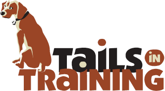
This logo was created fairly quickly, and without any other options presented to the client, who had a very low budget to work with as well as a very tight timeframe. In a case like that, I do the exploration work on my own, but the client never sees it - they only get one concept with minimal adjustments allowed. Less money = more control; less time = less prep work shown to the client. In many cases, this works best - and the alternative for the client is they'd be creating their own logo (probably in Word or Paint) or using some clipart, or even not having a logo at all (which sometimes isn't the worst case).
The client wanted earth tones (makes sense - dogs are pretty earthy) and a less formal look, so I used a font that had a cut-out kind of quality, and rendered the dog in similar rough shapes. I went with three colors on the main logo (something I rarely do - I'm typically a two-color guy) to give me a little more to work with the shapes in the dog illustration.

Color break, with tagline and slogan. This shows the client, and any
vendor they work with (most commonly, offset printers) how many
spot colors were used, and where they're located.
I developed a four page set of guidelines for this logo's usage, which you can view here as one long image (you may need to click once to zoom in). Because many of the logos I do are for startups, who will rarely be printing the logo using offset printing (some web-based businesses may never print the logo at all), I rarely produce these guidelines. But they are helpful, even if a big chunk of it is just a listing of what not to do. Some people need that most of all.

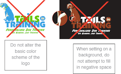
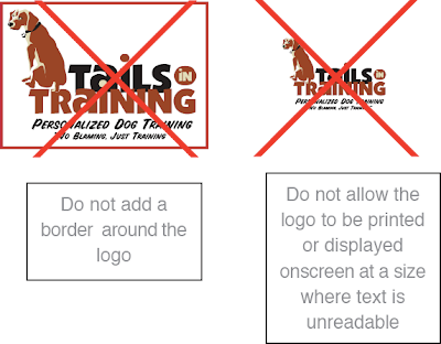
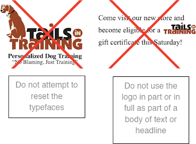
From page 1 of the logo guidelines - think of these as the logo "no-no's".
I'm always amazed, even after all the years I've been working as a designer, at the things people will do to a logo - especially people who've paid for that logo's development. I'll come off sounding like a jerk here, but I'm going to speak freely: if your instinct when working with a logo is to stretch it out horizontally or vertically to fill empty space, to cut it up, to change the colors around, to put it on a crazy background or stick it inside a shape - then you shouldn't be working with the logo. Or at the very least, you should consult a designer for some strict guidelines, and then follow them to the letterœ. Trust me, the best logo in the world will look like crap if you stick it into Word or PowerPoint, then grab one of those side handles and pull it across the page to become your header. And when people view it, they'll think less of your company instantly - whether or not they can articulate why they feel that way - and you've lost.
I'm often disappointed when I see what small businesses do with their logos. Better to not have a logo at all then to have something that degrades the image of your company each time it's used. I don't want to get too negative here, but I'll say this: working with an experienced designer will benefit your company's image in ways that you may not immediately recognize, but will pay dividends in the future. If you can't afford to hire a designer to develop your logo, check into consulting options - if anything else, for possibly a few hundred dollars, you might have someone to keep your worse instincts in check.
And since I mention Word and Paint above, I'll add this: you can't develop a logo in Word, or Paint - not even Photoshop. I mean, you can - but you shouldn't. It will be a problem in the future, if your business is to grow. You need a vector-based logo, developed in Adobe Illustrator or a similar vector-based design application. I'll tackle the reasons why in a future post, but trust me - it is a necessity. I've been hired by firms who started out with a raster-based logo, created at 72 ppi in Paint or Photoshop, and asked me to create a vector-based version. And usually, most often even, it's more time-consuming and expensive to do it that way - you have to accurately match fonts and precise shapes in a very tedious way.
As with anything, spend more time and money up front and you'll do better in the long run. When I was a younger designer, I was nicer to clients and potential clients about this. Now I'm not - I'm very direct, and I smack them around a little when I think they need it - which is often. Melodramatic as it may seem, I've seen too many people suffer over the years because they made poor decisions early on, based on money, and no one stepped in to tell them the downside to those decision. Even though as the designer I have a vested interest in getting clients to spend more money, and it may look like I'm trying to upsell them, I don't hold back - whether they use me or someone else, it'll always be an improvement over creating the logo themselves. I can live with that.
One-color version on colored background. I provided a separate version
of the logo for one-color uses like this. Besides making all the elements
one color, some shapes are removed, and pieces that overlap in the
full-color version (like the text) are given space between them. Just
printing the full-color version in grayscale wouldn't look anything
like this.

Two-color version on colored background. This version offers a little
more natural variation - the words are in two colors, so no space is
needed between them.
Back to this logo: here's one benefit of vector-based design right above. If you had created a logo in a raster-based program like Photoshop, with all the shapes and color on one layer, you would experience hell if you wanted to change the colors. You can select colors and alter them, but all the little edges would get messy and ugly. And if you wanted to lay your logo on top of a colored background, as I've done above, you'd have to cut out all the white and you'd end up with similar edge nastiness. Using Illustrator, I created color variations in literally seconds - just swapping out one color for another. It's really beautiful and efficient - when anyone who's tried to do something like this on their own sees me working in Illustrator, they say things like, "Oh man - that's how it's supposed to be done!" and also, "You won't believe how long it took me to do that - and mine still looks bad!" Vector is good.
So check out those guidelines to see all the rules and color options I provided. In the end, once the logo was handed over, the client immediately decided to drop the image of the dog altogether and just use the type. What a world!
Red Fox Validation

A few years ago, I designed this logo for a validation company, which is a firm that calibrates and oversees engineering processes - something I never knew existed until I was asked to develop the company's identity.
I'm sure I presented other logo concepts, but I couldn't find any of the "losing" concepts when I searched in the project folder. I think this was the clear winner, and I remember telling the client as much when the original concepts were presented - something I really don't do often, but hey - they asked.
I think this concept just worked too well to not be used - you have a strong, simple image that represents the fox, a big "V" for "Validation", and the client had asked if it were possible to have some kind of a check mark (representing the approval of a process) be included - check (get it?). It was all there, and I would have been hurt if they hadn't used it. Maybe I would have sought out a similarly-named firm to sell the logo to, like Red Fox Vegetables or Red Fox Vitamins, if either companies existed. If not, I would have been obligated to create those companies and run them myself.

Here's a long version of the logo, which the client also requested. It was a little awkward, because it was close enough to being symmetrical that it seemed like it should be, with the image at the center. But even though I played with the kerning a bit, I couldn't make "Red Fox" take up the same space as "Validation" without it looking even more awkward and off-balance. I've had to live with it.
I also wanted the full "Red Fox" text to be red, so it would balance the longer, black "Validation" at right, but the client wanted only the word "Red" to be colored red - which makes sense conceptually, but the uneven use of color still bugs me a little in the long version.
The website, which is no longer live (I believe the company was purchased by a larger firm, who discarded the original name) was, as always, built around the look and feel of the logo. I didn't develop the actual site, but the client had requested that I develop some static layout concepts, like the one below which was eventually used.

Red Fox Validation website design - it's no longer live, sadly, but it
lives on in .jpg form.
This was an easier logo project than most, because I hit on the best concept early on. That's almost a curse, because you're forced to develop additional concepts that you really don't expect to be better than the original, and that you hope won't be selected by the client. Luckily, this one worked out. I'd like to think it was all due to the client's excellent perception of the image they wanted to portray, but I've got to admit that my Jedi mind tricks may have helped - just a little.
Science Geek

Science Geek was a zine my friend Doug and I put out in the 90's. Doug and I were also both in the band cuppa joe during this time, but I guess we didn't feel like we spent enough time together so we joined on this project, too.
If you're not familiar with zines, here's the skinny: as you may have guessed, the word "zine" comes from "magazine", and that's what they often are: stripped-down, self-published magazines. The 90's were probably the golden era of zines - desktop publishing software and the widespread availability of copy shops like Kinko's really kicked zine publication into high gear, though by the end of the decade the Internet had diminished zine activity significantly. Why spend all that time and money printing these things, not to mention stocking inventory, shipping costs, promotion, and all the other hassles a physical object entails? Still, zines have their charms and they're still being produced - there's a certain satisfaction to holding something in your hand that was created with such care and craft.
Zines cover all kinds of subjects, though most are personal in nature. Doug started Science Geek while he was just beginning to work as a teacher, and used it as a forum for his writings on teaching, as well as a means to interview bands, review music and other zines as well (a common practice). For the first couple issues, Doug wrote his pieces, printed them out and cut-and-pasted the layout. He asked me to do a few illustrations and comics , which were reduced on a photocopier and worked in. Primitive times, kids.
Those issues were printed on 20 lb. copy paper, black and white only, and were stapled on the side. They didn't look super pretty, but what they lacked in polish they made up for (we hoped) in warmth and readability. Those early issues generated a lot of nice feedback. We had a post office in Trenton (the same post office involved in the 2001 Anthrax attacks, unfortunately) and fielded orders (usually with $3, postpaid, in cash) from there. We also sold issues at cuppa joe shows, and even at other bands' shows. We had no shame.

Then in 1995, Doug joined the Peace Corps and went off to Kenya. He asked me to handle Science Geek duties in the states while he was away, and I agreed. He wound up writing out the third issue on an old typewriter in his hut in Africa, mailing me the pages, which my mother or I would transcribe (we also recorded an album in this lo-fi manner!). I'd then do the illustrations and lay out the issue. It was a wild way to work, and certainly not the most efficient, but it was satisfying to see the printed issue and know what went into it. Doug's adventures in the Peace Corps, and just being in Africa, gave him a unique perspective as a teacher and writer, and we started to see some positive reviews at this point. We also managed to obtain international distribution through Tower Records and a number of other distributors by the time the third issue was available, which was both awesome and nightmarish as anyone who's dealt with distribution of any kind can attest.
That third issue had, for the first time, a color cover. By the fourth, we were using 11x17" paper and saddle stitching (stapling in the middle) so the zine looked and felt more like a "real "magazine. The fifth issue (cover shown above) was the best quality we'd produced, being laid out in (whoo-hoo!) PageMaker - and it was the last. All good things, you know. It was a satisfying thing to put together, but it was a ton of work each time - it took almost a full year to put out each issue, not to mention promoting the publication, working with advertisers (we sold ads to record labels, bands, and other zines) and mailing out issues. I think we just needed a break. I miss it, though - but I have enough copies of all five issues in my closet to keep Science Geek from feeling too far away.
Here are a few sample images from Science Geek - band illustrations, comics, spot illustrations, and them some reviews and a sample story that Doug wrote when he was in Kenya. Enjoy. I'm sorry you can't hold them in your hands, like the real zine. Maybe print them out and fold the paper, to simulate their original format.

A couple illustrations of bands we interviewed - this one
is Small Factory...

...and here we have The Wedding Present in a more conceptual style.

A short comic about my mall bathroom experiences.

This is the kind of illustration we used to fill in
the empty space that often wound up in the backs
of each issue.

Illustration from an article about being the new guy
in the workplace.

Spot illustration from an article about an African witch doctor. Yes,
they are real.

Just another little spot illustration.

Click for larger image. This was Doug's prediction about
how he'd feel after returning from Kenya after two years.

Portrait of Doug as the uncoordinated American.

Click for larger image to learn some horrible things
about my childhood.

These were all real t-shirts Doug saw while in Africa. So now you
know where your cool, kitchy clothing goes after you donate it.
A few decade-old reviews...
“[Doug Larkin’s] writing is plainspokenly evocative, examining human behavior (much of it his own) with both a scientist’s reason and less objective qualities like insight and affection. If you’ve ever been on the fence about the value of zines, try Science Geek; fun and sweetly poignant, it’s enough to knock you on the right side.”
CMJ Monthly
“...totally great...Doug’s reviews and writing are without pretension and his enthusiasm for science is invigorating.”
Wind-Up Toy
“...what makes this zine so charming is Doug’s ability to make such a dreaded subject like science fun and interesting."
Carbon 14
“It’s a damn good thing that there’s a zine like Science Geek...huge and funny and even educational...the hands-down coolest thing since computational biology.”
Permission
“What a fantastic zine...sometimes you find a zine and it seems like the publisher created it just for you.”
Factsheet Five
Photo Wall
from Science Geek Issue 4
© 1999 Doug Larkin
The wall above my desk is covered with photos. About half of them are from home and the rest are pictures that have been taken here. Every time someone comes into my house, they are immediately drawn to them. In a way, it's really good because it always starts an interesting cultural exchange about family and friends. The two biggest draws are the family portrait and the picture of my family's snow-covered house. I always think that the Kenyans would be more surprised by the snow but instead they always make a remark about the size of the house. It's just a middle-class suburban home, but here they have nothing like it.
One day Miss Simiyu and Joanne the lab assistant stopped by and were looking at the pictures. Joanne paused in front of the family portrait and had me identify each family member. After I did, she kept staring.
Finally, she disengaged herself. "Ah," she said, "all you wazungu look alike".
Miss Simiyu tapped her playfully. "Shut up." she said, "They probably say the same thing about us!"
Another time Mr. Makokha was over looking at the wall. I had also hung up a card from my friend Diz on the far end. On the front of the card was a picture of Chewbacca, taken from a scene in the beginning of The Empire Strikes Back. Mr. Makokha came to the card and asked, "What is this animal here?"
"It's called a 'Wookie'. You don't have them here?"
"No, I've never seen them in Africa. Do you find them in your place?"
"They're not here? They must just be indigenous to America then."
"It looks like a mammal. Some sort of primate perhaps..."
"Yes, I think so." By the time he left, I'm pretty sure he knew I was joking.
For continuity's sake, when I got the Captain Kirk postcard from the classic Star Trek episode I hung it up underneath Chewie. My friend Joseph from the village fell prey to that one.
After he asked me all about Wookies, he pointed to the picture beneath. "What are those things called?" he asked.
"Those," I said shamefully, "are called 'Tribbles'."

The Darjeeling Limited

Click to view the site in a new window. Some functions have been
disabled. Don't be too sad.
I was enlisted to develop the Flash website for the film The Darjeeling Limited by the same agency who'd asked me to created the Deviated Discharge game for The Heartbreak Kid. They're in L.A. and they're very specialized - they only do movie websites. Must be nice, eh?
Because of the tight deadline (about three weeks), the number of people involved in the project (including Wes Anderson himself), and the scope of the site itself, this project wound up being the most complex website I've developed - by far.
This was first movie website I developed, and I was told by the lead agency that it's very uncommon for the director to be so heavily involved in its development - but that was exactly the case with this project. Besides getting input from the studio (Fox Searchlight) and the lead agency I was working for, Wes Anderson had already contracted his favorite design studio (he apparently uses them on all his films) to develop the overall look of all the film's promo pieces, both print and online. There was also a third agency involved, developing just one section of the site ("Explore TDL"). And I was the set of hands putting it all together in Flash... and dealing with lots of questions and problems along the way. Par for the course.
I never communicated directly with Wes Anderson, but at a few key milestones in the site's development he'd go to his agent's office in New York, review the site's progress, and compose notes. His agent would forward his e-mail to the lead agency, who would then forward it to me - stripping out Wes's original e-mail address before they hit "send". I guess to prevent me from forming any direct communication with the guy. Maybe they were scared I'd add him to my famous Tuesday morning knock-knock joke distribution list. Maybe.
The website was a pretty messy affair - integrating elements provided by so many different sources, in a tight timeframe, is never going to be pretty. Working on the little music player, for example, required hours of testing and modification - especially programming it to fade out quickly when the user views the trailer, so the sounds don't overlap. I listened to the beginnings of those songs so many times that when I eventually saw the finished film, I had some strange Pavlovian reactions each time a tune began, quickly visualizing myself in front of my computer at 2 a.m. trying to debug some ActionScript. It made it kind of hard to enjoy the performances of Owen Wilson, Jason Schwartzman, et. al.
Eventually the Flash site was completed and integrated into Fox Searchlight's main site, which contained their global navigation and some additional, changeable elements below the Flash piece, like news, contests, and other press pieces about the film. The site went live a couple weeks before the movie opened, and no, I know what you're wondering - I was not invited to the premiere. I'm not bitter, though.
I almost designed another movie website for this agency a few months aftering finishing this one. They asked me if I had time to develop a simple website for what they described as a "little indie with Jason Bateman". The timeframe was initially to be two week so I agreed to take it on, but then they cut it down to one week. I had to pass on the project - that's too quick for my blood. I need to sleep a little between projects. And of course, that little indie turned out to be: Juno - a much more well-received film than The Darjeeling Limited. Grrrr.
Following Lights Into the Forest

Click for larger image - you'll be able to actually read the text.
This was a weird project. My band cuppa joe wasn't very active in 1998. We formed at college in 1991, and put out some self-released cassettes, singles and then full-length CD on Dromedary Records until 1995 - that's when Doug, our singer/guitarist/songwriter, joined the Peace Corps and went off to Kenya for a couple years. He returned in 1997, got married to another Peace Corps Volunteer, and then re-upped with his new wife and set of to Papua, New Guinea in 1998 for more fun.
In that little year or so span, we got a new bass player (our third), played some shows and recorded a few new songs. This was around the time when it was becoming more common to be able to burn your own CDs, so we decided to put together our new songs, some old unreleased tracks, demos, and a few live tunes into our own self-released "best of" collection. The CD, which wound up being packed with 24 tracks, was to be named "Following Lights Into the Forest" - a title Doug came up with, I believe, while in Africa.
The title seemed to suggest to me an old English fantasy/magic story, so I came up with a concept where the five words of the title would be "pulled" from the text of a bigger story. I laid out the title on the lower left of the CD booklet, balanced it with our logo in the upper right, and then proceeded to fill in all the surrounding text - all in Courier, for an old-style printed look.
I didn't plan this out very much - I had the vague idea of a story about a group of young travelers on a quest for a magical object. In the chunk of the story depicted on the cover, they encounter an apparition while passing through a clearing. I knew the text was going to bleed off the left and right edges, so I didn't feel the need to fully compose it beforehand - I just wrote out individual sentences, making sure the words in the title fit into the sequence. It was fun.
The varied color of the text was created by placing a photo of a lush forest scene in the background of the cover, then revealing it (at a much-reduced percentage) through the text. The swatch underlying the white-lettered title is also a chunk of the same photo - this time, at 100% opacity. I liked the effect - I don't know if a single person ever bothered to try to read more than a few words, but the fact that it was there gave the cover concept and album's theme some added depth.

The CD's tray card interior, for under-CD printing.
The final CD contained very similar imagery - the same typeface, colors, and another chunk of the forest image. The inside of the tray card - the part that goes under the CD (if you choose to use a clear tray, as we did) was a collage of band photos over the years - each picture of me with 1,000 times more hair than I currently have, though usually in a much dorkier style.
We printed covers, tray cards and CD labels, put the whole thing together ourselves and sent or hand-delivered copies to 100 or so friends and family. We even got some play - eight years later - from Jon Solomon's awesome Local Support podcast. Here's the song he chose to include: P.D.A., from Following Lights into the Forest:
SugarPlum Studio

When Sharon O'Connor Spatucci asked me to design a website showing off her fanciful pastry creations, I responded with an enthusiastic "yes!" - not only because I'm married to the woman, but because... wait... that really was the reason for my excited reaction. But I also knew I could give her online portfolio the kind of treatment her tasty treats deserved, and that started filling my head with website concepts.
I'd already designed a logo for Sharon - a straightforward interpretation of the name "SugarPlum", which implied fairy, which is what Sharon wanted (note the whisk instead of the wand - her clever suggestion):

So the basic feel and color scheme would be derived from the logo, as is usually the case. I designed a layout (approved by Sharon on the first round!) and began building the Flash-based website. Besides the typical "Bio", "Events", and "Contact" sections, the main feature of the site is a set of categorized galleries featuring Sharon's work. We did all the photography in-house (get it? in our actual house!), building a green screen which allowed us (okay, me) to easily mask the pieces out of their backgrounds, letting them stand on their own - really, on the purple.
I also built an interactive Cake Constructor tool, which allows visitors to visualize a cake, adding, subtracting and modifying the number and shape of the tiers, color, size, and other decorations (elegantly called "adornments" in the dessert industry - I've learned a lot of cool terminology being married to a pastry chef). Once a visitor is happy with their creation, they can click a "calculate servings" button to get an idea of how many people could eat their custom cake, were it only not made of pixels.
We launched the site in 2007, and for my efforts I was paid a handsome fee of seventeen cupcakes - with sprinkles. Not really. But I wouldn't have complained if I was. I like cupcakes.
Visit SugarPlum Studio.
Oh and hey - see if you can find the zombie cake. The week Sharon was making it, I knew it was in the refrigerator, but when I saw the life-size decomposing head and hand emerging from the cake, I actually got a little scared. Just a little, though.
Baskervilles - Twilight 14 Website

The New York-based band Baskervilles (no "The", please) asked me to design a site for their Twilight 14 project - a one-year initiative through which they would record and release a new single every month for a year (with two bonus tracks - hence the "14"), each with sleeve art by a different artist. But instead of pressing physical singles, they wanted a site that would be updated monthly with each new (and free) single offered as a downloadable .mp3 file. I admired their ambition, and they were working with producer Mitch Easter (who worked with, amongst others, R.E.M. in their early days), so I had a good sense that this would be an interesting project, and agreed to take it on.
I don't think I'd ever started a project like this, with a guaranteed timeframe of at least one full year (plus an anticipated month or two of maintenance after the last single had been posted), but lead singer Rob Keith seemed like such an agreeable chap, I wasn't worried about the marathon-like pacing of the project.
I designed a static layout for the website, which the band approved, and I got to work making it interactive in Flash. The site was fairly complex to code - every month a single variable was changed, which enabled the next record icon to become visible and clickable, allowing the new song to play.

That little album is pure vector art. After lots of
tweaking of the gradient's and grooves' size and
position, the element wound up looking
nearly photo-realistic, much to my pleasure.
I also custom-built a simple music player component in Flash, which pulls in MP3 files from the site's server and allows the user to pause and restart each song. Initially we'd added more functionality, but later decided that letting users do too much with the song was overkill, and so those buttons were removed. Other single-specific information is dynamically pulled into the display window once each single is selected, as well as a download capability. Sleeve art and page backgrounds also change with each song. All that, and a nifty little color-coordinated vinyl record animation slide-out effect, too.
The now-complete site has evolved to become the band's primary web presence, with Purchase (for Baskervilles CDs), Upcoming Shows, Mailing List and Share With a Friend functions. In fact, Baskervilles were so happy with the website, they actually wrote a song about me, to be released as a single in 2010. Not really. This did wind up being a very fun, satisfying project in the end, and though I heard some of these songs hundreds of times by the time the site was complete, I still listen to and enjoy the Twilight CD pretty darn frequently. It's infectious (but not in the bad way, like a disease).
Visit the Baskervilles - Twilight 14 website.
Dejected But Still Hopeful CD
In 2002, I put together a little CD collection of some of my favorite "broken heart" songs, just to give away to friends. No, I am not some lovelorn fool, pining away for someone from my past while gathering up melancholy MP3 files. I just like music, and I started noticing a thematic pattern in my favorite tunes from a lot of lesser-known bands that I like. Some people love a parade; I love a theme.
So I went through my personal photos and found a pretty famous (in my family, at least) photo of me in a goofy velvet tuxedo (the original was purple but I made it look black), acting as the Ring Bearer at my cousin's wedding in the 70's when I was about four years old. The story goes, moments after this photo was taken, I went down the aisle... then back up the aisle, crying for my Mommy who begrudgingly had to walk down the aisle with me. But that's beside the point...
Though this peachy-pink is not a personal favorite color of mine, it was so dominant in the image - and I liked the image so much for this concept - that I enhanced the color even more. I gave a little diffused glow to make it more dreamy, blurred the background a bit, and worked out a simple little logo. The final pieces:
CD booklet front...

...and back. Get it? The image continues!

Yeah, I know - it's me, I used my own kiddie photo on the CD packaging, which can be pretty lame - BUT (justification time) #1) I believe the image tells a little story (especially the angle of her face, and the peculiar position of my lips), #2) it's nicely composed, especially for a square format, and #3) I had it in my possession, and didn't have to hunt for something that would work, or take something new, or pay for a stock photo (which I wouldn't do for a personal, free CD sampler, after all).
Now if only my cousin would finally marry me, my life would be complete. Ew. Not true. Yuck.
So I went through my personal photos and found a pretty famous (in my family, at least) photo of me in a goofy velvet tuxedo (the original was purple but I made it look black), acting as the Ring Bearer at my cousin's wedding in the 70's when I was about four years old. The story goes, moments after this photo was taken, I went down the aisle... then back up the aisle, crying for my Mommy who begrudgingly had to walk down the aisle with me. But that's beside the point...
Though this peachy-pink is not a personal favorite color of mine, it was so dominant in the image - and I liked the image so much for this concept - that I enhanced the color even more. I gave a little diffused glow to make it more dreamy, blurred the background a bit, and worked out a simple little logo. The final pieces:
CD booklet front...
...and back. Get it? The image continues!
Yeah, I know - it's me, I used my own kiddie photo on the CD packaging, which can be pretty lame - BUT (justification time) #1) I believe the image tells a little story (especially the angle of her face, and the peculiar position of my lips), #2) it's nicely composed, especially for a square format, and #3) I had it in my possession, and didn't have to hunt for something that would work, or take something new, or pay for a stock photo (which I wouldn't do for a personal, free CD sampler, after all).
Now if only my cousin would finally marry me, my life would be complete. Ew. Not true. Yuck.
XipWire logo
XipWire is a startup that allows people who sign up for its service to send money transfers instantly just by texting over their cell phone or mobile device. Pretty neat, eh? Don't lie - you wish you invented it.
Five initial logo concepts were presented to the client:
initial concepts:

He preferred the typography from the first concept combined with the image portion from the third. Often this kind of mix-and-matching doesn't yield good results, but here it worked fine. In fact, the rounder typeface was probably a better fit than the contrasting non-rounded typeface used initially.
Note that in the initial version of the selected concept, there were no buttons or screens on the icons. This helped emphasize the hidden X in the center (you did catch that, didn't you?). However, some early test viewers felt that icons were not immediately identifiable as mobile devices - they couldn't identify them as anything for that matter. So we tried a modification, adding a screen and buttons to each icon:

This addition may have worked for a single icon, but multiplying it by four added a lot of visual complexity to the elements, and made them a bit too "airy", too (there's probably more negative space than positive space in each icon).
The bigger issue, though, was the way the added elements detracted from the hidden X - it was almost completely obscured, and much less likely to be noticed by a viewer. After a bit of thought and experimentation, the screens were removed - a very reasonable compromise, as the buttons seemed to be enough of a visual cue to indicate "mobile device", and the didn't detract from the hidden X.
Various color combinations were tried, but orangey-yellow and blue was the winner, with a slight shift in the blue to make it less purplish. The final logo (though the tagline may change):

I'm working on the website layout now. Leave a comment, and I'll text you some dollars when it's live (not really).
Five initial logo concepts were presented to the client:
initial concepts:
He preferred the typography from the first concept combined with the image portion from the third. Often this kind of mix-and-matching doesn't yield good results, but here it worked fine. In fact, the rounder typeface was probably a better fit than the contrasting non-rounded typeface used initially.
Note that in the initial version of the selected concept, there were no buttons or screens on the icons. This helped emphasize the hidden X in the center (you did catch that, didn't you?). However, some early test viewers felt that icons were not immediately identifiable as mobile devices - they couldn't identify them as anything for that matter. So we tried a modification, adding a screen and buttons to each icon:
This addition may have worked for a single icon, but multiplying it by four added a lot of visual complexity to the elements, and made them a bit too "airy", too (there's probably more negative space than positive space in each icon).
The bigger issue, though, was the way the added elements detracted from the hidden X - it was almost completely obscured, and much less likely to be noticed by a viewer. After a bit of thought and experimentation, the screens were removed - a very reasonable compromise, as the buttons seemed to be enough of a visual cue to indicate "mobile device", and the didn't detract from the hidden X.
Various color combinations were tried, but orangey-yellow and blue was the winner, with a slight shift in the blue to make it less purplish. The final logo (though the tagline may change):
I'm working on the website layout now. Leave a comment, and I'll text you some dollars when it's live (not really).
Subscribe to:
Posts (Atom)