DESIGN  |  ILLUSTRATION  |  ANIMATION  |  WRITING  |  FILMMAKING  |  MUSIC  |  GAMES

Simmer Down


Simmer Down with Sharon. Click for the full animation.

Another half-completed idea. I created this in 2004, not long after meeting Sharon, turning her real-life career as a pastry chef into an animated mockery. Not really. But it was a fun little experiment in creating an animated version of the woman who would become... my wife (I tried to make that sound dramatic)


Umberto, the irrepressible spatula with the overdone Italian accent.
I did the voice, and I'm 100% Italian, so it's okay - I cannot get in trouble
for the ethnic stereotyping.

And yet, it's really more of a rough idea awaiting completion, which will hopefully happen someday. The lip synching for Sharon is rough - I just created some semi-random movement and never got around to finalizing it. In fact, the sound is a clipped, giving it a static quality when the sound peaks. Blech. The theme song was done in Easy Beat, a program I used for music recording pre-GarageBand, so it's pretty weak. And Phillipé the Whisk is only shown in the intro - the scene ends abruptly and he's not even shown. Poor Phillipé.

I did enjoy voicing Umberto, brief as his lines were, and his interactions with Sharon seemed pretty funny. And I like the way the kitchen "set" turned out. So I'll consider this post a kick in the butt to revisit this project someday and at least get one episode done. Then Phillipé can finally have his moment in the spotlight.

Tails in Training


This logo was created fairly quickly, and without any other options presented to the client, who had a very low budget to work with as well as a very tight timeframe. In a case like that, I do the exploration work on my own, but the client never sees it - they only get one concept with minimal adjustments allowed. Less money = more control; less time = less prep work shown to the client. In many cases, this works best - and the alternative for the client is they'd be creating their own logo (probably in Word or Paint) or using some clipart, or even not having a logo at all (which sometimes isn't the worst case).

The client wanted earth tones (makes sense - dogs are pretty earthy) and a less formal look, so I used a font that had a cut-out kind of quality, and rendered the dog in similar rough shapes. I went with three colors on the main logo (something I rarely do - I'm typically a two-color guy) to give me a little more to work with the shapes in the dog illustration.

Color break, with tagline and slogan. This shows the client, and any
vendor they work with (most commonly, offset printers) how many
spot colors were used, and where they're located.

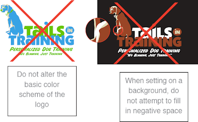
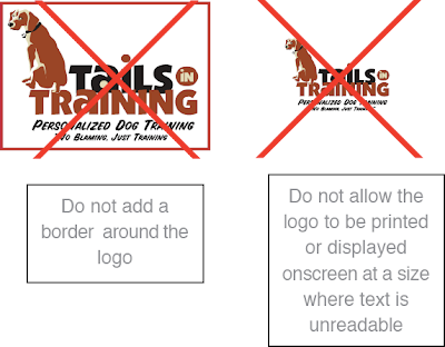
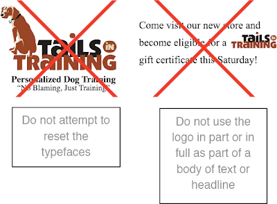
I developed a four page set of guidelines for this logo's usage, which you can view here as one long image (you may need to click once to zoom in). Because many of the logos I do are for startups, who will rarely be printing the logo using offset printing (some web-based businesses may never print the logo at all), I rarely produce these guidelines. But they are helpful, even if a big chunk of it is just a listing of what not to do. Some people need that most of all.


From page 1 of the logo guidelines - think of these as the logo "no-no's".

I'm always amazed, even after all the years I've been working as a designer, at the things people will do to a logo - especially people who've paid for that logo's development. I'll come off sounding like a jerk here, but I'm going to speak freely: if your instinct when working with a logo is to stretch it out horizontally or vertically to fill empty space, to cut it up, to change the colors around, to put it on a crazy background or stick it inside a shape - then you shouldn't be working with the logo. Or at the very least, you should consult a designer for some strict guidelines, and then follow them to the letterœ. Trust me, the best logo in the world will look like crap if you stick it into Word or PowerPoint, then grab one of those side handles and pull it across the page to become your header. And when people view it, they'll think less of your company instantly - whether or not they can articulate why they feel that way - and you've lost.

I'm often disappointed when I see what small businesses do with their logos. Better to not have a logo at all then to have something that degrades the image of your company each time it's used. I don't want to get too negative here, but I'll say this: working with an experienced designer will benefit your company's image in ways that you may not immediately recognize, but will pay dividends in the future. If you can't afford to hire a designer to develop your logo, check into consulting options - if anything else, for possibly a few hundred dollars, you might have someone to keep your worse instincts in check.

And since I mention Word and Paint above, I'll add this: you can't develop a logo in Word, or Paint - not even Photoshop. I mean, you can - but you shouldn't. It will be a problem in the future, if your business is to grow. You need a vector-based logo, developed in Adobe Illustrator or a similar vector-based design application. I'll tackle the reasons why in a future post, but trust me - it is a necessity. I've been hired by firms who started out with a raster-based logo, created at 72 ppi in Paint or Photoshop, and asked me to create a vector-based version. And usually, most often even, it's more time-consuming and expensive to do it that way - you have to accurately match fonts and precise shapes in a very tedious way.

As with anything, spend more time and money up front and you'll do better in the long run. When I was a younger designer, I was nicer to clients and potential clients about this. Now I'm not - I'm very direct, and I smack them around a little when I think they need it - which is often. Melodramatic as it may seem, I've seen too many people suffer over the years because they made poor decisions early on, based on money, and no one stepped in to tell them the downside to those decision. Even though as the designer I have a vested interest in getting clients to spend more money, and it may look like I'm trying to upsell them, I don't hold back - whether they use me or someone else, it'll always be an improvement over creating the logo themselves. I can live with that.


One-color version on colored background. I provided a separate version
of the logo for one-color uses like this. Besides making all the elements
one color, some shapes are removed, and pieces that overlap in the
full-color version (like the text) are given space between them. Just
printing the full-color version in grayscale wouldn't look anything
like this.


Two-color version on colored background. This version offers a little
more natural variation - the words are in two colors, so no space is
needed between them.

Back to this logo: here's one benefit of vector-based design right above. If you had created a logo in a raster-based program like Photoshop, with all the shapes and color on one layer, you would experience hell if you wanted to change the colors. You can select colors and alter them, but all the little edges would get messy and ugly. And if you wanted to lay your logo on top of a colored background, as I've done above, you'd have to cut out all the white and you'd end up with similar edge nastiness. Using Illustrator, I created color variations in literally seconds - just swapping out one color for another. It's really beautiful and efficient - when anyone who's tried to do something like this on their own sees me working in Illustrator, they say things like, "Oh man - that's how it's supposed to be done!" and also, "You won't believe how long it took me to do that - and mine still looks bad!" Vector is good.

So check out those guidelines to see all the rules and color options I provided. In the end, once the logo was handed over, the client immediately decided to drop the image of the dog altogether and just use the type. What a world!

Nico's Monster Hunt

I guess I'm going a little crazy for my son Nico's first birthday party, which is under a month away. They only turn one once, from what I hear.

I'd previously posted an entry about the monster invitation I created (my wife came up with the theme, believe it or not) and since then I've printed the invitations, along with a directions card, and sent them out (purple envelope with monster-face sealer sticker) to about 55 families.

Besides the invitation, I've printed more monster face stickers on Zazzle (as part of the giveaway), and a custom shirt for Nico to wear to the party featuring this design.:


I've also printed banners with the five monsters wishing Nico a happy birthday (each including a corny joke), and a series of signs with each monster offering Nico birthday advice. I put together a 14-song CD with rockin' versions of Monster Mash, I Put a Spell On You, Purple People Eater and similar monster-themed songs, designed and printed labels for the CDs, burned 70 copies, bought purple clamshell cases and assembled them all - another party giveaway.

And we have purple and green balloons, streamers, pom poms, monster cups (the main giveaway), paper plates - even Frankenstein's Monster and Wolfman piñatas (the Monster is, fortuitously, mostly purple and green) - it's become quite a project. My wife, who is designing a Mad Hatter-style cake featuring all five monsters (she's a pastry chef) has already suggested that his second birthday party be a quiet, intimate affair - I'm in agreement.

So, besides all of the above, we're working on activities - all monster-themed as well. You can't have a theme party without constantly reinforcing the theme, I always say. We're counting the piñatas as one activity, and we're going to play Hot Potato with a Frankenstein's Monster head for a second game. For the third activity, I'm developing a fairly elaborate game - Nico's Monster Hunt.

I want the kids (there are sixty kids invited - and about ninety adults - that's why we're having the party in a huge park) to have a little adventure, and a monster adventure at that. So I've created something kind of like a scavenger hunt, but instead of having the kids collect things (I didn't want to buy sixty of five items), it's a clue-based adventure.

The kids will get a flyer (I've pieced the elements together below) with instructions, a map of the park that I illustrated, and a spot for the answers to be filled in. Here's the setup:


The kids will use the map to walk around the park (probably with their parents, unless they're brave) using the five numbers to locate five semi-hidden signs. Each sign will have a clue that they'll have to figure out, filling it in above. And here are those clues:

1
The monster made by Frankenstein
Beyond this hill made his decline
And as he stumbled past this spot
He feared a stick t'was flaming hot

What did Frankenstein's Monster see here?

2
The Wolfman running in the night
Silhouetted in moonlight
Suddenly he howled in fear
From a bullet he found here
What kind of bullet did The Wolfman find?

3
Dracula, the king of dread
As a bat flew overhead
But when he landed in this tree
He lost his best accessory

What did Dracula drop here?

4
The Mummy, wrapped in dust and gloom
Walked here from his ancient tomb
He fled as soon as he could see
An insect just as old as he
What scared the Mummy off?

5
The Creature From the Black Lagoon
Swimming here one afternoon
Found beneath his scaly fin
A mesh of strings to reel him in

What made The Creature From the Black Lagoon swim away?

I'm not giving away the secret word, sorry - you'll have to work it out on your own.

Developing the puzzle was more challenging than I anticipated. The rhyming of the clues came fairly quickly, but I had to make some adjustments once I'd worked them all out. I gave no forethought to what the final answer to the whole puzzle would be as I was developing the clues - I just figured I'd make a five-letter word out of the answers, which I did - but the words I was coming up with had no connection to the theme. "Ropes" was one I kept arriving at - but how do I make "Ropes" the big answer? I couldn't make it work.

Then, when I figured out a word I liked for the final answer, it required one of the clues to be adjusted. Initially, The Wolfman saw his reflection in the moon (a nice, iconic image - I'm trying to give the kids the impression that the monsters were all recently in the park - I want them to have that warm, spooky feeling, which is hard to pull off in a beautiful outdoor environment, mid-day) - but "moon" didn't have the "r" I needed, so adjusted it to be... well, the final answer. All things considered, it wasn't too big a change to make, but I did feel a little sad that I had to lose the moon for The Wolfman. I hope the kids understand.

For the park illustration, I used Google Earth as a reference - but as you would imagine, it gave me too much detail. So after reviewing the satellite image, I grabbed a letter-sized piece of paper, folded it in half, and using a thick brush-tip marker, sketched it out from memory. Then, I compared it to the aerial view and made some adjustments.

I kept the view a bit distorted - not straight above, but down a bit, yet distorting some of the views of the objects so they're more easily recognizable. And I tried to include just enough landmarks so that the kids (and the parents) would be able to find the 8.5x11" signs on a stake in a sand pit (The Mummy = sand), nailed to a tree (for Dracula), by the edge of the lake or wherever they wind up being placed.

I originally considered making the map in full color, or even two color (tints of purple and green), but then just went with tints of the green. Besides being the fastest option, I think it works best this way - giving the kids just enough detail to get their bearings in the park.


Map detail. Click for full, larger view...
you amateur detective, you.


I used the same technique for the map illustration that I did for the invitation - hand sketching and inking with brush-tip markers, scanning, Live Trace in Illustrator, recoloring and final layout in Freehand. Someday I'll break myself of using Freehand, but probably not any time soon. It's the best.

I'm going to head out to the park next week for a test-run, and to make sure my sign/clue locations will work, and that the map is accurate and workable. I don't want the kids getting mad a me for a misplaced bush or something similar - that could get ugly.

I enjoyed making this whole puzzle - it gave me new respect for designer/illustrators who develop these kinds of pieces for publications like Nickelodeon Magazine and Highlights (who gave me the worst rejection of my life in the early 90's - "We don't use material of this style - please do not ever resubmit your work again in the future." - yes, seriously - it gave me a horrible impression of them after loving their magazine throughout my childhood, and every time I see a copy in my dentist's office I recoil).

Maybe puzzle-making is something I'll pursue in the future - in the meantime, I hope the kids and parents at the party appreciate it - and Nico, once he's old enough for it. I'll have to take him back in a few years and recreate it for him, once he has the word "scarab" in his vocabulary, I know he'll be ready (there's your freebie clue).

Croc and Boy Sketch


A crocodile and a little boy. Will this become the Calvin and Hobbes
ripoff I always knew I had in me? I do not even know myself.


Just a little sketch today - a lite snack for a Friday morning.


Pencil sketch detail, slightly cleaned up in
Photoshop. This guy needs a name. Any suggestions?


I have no idea what this is about - I just did the sketch with no pre-planning ("pre-planning" seems redundant, doesn't it?) I really liked their proportions, though - maybe I'll ink them up and work them into a little strip. It could be my Calvin and Hobbes - or maybe something more like Copper, which I love a lot, too. And then I'll submit it to Universal Features Syndicate. Not really. I'd just post it here.

Mother Goose Learning Center


Click for a larger version.

When I was a young design student, I had a class assignment to develop a logo for a fake product whose name was something like "White Night Sugar". I remember I created three rough pencil treatments for the project. Two were pretty simple, mostly type-dependent treatments, and the third was a fairly elaborate rendering of a knight on horseback. I was pretty impressed with myself - as I recall, it was a decent rendering, though very detailed.

My teacher walked around the room critiquing the designs, and helping us select which one to move forward with to a complete design. He looked at my three treatments, complimented me on the rendering of the knight drawing, but told me it was "too illustrative" and suggested I pick one of the other two simpler pieces to follow through on.

I was a little pissed - I was a Graphic Design Major with an Illustration Specialization, so I could draw better than most of my classmates, and I suppose I enjoyed projects where I could use that skill. Over time, though, I realized I was creating overly complex logo designs, and I needed to tame that instinct. I don't have that knight logo project anymore, but I'm sure if I saw it today, I'd agree with my teacher completely. I feel as strongly now as he did then, that a logo should convey a concept with a minimum amount of detail - the more shapes, colors, text and complexity you add, the piece begins looking less like a corporate identity and the more like an illustration - and the more difficult it becomes to reproduce on different media (clothing, signage) and at small sizes (business cards, websites).

That brings me to this project, a logo design for a preschool childcare facility. I didn't work directly with the client - this was another agency-driven project. The agency came to me because the client specifically wanted an elegant, illustration-dependent logo. But now, being gunshy about such things, I tend to push too far in the opposite direction in trying to keep things simple and stripped down. I submitted three concepts total, and the other two were much simpler, but this is the one the client chose. And I'm okay with it, despite the fact that it's a pretty detailed goose - the colors are limited, the shapes, though realistic, are still pretty simple - it was a nice compromise.


Detail of the logo. Just two colors - but I used tints
of those colors, for maximum effect.

And speaking of the colors, I did something here that I tend to do often - I used only two colors, but I used tints those colors as well. This is an old-school offset printing-based technique for saving money in printing, since if you're printing a logo (let's say it's a pear image with text next to it) in two colors (black and green), and you wanted to include a lighter green (for a highlight), you could still get away with using those two spot colors - you'd just print the highlight as a percent of the green. However, it's very doubtful my client here would ever print their logo, especially using spot colors (they'd probably just go process, as in CMYK printing) - but I still use the tint technique to limit the colors, thereby unifying the design. Now you know - please don't go stealing my secrets.

An aside: for those of you who don't know (and who might care) - and this is real design/color theory nerdiness - here's the proper use of the terms "tint", "shade", and "tone":

tint: when you add white to a basic hue, lightening it
shade: when you add black, darkening the hue
tone: when you add both black and white (or, of course, gray) to a hue, desaturating it


So you see, when people say they like different "shades" of a color, they typically mean variations in the hue - which isn't technically accurate. But if you go around explaining, "Actually, a shade is adding black to a hue", they may punch you in the nose, so don't try it. I don't want to get in trouble. I've already had my own altercations concerning color theory, and I don't want to go through that again.

The only sticking point on this logo was the hat - after doing some research on traditional images of Mother Goose, I first had a bonnet on her - but the client thought it looked too old fashioned. We then went with a wide-brimmed straw hat, but that didn't look right, either, so I found a picture of this hybrid bonnet-hat style, rendered it, and the client was pleased. I didn't consider myself a hero; I was only doing my job.


The alternate bonnets - the first one in an earlier
color scheme, deemed too masculine - also sans
tinted highlights.

And that was the end of my involvement - I submitted the logo and the client was reportedly pleased. My wife saw the logo recently (I think it was online) and went crazy, screaming, "That's your work, my husband! I am so proud that I married you!" And then she baked me a blueberry pie. Not really. I wish that's what happened, though - maybe someday my logo work will earn me pie.

One More Quarter


I've been repurposing a lot of of my old band art - album covers, CD covers, images from flyers, t-shirts, even unused images - I'm pulling out all the stops. Most of this stuff was rarely seen when it came out, and much of it is out of production, so I'm happy to keep it alive via my various Print On-Demand stores.

This piece, which I now call One More Quarter, was originally done in 1995 for my band cuppa joe's 7" vinyl single Archipellago/Love Peace Anarchy Infinity (those were the song titles), released on Drive-In Records. I designed it to fit in the square format, alongside some handwritten text. The image was printed in one color (purple) on textured peach recycled paper. I liked the way it came out - the final product had a nice handmade look to it.


Archipellago/Love Peace Anarchy Infinity 7" vinyl single
cover- still
for sale ten years after its release.


As far as the concept, it was a typical "romantic intentions gone wrong" image. Both songs on the single were about romances that didn't quite work out (what else is new, as far as song subjects?) so I took my cue from there.

The illustration was done with my trusty brush-tip markers, which was then photocopied, and then Zip-A-Tone was added for tone. If you're not familiar with that product, it was popular in the 70's and 80's, though scanning and digital production pretty much killed it. You bought it in sheets that were tacky on one side, and you'd lay it down on top of your finished image, then you'd cut it to the areas you wanted to fill and pressed it into place. Using it made me feel like a pro.


Detail of the illustration. Check out that crazy Zip-A-Tone!

Zip-A-Tone came in different variety, based on the percent of tone and also the screening size (how close the center of the dots were to each other). It was an efficient way to lay down tone, allowing the art to be shot as line art, and not grayscale - so the final printed piece was always totally crisp. It was a bit of a pain to use, but I do miss it - I admired a lot of cool Zip-A-Tone-based art when I was younger, especially in the many black and white horror and science magazines that I hoarded.

Would you like to hear one of the songs, Archipellago? Here it is:


I played drums AND tambourine on that one - but not at the same time. That's what they call "the magic of multi-track recording". We even called in a small string section for maximum bittersweet sound quality.

Recently, I started applying the image to shirts and other products, and I worked well. I was initially worried that the dot pattern wouldn't reproduce well, especially on clothing, but I ordered a sample shirt and it turned out just fine... even if it does make me look a little lovelorn. I can take it.


One More Quarter on Skreened

Doggystyle


Yes, this is a real logo project. An agency came to me with a request for an illustration-heavy logo. The brief was simple: their client was starting a retail chain named "doggystyle" (one word, all lowercase) and wanted a logo showing "a horny-looking dog humping the letter d". Well, you can't say they weren't clear about what they wanted.

I took a first pass, keep the single color dark and bold:


The client was happy for the most part, but thought that the expression wasn't quite horny enough (seriously) and they felt like the part of the rear leg shown behind the lowercase "D" made it look too much like the dog was climbing the letter, and not trying to have intercourse with it. Not wanting anyone to get the wrong idea, I made modifications and worked out the version at the top.


An alternate version, ruled too tame.

I would say the problem with this name, if you're marketing and/or selling dog products, is it's so perfect... except it's so vulgar. But these people expected to get some mileage out of the controversial name and logo, and who's to say they were wrong to do so? Not little old me, the designer. I try to leave my moral compass out of these projects.

And in the end? From what I recall, the client got cold feet and changed the image (not using me for the new logo), and possibly changed their store's name as well - I can't remember. A quick google search did not find them, though it did find some other even more controversial images not quite suited for this blog. Sorry people - it's only a couple clicks away if you need it.

Shoplifting for Santa


An excerpt from my forthcoming book, "It Must Be Me":

I stopped believing in Santa at a young age - I believe it was the Christmas when I was four. I remember I'd been questioning the logistics of the whole delivery system, like lots of kids, and I was feeling some doubt. But then my sister made a comment one night when she walked in the door - she said she'd just seen a sleigh on a nearby rooftop as she was getting out of her car. Then she cupped her hand to her ear and looked around excitedly asking, "Are those sleighbells I hear?!"

My sister then suggested I look out the nearby window, which I almost gave me a head injury. I pulled back the curtain, but the only sight that met me was the blackness of the night sky. She was really trying to sell the story, though, and she said, "Ohh... we must have just missed him!" Our parents were in the room, and they chuckled at her comment. There was something in my sister's voice and expression then that got me thinking "something ain't quite right here." It was all just too convenient, and the conspiratorial tone ("Maybe you'll see him next year!") in the room sickened me. I decided right then and there that Santa was a sham, and I wasn't having any more of that particular myth.

I was forthright with my parents and told them that I didn't believe, but they must have felt some guilt because they tried to push Santa down my throat even harder. That Christmas I merely endured the concept of Santa, feeling somewhat more enlightened than my peers - how gullible they were. But it wasn't until a year later that I really made an issue out of it.

My father was the Electronics Department Manager of a regional department store, and it fell upon him to book their location's Santa every year. I overheard my mother saying to one of her friends that my father had prepped this year's Santa, telling him I was a non-believer. "Oh, so that's how it's gonna be?" I thought. Not really - I was only five. But now alerted to the situation that awaited me, I set about forming a plan.

On our way into the store, my parents were attempting to subtly manipulate my brain into being more receptive, telling me, "We know you don't believe in Santa, but you're going to meet him today, and since he knows everything, wouldn't he be upset to hear that a good little boy like you doesn't have any of the Christmas Spirit in him?" and other similar propaganda. I was strong and did not relent. I nodded, sure in the knowledge of what I was about to do.

As we entered the store, I noticed my father's co-workers and employees paying special attention to me - this is always more obvious to a child than adults allow themselves to believe. "So are you excited to meet Santa, Stevie?!" one giddy woman asked.

Oh yeah - bring him on. The line for Santa was long, so my parents let me walk through the toy section to kill some time. Big mistake. Since my father was a manager there, I was allowed to roam relatively freely. I knew what I had to do - I'd been pre-visualizing it for days. I selected some of the low-hanging blister packs of action figures. "Yes, these will do nicely," I thought. By and large, there were few security cameras, even in big department stores, during this time - so after a quick over-the-shoulder check, I ripped open four or five of the action figures, removed their heads with a quick plucking motion (I'd practiced) and stuffed the decapitated doll parts into my coat pocket. I sure was pretty devious little brat when I felt I'd been wronged.

With a cautious look, my parents brought through the line to see Santa. Within half an hour, I stood before, then sat on, "Santa" himself. Pity this poor man, hired to portray Santa for just a short span of time each year. He had a lot of patience - I'll give him that. But he was trying to take me on a trip that I just didn't want to be on. I didn't despise him - I despised what he stood for.

He did a bit of ho-hoing and got down to business:

"So, Stevie - I hear that you don't believe in me!" The condescension was oozing out of him.

"That's right, Santa," I replied, trying not to sound too snide.

"That's a real shame. Can I ask why you don't believe?" He was really laying it on thick.

"Well, is it true that you know if I've been good or bad?" I asked.

"Oh, yes - yes it is!"

"So - have I been a good boy or a bad boy?"

"I've been keeping my eye on you, Stevie, and I know that even though you don't believe in me, you've been a very good boy this year!"

The setup complete, I removed the action figure heads from my coat pocket and held them to his overly roughed cheeks.

"Then why did I just steal these?!" I asked nice and loud, for all to hear.

The proceedings came to a screeching halt. My father's employees suddenly had to be in another location of the store. Santa, as far as my brain can recall, did not respond verbally. He may have stammered a bit, but his rhetoric had been stifled. A red and green-clad worker ushered me off the platform.

My father was at a loss for words as well. My mother may have managed a shameful, "Oh, Stevie!" but there was no lecture as we made our way out of the store, moving through throngs of other parents actively shunning us. Nor was there any discussion on the drive home. Only years later did they discuss the event, and even then it was in hushed, halting tones. I have to say, I believe a lesson was learned that day, and I made sure it wasn't learned by me.

R-Rated Storyboards


Some wild storyboards. Click for an uncensored larger version.


I'm continuing the run of wacky, unusual projects from my past. An agency came to me and asked if I could develop some very short, simple storyboards. You know how high-profile American celebrities sometimes do those foreign commercials, thinking that it does no harm to their careers because no one will ever see them (before YouTube, that is)? Well, I did these storyboards for an American company, but for a short foreign commercial (animated? live action? I have no idea) that I was to have no involvement in beyond storyboarding. No problem.


I must have been pulling a Warhol on the client, showing them multiple
color variations of the same image.


The client specified that they wanted this flat, vector look for the storyboards. They also specified that the girl should lower the dictionary in one of the panels, revealing her unclothed upper half. Pretty weird - the company was a fairly high-profile online reference source. Who the heck knows why they wanted nudity, but the agency did tell me that the client thought it would go over well in Japan, which is where this commercial was scheduled to run. Who am I to argue?


Magenta girl. Pretty cute, eh? You want to date her, don't you? Be honest.


You can click this one for the full view, too. I won't judge.


I did it. I drew the naked lady and I was not ashamed - it was client-specified, after all. And as with many of these projects where I was an intermediary, shaping the final project but not delivering the actual piece, I never saw the end results. I wonder if they hired an actress, or made my vector lady animate? I will probably never know - and I'm okay with that.

Red Fox Validation


A few years ago, I designed this logo for a validation company, which is a firm that calibrates and oversees engineering processes - something I never knew existed until I was asked to develop the company's identity.

I'm sure I presented other logo concepts, but I couldn't find any of the "losing" concepts when I searched in the project folder. I think this was the clear winner, and I remember telling the client as much when the original concepts were presented - something I really don't do often, but hey - they asked.

I think this concept just worked too well to not be used - you have a strong, simple image that represents the fox, a big "V" for "Validation", and the client had asked if it were possible to have some kind of a check mark (representing the approval of a process) be included - check (get it?). It was all there, and I would have been hurt if they hadn't used it. Maybe I would have sought out a similarly-named firm to sell the logo to, like Red Fox Vegetables or Red Fox Vitamins, if either companies existed. If not, I would have been obligated to create those companies and run them myself.


Here's a long version of the logo, which the client also requested. It was a little awkward, because it was close enough to being symmetrical that it seemed like it should be, with the image at the center. But even though I played with the kerning a bit, I couldn't make "Red Fox" take up the same space as "Validation" without it looking even more awkward and off-balance. I've had to live with it.

I also wanted the full "Red Fox" text to be red, so it would balance the longer, black "Validation" at right, but the client wanted only the word "Red" to be colored red - which makes sense conceptually, but the uneven use of color still bugs me a little in the long version.

The website, which is no longer live (I believe the company was purchased by a larger firm, who discarded the original name) was, as always, built around the look and feel of the logo. I didn't develop the actual site, but the client had requested that I develop some static layout concepts, like the one below which was eventually used.


Red Fox Validation website design - it's no longer live, sadly, but it
lives on in .jpg form.

This was an easier logo project than most, because I hit on the best concept early on. That's almost a curse, because you're forced to develop additional concepts that you really don't expect to be better than the original, and that you hope won't be selected by the client. Luckily, this one worked out. I'd like to think it was all due to the client's excellent perception of the image they wanted to portray, but I've got to admit that my Jedi mind tricks may have helped - just a little.

Remembering Blake Snyder


If you're not a screenwriter, you've probably never heard of Blake Snyder - but if you are, it's likely you've been hearing his name quite often over the past few years. His books Save The Cat! and Save The Cat! Goes to The Movies caused quite a sensation in the screenwriting world, and Blake capitalized on their success by building a worldwide series of seminars and writing groups based on the concepts he laid out in his Cat! books.

Blake passed away from cardiac arrest on Tuesday. I learned in his obituary that he was in his early fifites, but if you were to guess his age by the enthusiasm level he conveyed in his writing and teaching, you'd probably place him as an energetic teenager. Whether it was his own website updates, in audio interviews, as a guest on writing podcasts, or at one of his own seminars (which I never got to attend, regrettably), he was clearly a great encourager of other writers, and seemed to get no greater pleasure than helping a writer make a breakthrough in their screenplay.

The Save The Cat! series (a third book is scheduled for publication in October) had a unique way of looking at movies, breaking down their hidden codes and structures. Blake took a deep look at movies and created his own categories like "Monster in the House", "Golden Fleece", "Buddy Love", that defied traditional genres like Horror, Action, and Romance and gave screenwriters a fresh way of thinking about their stories. I've recommended or loaned the Cat! books out to quite a few people, many who weren't screenwriters but who just enjoyed reading Blake's breakdowns of existing movies.


Blake at an Save The Cat! book signing.

Blake also did something pretty unconventional in his first Save The Cat! book - he published his e-mail address and asked writers to send him their loglines for some critique. A bold move for any author, but especially bold considering how generous Blake was with his time. I took him up and e-mailed him (as many people did) when I was working on my last screenplay, and he got back to me within a day with lots of good thoughts on how I could improve my logline. We exchanged a few e-mails, with Blake giving me some nice insight into my idea and how it could be tweaked and improved. I was much appreciative of his help.

This is the only video I was able to find of Blake on YouTube (though I hope and assume more will turn up in the coming weeks), and though it doesn't feature Blake prominently, you can get a sense of how patient and humble he was in working with other writers. He'll be missed.

Hatch


Click for biggerness.

Another weird one. I was reading a lot of Moebius at the time I did this - sometime around 1993 or 1994. The influence is clear - I never really worked in this crosshatching style before or since. I usually avoid adding any kind of linear tone to my illustrations these days, though I did flirt with a horizontal messy line crosshatching style around this same time.

This piece was different, tough - I think I created it as a possible piece of art for my band cuppa joe - I can't remember if this was supposed to be a CD cover, a 7" vinyl single cover of something else. Regardless, I got a bit spacey (obviously), which was not too appropriate for our homegrown musical stylings, and the illustration never saw the light of day... initially.


Closeup of the illustration. Look at all the pretty, intersecting lines.

A quick aside about Moebius: In the early 90's, I was very much into him - as I still am, but I'd just discovered him then. And as he lived in France, I didn't expect I'd be seeing him anytime soon. However, at the end of my senior year of college, I decided to get my long hair cut off, so I went to a salon in a mall in central New Jersey (don't laugh) and asked them to give me what would be my "college graduation cut" - the shortest, most militaristic hair style of my life. It was also the longest haircut of my life, given by a guy who, ironically, had even longer hair than me.

Here's the kicker: while he was in the middle of my lengthy hair cut, my stylist and I were talking about art. This guy mentioned he was into comic books and asked me if I liked Moebius. I said yes (of course) and he looked at my curious and said, "Then man, I'm surprised you're not across the street seeing him! I'd be there if I wasn't working." Turns out Moebius - from frickin' France! - was making an appearance at the comic book store across the highway. I couldn't escape, though - I was mid-cut - and by the time I was finished and rushed to the store (five minutes away!), Jean "Moebius" Giraud was gone. I hate that story - I could have picked any other day to get my hair cut! Why then?!

So anyway... the reason I think this image was an alternate concept for my band's CD cover is the concept. The CD was eventually called Nurture - this was the actual cover I designed:


Actual Nurture CD cover. No crosshatching here.

You can see that either image works for the concept of "nurture", but in pretty different ways. And I was definitely locked into the same color scheme. I think the idea of such a sci-fi image just didn't work for our music - especially an image containing some nudity, allthough mild nudity (I was reading lots of Heavy Metal at the time - this is pretty tame by comparison). The other possibility, though, is that I did the alien-egg-hatching image after the CD came out, just riffing on the concept of nurture. Who knows? I can't remember. I also did a similar black and white image of a human woman breastfeeding an alien. I guess I was into aliens and motherhood back then.

For years the Hatch piece sat in my portfolio (a physical portfolio, pre-internet), most likely offending sensitive female art directors everywhere. Once I stopped using a physical portfolio, the piece pretty much disappeared. And then when I opened my online Print On-Demand stores, I decided it might appeal to some of the more spacey folks out there. I've sold a few mousepads and a couple t-shirts - here's one of them.

Check out the full
Hatch product line on CaféPress