

It Must Be Me - New Site Design
After way too many years of dormancy, I've updated the design of It Must Be Me, the website for my future book about all the strange encounters I've had in my life.
The book has been nearly done for (gulp) over five years - I just need to take a final pass over the entries before publishing. However, I'm starting from scratch, only posting each new story as I edit it. Check it out here and check back over the coming months - it'll be populated with most if not all of the stories by then.


Breach Point
My serialized supernatural thriller Breach Point is now complete. When last mentioned on this blog in the late 2000s, Breach Point Castle was a screenplay featuring a 20 year old college student named Clara who investigates the mysterious fire that destroyed a haunted attraction in the 1980s.

I've since rewritten Breach Point as a serialized novel, spending the
first nine months of 2014 writing and posting one chapter a week online.
I'm now working on publishing it as an eBook, but you can read the
existing version on the Breach Point website or on Wattpad.
A Perfectly Reasonable Explanation
A special note: This long post has spawned its own blog. To read more of these writings, please visit A Perfectly Reasonable Explanation.

If someone was immortal, how would we even know? Maybe they're only going to live to be 10,000. Let's not assume.
I am not above adding an already-completed item to a To Do List. Those still count.
When will Billy Joel write a sequel to "The Ballad of Billy the Kid"? It could even be a whole series of songs. You know nobody can dramatize the legends of the Old West like that guy. What a missed opportunity it will be if he dies before composing a song about Wild Bill Hickok. His ghost is going to be kicking itself throughout eternity if that occurs.
You know you're old when you have a designated place in your house to store your MRIs. Same goes for dental molds. But don't let that place be too prominent. Your house guests do not need to see detailed views of your herniated discs and bridgework while you're entertaining.
Cowards have ruined throat-clearing. When I want to clear my throat in public, I sometimes have to clarify by saying, "I'm not trying to get your attention or alert you to something you haven't yet noticed. I actually had phlegm clogging the opening to my esophagus." Thanks for wasting my breath when I could have used it most, cowards.
I remember the days when using the word "exactly" meant something. Now it's become a conversation-ender when someone doesn't know what else to say. I'm going to start using "approximately" just to bring a sense of danger back to my interactions with people.
Old-timey phrases that never sounded right to me: "Remember me to ____", "You want I should ____?", "And how", and the biggest offender - "Believe you, me." None of those make sense.
I believe that Diplomatic Immunity was invented for the sole purpose of helping the writers of thrillers come up with their plot twists. I'm developing a similar theory about Truth Serum but I haven't reached a conclusion yet.
You're never as aware of rocks flying at your car as you are the day after you've had a new windshield installed. That day sucks a whole lot (unless you live in the rain forest).
Why do people still use the word "apiece"? It is no longer 1913 and those people are not a shipyard workers counting their crew's take of the day's catch. Probably, I mean. I don't know for sure. I shouldn't have been so damn exact about that.
What if someone was dying, and on their deathbed they said, "You know, I really wish I'd spent more time at the office"? Then that old saying would have a permanent footnote. "Hey Bill, do you want to go white water rafting with the gang this weekend?" "No, Stan. I have to finish up my big report by Monday morning." "But Bill, nobody on their deathbed ever said they wish they'd spent more time at the office." "Not true, Stan. Morey Gumberson said that very thing back in 2013. Now how's about shutting up and letting me do my work?"
I don't believe in time travel because where's my phrestinoculator? You know I would have brought myself one of those from the future by now.
People say that you should use smaller plates if you want to lose weight. That way, the same amount of food looks bigger. But are we really so stupid? I think that I will eat my dinner from a tea cup saucer to find out if the technique really works. If not, someone's gonna pay.
Try not to live in a neighborhood where the residents keep lawn chairs outside by the street all the time. I think they might kill you if you go there, calling you an "outlander" and maybe an "infidel" as they bring their fists down on your head. It's just a hunch. Don't hold me to it. I'm not a certified soothsayer.
Sourdough bread comes from a living thing called a Levain. Some Levains made in the 1800's are still alive now, and still being used to breed sourdough bread to his very day. That's horror movie backstory right there. There is only one lesson to be learned here: DO NOT EVER EAT SOURDOUGH BREAD.
My son's Kindergarten class was studying historical and pop culture figures. His teacher told the class they were going to learn about Elvis. He asked her, "Presley or Costello?" I hope he realizes how badass that question is when he's a teenager. If not, I will explain it to him. Possibly with the assistance of a flowchart.
I think it's time I start addressing all Latina women as "Mami". I've been putting off making the change for way too long and I can't hold off any longer. I mean, if Latina women can get away with it, what's stopping me?
I was once in a movie theater when a fire started, but no one yelled "Fire!" Everyone in the theater smelled smoke, and we all got up and walked out quickly. So unfortunately, I did not have an opportunity to put that Free Speech argument to the test. Maybe next time.
Starting an e-mail with my name and a comma doesn't make me more likely to read that e-mail. It has the exact opposite effect. I'm not fooled by fake cursive fonts on junk mail envelopes, either. Seventeen "e"s are not likely to look exactly the same if they're written by an actual human.
What examples do dentists use when they're trying to explain something unpleasant that they want to avoid? That must be their biggest challenge, aside from getting people to floss.
I’ve never been addicted to hard drugs, but I do know the pain of listening to the early Jerky Boys albums in the hopes of getting back that first intense laugh high. I guess meth users and I have more in common than I have previously thought.
Everyone's all excited at those ice bars they construct in Sweden and Norway and Finland. Well sure, they look cool with their gleaming crystalline structures - but what happens if you're inside one and there is a sudden rise in the temperature outside? This is why I prefer my bars constructed of stone and wood. You never see those bars melt. While I'm sitting inside the stone and wood bar of my choice watching closed circuit television of you in your ice bar, I will be sure to toast you during intense temperature fluctuations.
Most things determined to be unacceptable will eventually be accepted anyway, making the person who called them unacceptable a liar. And I find lying to be unacceptable. I turned that one back on itself, as you may have noticed.
You can tell a lot about what a person thinks about you by how willing they are to interrupt you when you're talking to someone else. They're probably just jealous of you guys, anyway. I mean, you two have been getting pretty chummy lately. Don't deny it. I have video.
People often say that they still like seeing a movie in a theater because the image is fifty feet across. Okay, but that screen is also fifty, seventy five, maybe a hundred feet away from you. A TV ten feet away fills just as much of your vision. So does a tablet or smart phone. So come up with a better argument, people.
I'll refill the ice cube trays when they're good and empty, thank you. I don't believe that water and ice should be forced to share the same tray. They're different phases of matter, after all. We have separate locker rooms for boys and girls for basically the same reason. Thank you for respecting my decision.
When did we all start using the phrase "National Television" to describe television? No one ever talks about being on television anymore without including the fact that it's national. We get it - TV channels usually cover the whole nation these days. That started in the late 1940's. Find another way to make that sound more impressive and I'll beat a path to your door.
How cool would it be if they got Shirley Jackson to authenticate the PowerBall drawing? (think about it)
If you work in an office, don't blame people for getting you sick just because they sneezed one time three days before you got sick. Especially if you interact with hundreds of people in a week. Tell you what - you prove that one particular person got you sick and I'll back you up. But the proof had better involve an electron microscope, because I always thought those things were awesome.
I've never slapped anyone across the face. I wonder if it's fun? I have been slapped, though, and that's definitely not fun, so don't try slapping me and claiming I was asking for it. I just said that I am not.
One time this guy hired me to work on this project for him. He called to tell me he was beyond excited that I was taking the project on. Then, when the project wasn't completed by the dated he'd hoped, he e-mailed me to say that he was beyond disappointed that I hadn't finished if quicker. Hey now. Can we control our emotions a little bit more? Please stop going instantly beyond things like that. It would benefit both parties if you could avoid such overshooting in the future. Thank you.
Someday I'm going to open a store called Keepsakes for Cheapskates. The people who are able to pronounce the store's name will be my loyal customers. Not sure what I'll sell yet, though.
Trigger words that most people can't resist turning into really obvious jokes: Gas, hot air, and any mention of inches. Oh - also 'poked'.
The number of times I've been kicked in the balls in life took a sharp decline from age 15 to age 39. Then it began rising steadily once I had a son who gained the ability to kick. I've considered making a graphic of my lifelong ball-kicking episodes, but I fear what would happen when my son gets older. What if his classmates Google his name and find my infographic? What if it becomes a meme? I can't have him living with my groin-related injury for the rest of his life. That is a shame he should not be forced to bear.
Having a husband/wife shared address is a great way to prevent an e-mail from being responded to by me. E-mail is free. Please divide your addresses post-haste. I feel too much pressure to be inclusive when all I wanted to do was tell the husband about a movie I saw. I don't need that kind of pressure.
Remember in the 90's when people believed in the idea of e-mails being tracked. Those people forwarded spam to everyone they knew expecting some kind of financial windfall. Well, I tried to talk them out of it, but they wouldn't listen. Don't go blaming me. I just said that I tried.
I used to know this girl whose last name was Chambersberg. She met a boy in her homeroom in high school, and his last name was also Chambersberg. It happens. They dated for four more years, and then they got married. I often think about how much bureaucratic nonsense they avoided by not having to change their last names. They defied the odds. I wonder if they're still married? I'll just Google her now… … … aw, crap. Looks like she's divorced. This whole story just fell to pieces. I'm sorry.
You know who's cocky? Locksmiths. And why shouldn't they be? There's nowhere they can't get into. Nowhere. You'd be cocky too if you could eat your lunch atop a pile of gold bricks in a Fort Knox vault. Don't lie and say you wouldn't be, because I know the truth. I read minds.
When I moved into my first apartment, I didn't have much experience cooking. I kept forgetting that you had to buy food on a regular basis. The first time I got sick and stayed home from work, there was very little food in the place. I had enough for one meal, and I figured I'd go shopping the next day when I felt better. But actually I got much sicker the next day. And now there was no food at all in my apartment. But there were bags of Earl Grey tea. Yes. Yes I did. I did eat the tea bags. Just two, though. I'm not very proud of this moment in my past.
For a few weeks, I changed the salutation on my work e-mails to, "Stay sexy". It seemed like a good idea at the time. I had to change it because apparently not everyone shares the same sense of humor with me. Thanks, Puritans.
When I was a kid, my father told me that Edison invented the lightbulb and Marconi invented the radio. I asked him who invented the television, and he said, "Oh, a lot of people working at a lot of different companies over a long period of time." Sorry, but that's not going to cut with my young self. I always liked things to be clean. So I made up an inventor named Englebert Televisioni and I've believed in him ever since. If you try to talk me out of it, you'll have one disappointed man-child on your hands.
They say you're never supposed to wake a sleepwalker, but how cool would it be if they never woke up on their own, either? We could just play tricks on them as they sleepwalked through life. You could get kids to try to throw hula hoops around them, and make dogs ride on their necks. A whole new breed of sleepwalking prank shows would pop up. Though I suppose you'd have to feed the sleepwalkers every once in a while. They're not zombies, after all. And the bathroom situation would be a nightmare. NEVERMIND. I just changed my mind about how cool this whole concept would be. I'll think of something else way better. Just give me time.
I once considered switching my auto insurance to Geico because my son really enjoys the gecko in their commercials. He is pretty cute. Maybe I'll do it someday. I like reptiles and Lord knows they like me.
"Threshold" is a pretty elaborate word for that little piece of metal that separates rooms with carpet from rooms without carpet. What are they trying to compensate for? A "bolt" of fabric seems suspicious as well. Don't try to impress me, inanimate objects. I do not write for the Walt Disney Company. I cannot make you famous.
People get really excited when someone dies doing something that they love. "Oh, Jim died parasailing - but he loved it! He died doing what he loved!" Yeah, but he's still dead. How about remembering one of the many times Jim parasailed and managed to survive? Don't be so selective with your memories of your dead friend Jim. He was better than that and you know it.
That song "Jessie's Girl" would have been way less confusing if Rick Springfield had picked a more traditional boy's name instead of Jessie. Do you know any boys named Jessie? Don't even try citing John Stamos' character from "Full House". That came later so it's an ex post facto argument. I'm onto you. Plus, he spelled it different.
The second time I felt like a real adult was when my wife used the word "household". She said, "I have to buy food for the household." I had to sit on the couch for twenty minutes after that one. The first time was when I bought pepper.
Supposedly mowing the lawn drunk is dangerous. I think that's pretty judgmental, though, don't you? Okay, let me come clean. I did it once. But I was under the legal limit. Probably.
The phrase "I love ____ to death" is always followed by a "but", and then some horrible fact about that person. That's so mean. Switch it up sometimes by adding a compliment so people will be thrown off. "I love Sarah to death, and also, she has clean teeth." See how far a little originality can go? Make what was old new again.
The ultimate betrayal while driving is when a car cuts you off, and you see a bumper sticker representing one of your interests. You were the inspiration for this thought, old Honda Civic with the Rebel Alliance sticker on your trunk. Traitor.
When I was in college, my friends and I used to go to this one video store to rent movies. Back before eBay, stores would give away the big cardboard standees used to promote the new releases. You could write your name and phone number on the back, and once the movie had been out for a few months, they'd call you and tell you to pick it up. Well, I had my eye on this "Pet Sematary" standee. It had a light inside it that illuminated the eyes of a cat standing on a gravestone. I wanted it so bad. I was the first one to write my information on the back. It would be mine in only a matter of time. Or so I thought, because I went back to the store a month later and saw someone else's name and number on the back. I talked to the manager and he told me that I shouldn't have written my information in pencil, because it was so light that they didn't see it and let the other customer claim the standee. I was very angry. You don't blame my writing implement like that. I tried to enlist my friends in a plan to steal it before it was gone forever. I worked up a timeline for the heist, but in the end, no one was willing to help me. "Let it go," one of them said. But I never did, obviously. How different would my life be today, if I had that standee in my possession for the past twenty-two years? I may never know.
Oh, here is a picture of that standee from some person's private collection. What a lucky duck this guy is:

I once worked as a temp for a cardboard box manufacturer, but only for one week. I showed up wearing a shirt and tie, but when my new manager saw me, he complained that he told the temp firm that all new hires should wear casual clothes. Then, the fire alarm rang. Within ten minutes of showing up, I was standing in the parking lot with 300 other employees, many of whom stared at me because of the way I was dressed. You do not want to stand out at a cardboard box manufacturer, let me tell you. When they let us back in, I immediately took off my tie, but it was too late. I never blended in with that crew. What a damn shame. Thanks, tie.
Before I had a kid, I remember hearing people complain about parents who would reward their kids when they did the right thing. "Oh, sure! Give them candy when they don't misbehave in public!" those people would say. But hey, guess what? That's the only way they learn. What, you think a four year old is going to decide not to scream at the 7-11 all by himself? Bribe the crap out of them, I say. Call it "positive reinforcement" if that makes you feel better about yourself. I bet it will.
Spelling hors d'ouvre makes me sweat.
I once saw a woman writing in a coffee shop. She was bawling her eyes out as she was typing. This woman had to keep stopping to wipe her tears. I could see from her screen that she wasn't writing an e-mail. She was in Word and she was clearly typing a manuscript. Man, that must have been one awesome book she was writing. I wish I knew the title so I could read it and cry, too. I find weeping such a release, you don't even know.
May you work with people who are more worried about screwing up than you are.
Why does everyone want to pull up their carpets to expose their hardwood floors? I think you should blindfold those people and do a foot test. Place their naked foot on a cold, hard piece of wood. Then place it on a soft, fluffy carpet and see which one they prefer. If they pick the wood, hit them with it because they're lying. Also, how did it feel when you touched their feet? You liked it a little, didn't you? Be honest.
If there's one thing I can't stand, it's blanket phrases.
I got a colonoscopy a few years ago. The main thing I remember from that procedure is a vivid dream I had as I was coming off the anesthesia. I had a vision that I was very good friends with the Mario Brothers. I woke up insisting to the nurse that I was equal friends with both Mario and Luigi. I was angry because I just knew in my heart that she would assume I was better friends with Mario, because the brothers used his name as their joint moniker. Then the drugs wore off and the vision faded, leaving me to find new conversation topics. But as I talked, my anger over her perceived bias against Luigi just would not go away. Why couldn't she try to see things my way? Just because I was still high on phenobarbitol, or whatever? I bet she's still out there somewhere, thinking that I was all pro-Mario, but that is not the case.
Growing up, my mother had framed illustrations of bathrooms in our bathrooms. What was her thinking there? Did she believe that my family needed to ruminate on the very idea of bathrooms as we were within them? At least if she went with photos of a kitchen or even a nice living room, the whole idea would have been given a nice twist.
A friend of mine used to always say about pretty girls, "I wouldn't kick her out of bed for eating crackers... in bed." He wanted to be clear that the bed in question was both the place he would not kick her out of, but also that the cracker-eating would have theoretically been happening in a bed, making the crumb situation worse - and therefore, his forgiveness more magnanimous. Man, that guy was a stickler.
If you ever visited a house you lived in as a kid once another family had moved in and changed everything around, then I think you know what true sorrow is. New families hardly ever retain shrines for the previous families' kids, though it would be pretty thoughtful if they did. This goes out to you, 18 Hunters Lane.
One time I was on a plane in really bad storm. The lights in the cabin went out and the emergency power came on. The movie that had been playing stopped, which made things much more scary for us passengers. A father and three kids were in the row in front of me, but there wasn't room in that row for the mother, so she was sitting next to me. When the plane started dipping and swerving, the dad and kids all held hands. People were crying. I saw the mom look at my hands like she wanted to hold them. I didn't know what to do. Would her husband get mad if she saw us embrace? Or was I only imagining that she wanted my comfort in the first place? Then the power came back on and we all watched the rest of "The Waterboy" like nothing happened. That mother and I do not keep in touch. We forgot to exchange contact information.
When someone insults you in your own house, all bets are off. Just start punching them. They deserve it.
I'm pretty sure the mental health community would appreciate it if people would stop calling their days off from work for no reason a "Mental Health Day". Just say you're taking off for the hell of it. That day does not need a title. You'll feel a little better about yourself because you'll have less fear that a psychotherapist will want to stab you.
One time I went to a shoe store with a friend who had something to return. I assumed it was shoes that he was returning, but it turned out to be shoelaces. And the problem wasn't that the laces were the wrong length or anything like that. There were two sets of laces in the package instead of one. They were returning the product because it contained double the value for the same price they were willing to pay for half. I am still getting over that one.
I've been thinking about writing a rap song about Batman. Here's what I have so far: "You're about as tricky as Ra's Al Ghul". I just need the rest. Don't worry. It'll come to me. I can't wait until it drops at Comic Con. It will be a large hit with the geeks.
I would never tell my son that he throws like a girl because I think that idea is sexist. But I did once tell him that he was throwing like a baby. Not only was that mean of me, but what does it say about my feelings toward babies? Not a whole hell of a lot, I would say.
In many kid's cartoons you will see that the bigger animals can talk and act like humans, but fish and bugs can't. I say that's bullshit. Either anthropomorphize everything or nothing at all. Don't play favorites within the animal kingdom. One phylum is as good as another.
When I am in a restaurant and a waitress comes by toward the end of the meal to ask me if I'm still working on it, I feel guilty. Let's not glorify eating by making it sound productive like that. The only people who get paid to eat are those food contest people, and they usually wind up throwing up anyway. You want them as your role model? I thought not.
If I was the shortest person in the world, I'd make friends with the tallest person in the world just so we could mess with peoples' heads. We'd travel the Earth having wonderful adventures and changing height perceptions one person at a time. Can you imagine us in silhouette, purchasing desserts from a French pâtisserie? The sight of us would set hearts aflutter. We'd probably even have a term for people of average height. "Averagers," we might call them. No, forget that. That was just a first draft idea. I can do better.
This year I installed a car battery after mine had died. I do not have much skill or experience with cars, so this was a big deal for me. It went off without a hitch. It was a textbook battery install, if you ask me. When I had finished, I planned to post a photo of my successful battery installation on Facebook so I could receive compliments to boost my ego. But when I logged on, the first thing I saw was a photo album my friend had created. It was filled with dozens of photos of a classic car he had built from scratch. Yes - from scratch. So I held off and instead drank some hot chocolate while watching an interview with David Cronenberg from 1981. Man, "Scanners" was groundbreaking.
One time my friend texted me and said, "I am going to Belgium on Tuesday." Then he texted me back and said, "Steve, that text was meant for Jen. Sorry." But then he texted me again and said, "Steve, I just want you to know that Jen already knew that I might have to go to Belgium for work. I didn't want you to think that I just tell her I'm traveling internationally out of the blue like that." Before I could reply, Jen texted me and said, "Tom told me about the texts! Wasn't that funny?!" I was so thrown off I only responded "Yes" to her and "Got it" to him. You can't put me through that kind of experience and expect a lengthy response in return. That wouldn't be fair.
Someday I will write a sitcom pilot for my brief experiences in Physical Therapy for back problems a few years ago. There is no more natural setting for an oddball collection of people than that environment. Where else can you see a 62-year-old school teacher working her injured knee, right next to a 16-year-old high school athlete getting his shoulder back in shape? "Nowhere, Steve" is the only correct response.
I feel a little closer to Lon Chaney Sr. when I use BreatheRight® Pore Strips™.
In 1982, my father took me to see the movie "The Beastmaster". Not long into the movie, there was some prominent nudity featuring miss Tanya Roberts. I was twelve years old at the time, and this baring of private parts made my father uncomfortable. After a few minutes of bare bosoms, he turned to me and said, "I don't think this movie is right for us. Do you want to go?" I said "yes" and we stood up and left, but I didn't really want to leave. I had lied to my father about my true feelings out of pressure. When the movie came on HBO a year later, I remedied the situation by recording it on video cassette and watching it many times. I would have married "The Beastmaster" if it was legal. Besides Miss Roberts, it had swordplay and magical animals and everything else I enjoyed at the time. This movie was very right for me. I could not deny my true nature forever. I'm like the scorpion in that oft-told parable.
Everyone who's said, "Everyone's a little bit racist" to me has turned out to be a whole lot racist.
If you don't know much about sports, just have a kid and you can pretend to be an expert. At least, for a few years.
If ninjas had kids, all they'd have to do for their training would be to sleep in the same bed with them for a few nights. No need to throw your shuriken at a series of targets in the bamboo forest, ninjas-in-training. The surprise attacks a child can launch throughout a night are all you need, silent warriors of feudal Japan.
People who complain about two dollar convenience fees on ticket purchases either never waited for hours at a TicketMaster location in the 80's and 90's, or they did do that and they just forget. Oh, I just remembered a third category: they're cheap.
In college, two guys I knew bought lizards at a fair. They named them Eugene and Webster. Eugene died first, and they held a nice funeral for him, burying him on campus. Then Webster died a few weeks later. My friend Al hadn't heard about Webster's passing when he asked me what was new. I told him, "Webster died." He looked really sad. "How?" he asked. "Natural causes," I said. "That's really sad," he said. He looked to be on the verge of tears, but I had yet to figure out the cause. Then I told him that our friend Sean was giving the eulogy. He stared at me in disbelief. "Sean? How? Is it a public funeral? Are they just letting anyone speak?" I told Al it would be a public service, but he was still thrown off. "I'm still confused, Steve. Did Sean know Emmanuel Lewis?" Do you see Al's misunderstanding now? It was like one of those "Three's Company" episodes. No one played a role similar to Norman Fell's Mr. Furley, though. I did not mean that our dilemma was an exact replica of a "Three's Company" episode. It was only the spirit of the show that we inadvertently mimicked.
How about that Bjork song "Human Behavior"? It's kind of weird but I still like it.
When I'm driving and someone is giving me directions, if they use the phrase, "You're going to want to" to impart those directions, I get angry. "Steve, you're going to want to turn right up here." Don't tell me what I want to do. I'm not the Manchurian Candidate over here. Why not make it sound like a suggestion? "I think it might be nice to turn right up here. What do you think, my friend Steve?" Make it seem like that right turn is my idea and I'll get behind you 100%. Try to trick me and I'll expose you for the brainwasher you are.
I used to buy a lot of drums on eBay. One time I bought two drums from a guy and it turned out he lived only fifteen minutes away from me. Drums are difficult and expensive to ship, so he e-mailed me and asked if I would just want to pick up the drums from his house and save the shipping costs. I agreed. When I got to his house, I paid him and loaded the drums in my car. But as I was leaving, his kids asked me to play kickball with them. The father said it was okay, and he and his wife also played. Oh, and some neighbors. Then the sun set and I went home. Sure, it was an unusual situation, but nothing strange happened. Just kick back and enjoy the image of me playing kickball with a family I'd just met. Stop expecting twist endings all the time. I'm not Manoj Nelliyattu Shyamalan… or am I?
One day my son decided that my right leg was the mellow rock star James Taylor. It just kind of happened. He would hug my leg really hard and say, "Oh, James Taylor! I like your music James Taylor!" So I went along with the charade. You can't burst a kid's bubble by telling him it's just your appendage and not the sincere acoustic songsmith he believes it to be. After a month had passed, the phenomenon ended and my right leg became a normal leg again. The magic had passed. Then a few weeks after that, my son and I were watching a music channel and guess what came on? Why, a recent concert fearing none other than "J.T." I looked at my son and he looked at me and we both chuckled. What had we been thinking? James Taylor can never be replaced by a body part.
Two things I tried to stop doing in the last few years: Saying "nks" instead of a full "thanks" when handling transactions with strangers, and saying, "Oops!" when I come around the corner and someone else is vaguely close to my path. It's made me so much tougher. Now I have street cred. Or hallway/vestibule cred.
Never trust anyone who says they remember doing something "once or twice". If you did something only one time in your life, you'll remember. "Have you ever climbed Mount Everest?" "Oh, yes I have - once or twice." That person may not even be a mountain climber in the first place. Check their ankles for scrapes, and if they're clean, shun them like the Amish shun their disbelievers (except during Rumspringa).
Despite what a dictionary might say, children know that the word "fart" can be conjugated.
I thought my parents were kidding when I was younger and they were in their 40's, and they'd make pained noises every time they bent over. But they were not. I tell my son, "I'm not joking!" every time my bones crackle to reinforce this.
I know this guy who I didn't see for twenty years, but when I saw him again, he instantly recognized me and remembered a lot about me from our teenage years. But then I saw him one year later and he did not even remember my name. I did get glasses within that year - maybe that was what threw him off? Or my lack of shaving? I don't know and I did not ask.
One time I called the cops because I thought someone placed a firecracker in our back yard. But after I'd made the call to the police station, I realized it was actually a very perfectly-shaped mushroom. It looked just like a firecracker, I am telling you. But I didn't want to look stupid, so when the officer arrived, I pretended like I still thought it was a firecracker. Even though it had started shriveling. Now if there is a break-in to my house, I will probably just wait it out. I can't go through that humiliation again.
I had a friend who'd always call me the morning of my birthday. But the thing is, he never remembered that it was my birthday. He was just calling to chit chat. Those were some depressing conversations.
I once got a massage right after I drank a cup of coffee. I didn't want to offend the massage therapist with my coffee breath, so I popped a mint into my mouth right before the massage started. But she tripped me up by telling me to lay on my back first. So I spent most of the massage trying not to choke on the candy. It was really hard and I think my small talk suffered because of it. (update: I have learned that massage therapists do not really like small talk. It is not required)
When you go to sleep over a friend's house, they are likely to offer you their bed to sleep in. This is considered good hospitality. But I find it strange sleeping in my friends' bed while they sleep on the couch or some air mattress. Can't we just let the host keep their normal nighttime position? I have a hard time sleeping anyway if I know I'm drooling on the sheets. They're going to see the drool marks in the morning, and how will they feel about our friendship then? Probably not any better.
A guy I lived with in college had a car with a broken driver's seat. The seat didn't lock in position, so he was always holding himself up with his arms on the steering wheel. It was so fun watching him going around turns.
Sometimes I look for an old friend on Facebook, and it turns out that they are not signed up. But in the process of searching, I find someone with a similar name who looks cool. And sometimes I befriend those people. But I never tell them the reason. I hope they never find out or they might feel slighted. And if the original friend I was searching for join Facebook someday, there will be hell to pay. Damn it. Life is so complicated at times.
I walked into my chiropractor's office and the receptionist looked at me and said, "Hi Chris!" in a giddy tone. Then she looked at me again with a frown and said, "Oh, sorry - you look so much like another patient named Chris." She told me Chris played in a band and she'd just taken her family to see him perform. The receptionist said Chris was amazing onstage. Then she pulled up a picture of Chris on her phone. Before she showed it to me, she said, "He DOES look like you, except he's thinner than you and you're shorter than him!" I really wished that one of the two differences between Chris and I would have been in my favor. I didn't want her to think of me as the shorter, fatter Chris. I was going to tell the receptionist about my band but then she had to answer the phone. I bet my band's music is nothing compared to music of amazing-sounding, tall, thin Chris, anyway.
Sometimes when people come to visit me, I print out photos of them and put them into picture frames around the house. When they see them, they either laugh with me, or they question the nature of our friendship. I do not mind either reaction.
A friend of mine convinced me to take part in a poker tournament once. I know almost nothing about poker and he's an expert who teaches the game, but he said this event was low stakes and it would be a great place to learn. As we played a few hands, I was betting wildly because I didn't know any better. As the night went on, he got knocked out of the tournament and by chance, I continued getting rounded into the increasingly smaller groupings of winners. I got really nervous. Soon I was in the final round, and he had to use the rest room. When my turn came, I stalled as I waited for him to finish peeing, pretending I was slowly making a decision on what to do next. I kept my eyes steady and my jaw firm. When he came back and continued advising me, I felt a sense of relief that I hadn't felt since early childhood. I did not win the final pot but I left knowing that I'm a poor bluffer.
I was home and my wife was at work when we got a new floor put into our kitchen. I asked the guy installing it a question about counter tops, and in a wizened voice, he said, "Steve, I'm going to be honest with you - I do not know anything about counter tops. I only know about floors. You see, I believe that in life, you should be able to do one thing perfect. And floors... floors are the one thing I do perfectly." I agreed with him. My wife came home later as he was finishing the job. I slipped up and asked him a question about molding in front of her. He looked me in the eye and wistfully said, "ONE. THING. PERFECT." in a slow, airy tone. I felt like a child in a movie, learning wisdom from a cranky old wizard or surly kung fu master, except I was an adult, and that made me feel much stupider. He did a great job, though. No visible seams at all.
I knew this guy who claimed his grandfather created the term "diddlysquat". Yeah, right. You know it was around longer than that.
I grind my teeth at night. They're completely flat in the front which dentists find pretty amusing. I started wearing a night guard to bed a few years ago. It protects my teeth as I grind away, which is good, but it's annoying to wear. It impedes my sleep at times. Once, I was falling asleep on the couch and my night guard was upstairs. I did not want to go up and get it. I was quite drowsy. So I thought, "I'll just sleep without it for once. What is the worst that could happen?" I woke up the next morning and thought everything was cool. Then I got a cup of coffee. Oh sure, I'd love some enamel with my morning java. It adds texture.
I used to use the word "innocuous" a lot. Probably too much, because my wife made me aware of the fact that it was becoming a problem. I had to back off. Now whenever something in my life is not harmful or offensive, I hesitate to label it. I have become innocuous-shy.
I have severe cat allergies. When I tell people I am allergic to cats, they will often say, "Oh yes, Steve. They sometimes make me sneeze as well." Go to hell, those people. If I get near a cat my breathing is seriously impaired for the next few days. This is why when my friends tell me that they have purchased a cat, I can only take it as a sign that they do not want me around their residence. That's right. I make it about me.
I have long believed that no one actually lives in Nebraska. It's an elaborate trick by the world's cartographers. Have you ever met anyone who actually lived in Nebraska? Friends of friends do not count. I need proof. Yeah. I thought not.
Some people have a problem when you use a term that is not part of their vocabulary. I will say, "That bat is nocturnal." Then they ask, "Why don't you just say that the bat does not sleep at night?" But that's more words. Do not penalize me because of my tendency to use time-saving techniques (a.k.a. "efficiency").
I cannot decide what I find more difficult to believe - the idea that teeth flex or the idea that buildings flex. Wait - I just remembered that I've seen black and white footage of buildings flexing in strong winds. I've never seen video of teeth flexing, though. Decision made.
As a teenager, my friends and I played a lot of Frisbee football. I soon decided that I was very good at catching difficult throws. I created a nickname for myself that I tried to get my friends to call me: "Snatch". Yes, I know now. "Snatch" does have one meaning that a teenage boy may not want to apply to himself. Luckily I recinded my nickname suggestion before widespread adoption could occur. I lucked out.
My wife is a few inches taller than me, so after she drives my car, I have to pull my seat forward so that my feet can once again reach the pedals. Though I am not the most macho of men, this is still somewhat embarrassing. Why can't she reposition the seat herself when she gets out, saving me that painful adjustment? Can someone talk to her? Please?
When we were kids, my friend Brian and I were fooling around with fireworks. He lit one that spewed smoke, placing it his mouth to pretend that he was enjoying a cigarette because we thought that would look cool. But what Brian did not count on was the fact that it was a two-sided firework and the other side contained an explosive. This was discovered when it blew up in his face. I ran away from him and didn't look for several minutes out of fear that I would see something horrific. But Brian got lucky and only suffered a singed face and ringing in his ears for the rest of the day. Can you imagine if he'd lit the other side first, though? On second thought, don't even let your mind go there. Brian and I are still friends and I do no want you to sully his image that way. He's a good guy.
I have been towed many times in my life. I find tow truck drivers fascinating. You sit in their cab with your vehicle on their rig, and they tell you the most life-affirming tales. One tow truck driver shared with me a story about his youth. He and his friends used to put ground glass pellets in the mufflers of their cars, which he recalled would make an aggressively loud noise that could be heard for miles. His neighbors hated the noise and called the police on him and his buddies. Those were the days, right? But before I could find out more, he got me and my vehicle to the service station. What happened after that, tow truck driver? Did you guys get in trouble? Or maybe the police went easy on you? Guess I'll never know. I propose we create a tow truck driver storytelling project, similar to what Steven Spielberg did after "Schindler's List". That way, the information these tow truck drivers hold will not be lost forever. Did I go too far with this one?
One time I parked my car on the main street of a town and went inside a pizza parlour for lunch. When I was finished eating and went back to my car, there was a note on it. The note said someone hit my car and then took off. But the writer of the note claimed that he got the license plate. Whew. He had left his phone number, but the guy was actually inside the pizza parlor and saw me from the window. He came out and briefed me on the situation. He told me that my car was hit so hard that the sound of the impact echoed off all the buildings on the street. Wow. I then called the police. When the officer showed up, he looked over my car and saw no signs of damage. Hmmm. The police officer also spoke to the note-writer, who worked right down the street. He seemed like a responsible person with an important job. The officer told me that I should take my car to a shop and have it inspected. He instructed me to call him back if there was damage, and if not, I should just let it drop. So I did that. But the guy in the shop told me, "There is no way this car was hit. Not like you're saying. Maybe a tap but that is it." So what was all that about? I came to believe that the note-writer was insane. I still have his work phone number. I've thought about calling him from an anonymous number and trying to get to the bottom of it, but it's been over five years now. He probably doesn't even remember it, the whack job. Let's just let him suffer in that deranged head of his.
When my son was three, he first became aware of the idea of a child giving their parents birthday presents. I wanted to take him to a store so he could pick out a present for my wife on her birthday, but there was not time. It was a busy week. Please don't get on my case. So I went shopping on my own and bought a cutesy backscratcher for him to give to her (her back gets itchy sometimes). But the thing is, I did not want him to tell her that he didn't pick out the present himself, which he might do if the first time he saw the backscratcher was at its grand unveiling. So I exposed him to it. Yes, I showed him the backscratcher when we were alone, talking about how it was his present to her. I implanted false memories in his head of him selecting this particular backscratcher because it was purple, and because it had a stylized foot on the end that provided the scratching. That seemed like something he would be attracted to. My plan worked. When my wife opened the present, she was unaware that it was purchased by me. My son went along with it as well. Let's agree to never tell her the truth.
The best dream I ever had was about a worldwide mission to teach dogs to parallel park. It was like the race to fly across the Atlantic that took hold of this country in the late 1920's. Like many others in my dreamworld, I had spent months training a dog to drive for a televised competition. And it's not like this dog could talk or anything - it wasn't that kind of dream. Don't get ahead of yourself. The competition began and while we were up against the best of the best, my dog and I won. After the win, a reporter asked me how I felt. There was a shot of a single proud tear rolling down my cheek. Yes, the win was that meaningful to me. I woke up feeling a deep joy that stayed with me for the rest of the day. I hope I have a dream that makes me feel like that again someday. (the second best dream I ever had featured Samantha Fox. I don't want to talk about that one, though. It is private.)
How about that time I went to traffic court? It was a trumped up charge of me supposedly turning right on a red light without fully stopping. Well, the turn was so wide, there was no way to see the light once you'd past it. I just slowed down, saw that no cars were coming, and continued - until a cop waiting at a nearby Taco Bell pulled me over. Trust me on this - that light was designed as a money maker for the township. Anyway, I figured I would bolster my case by photographing the scene and printing up large posters of the area in question, highlighting its built-in design flaw that tripped me up. When the judge and the DA saw me enter the courtroom holding my amazing posters, they got nervous. I could see them sweating. The DA tried to cut me a deal but I wasn't having any of that. They held my case until the very end. I stood up and adopted the tones I'd heard in my favorite courtroom dramas. "Your Honor," I said, "may I present..." (dramatic pause) "...Exhibit A." Guess what, though? It turns out you're not supposed to name your own exhibits. I got way ahead of myself on that one. The judge said, "Give me that" in a rude tone. I handed him my carefully dry mounted poster and he wrote on the back, "Drawing D-1". But it was not a drawing. It was a photograph. Damn him. He did the same with the other poster, naming it "Drawing D-2". Then they tried my case, and I lost. They said the photos were not conclusive because they did not show the entire scene in one view. What, was I supposed to have rented a plane to help me take an aerial view? I'm not a big fan of those private jets. I guess that judge never heard of "The Day the Music Died". The Big Bopper was the least known of the three musicians who died that day, but his music is still worth checking out if you have the time.
A few houses down from my house when I was a kid lived a family who kept a duck on a leash on their front lawn for years. Before you go making any assumptions, they're Filipino (people from the Philippines). It was a little odd to have a duck tied to a string, which was in turn tied to a brick, right there in a suburban neighborhood. But we got used to it. It was a good conversation starter. Oh sure, they ate the duck, but that was like five years later. Anyway, I was pretty good friends with one of the family's kids, Michael. So I got to thinking about him recently. We had some fine times with that duck, playing fetch and whatnot (true). I tried looking Michael up on Facebook, but he did not have a profile there. But I looked him up on LinkedIn. Lo and behold, he was a now a high profile politician in the area! I sent Michael a short message through LinkedIn, greeting him and reminding him of the fun times we once shared. It was about two short paragraphs in length. Do you know what that guy did? He didn't respond to my LinkedIn message. Not at all. But he added me as a connection. What the hell was that about? He had a secret panel in his room that we used to hide Star Wars figures in. I wanted to reminisce about that with someone who lived it. My son is tired of that story. I guess that will never happen, though. Thanks, Michael. I hope your constituents are worth this snub.
The first new car I bought was a black 1997 Pontiac Sunfire. I kept that car for eleven years. Then I bought a black 2008 Honda Accord. When I got the Accord, a friend said to me, "You sure do like black cars." Come on now. Black is a common color. It is not as if I chose purple. And more importantly, I do not think two vehicle purchases in eleven years is enough of a basis to define my color predilections. Stop pretending you're a profiler, Alex. You do not work for an elite criminal taskforce. What's next? You're going to try to catch a serial killer based on two pieces of information? That's flimsy police work, my friend. He will evade you like the muskrat evades the panther.
The funniest thing I ever read? It was a set of instructions at a funeral home describing how to handle a close family member of the recently deceased. There were line drawings and everything. One section advised you to not use the name of the deceased when speaking with their loved ones. How awkward would that make conversations? "I am so sorry for your loss of... well... I think you know who I am referring to here." I laughed so hard at that. I took a copy of those instructions with me, but I lost them. I don't remember how. But I was very disappointed when I got home and could not find them. I kid you not - I have spent hours in the past few years looking for those death instructions online. I even used Google's Boolean operators. I pulled out all the stops. But no luck. I have considered returning to the funeral home to obtain another copy, but can you imagine how suspicious that would look? Should I pretend I was given the wrong date on a friend's service? They're not going to believe that. Funeral home employees are pretty sharp people and I do not appreciate you implying otherwise.
The pipe coming out of the garbage disposal in my house started leaking. I thought we would have to call a plumber, but when I inspected the situation, I made some adjustments to the positioning of the pipe. It did not take much adjusting. To my surprise, a few small moves solved the problem. The leak was gone. But my wife would not let me say that I fixed the leak. What a gyp. There was a leak. I intervened and then the leak was no more. That is fixing in my book. Oh, and then the actual disposal broke. I'm not fixing that. You've got to be a plumbing genius for that job. So my whole argument here was in vain.
If you tell me a story about how you sing in the shower, or how you had some great idea in the shower, or whatever, I'm just picturing you naked and wet. Soapy too. I can't help it. It is not a conscious choice on my part. This isn't pleasant for me either, you know.
How about that Vlad the Impaler? I get chills just thinking about his misdeeds. Oh, you do not know about Vlad? He was a Romanian ruler in the 1400's who impaled over 50,000 of his enemies. If I was alive back then and I heard that Vlad wanted to stop by my house for dinner one night, I would make sure not to be there when he arrived. Even if we were not enemies but merely acquaintances, I would still make myself scarce. You don't take those kinds of chances around an impaler. But if Vlad popped over without being invited, what would I do then? I think that I would just order a pizza for us to split and hope that by the end of the meal I would have charmed him to the point where he no longer wanted to impale me. I'll tell you this, though - while Vlad was busy devouring a cheesy slice of olive pizza, I would sneak off to the bathroom and remove the towel bars and toilet paper holder. They may not be up to Vlad's usual level of sharpness, but why tempt fate?
My first apartment was small. It had just one bedroom. That was not a problem, though, because I had just one bed at the time. But oh, was that space crowded. Where did I keep my fourteen long boxes of comic books and six boxes of magazines? In the front hallway, of course. Piled end to end and atop one another, their presence made the entrance to my apartment quite cozy. But something sad happened. Those boxes were twenty years old at that point. Their integrity was lacking. So when I wanted to read, say, "The Dark Knight", it was often more trouble than it was worth to dig through the boxes to find that particular softbound trade paperback. So what was I to do? I am ashamed to tell you. Almost. I would re-buy that comic. Yes, it was a bad habit and I did nothing to curtail it. Guess what though? I now have lending copies of many of my favorite comics. So if I wanted to, I could loan you that Frank Miller classic and you could keep it as long as you like. But I will not do that because you laughed at me several sentences back. I can feel it. Let this be a lesson to you. Have some respect for your author.
A friend gave me a very generous Christmas present one year. It was a very large book of coupons for my favorite local movie theater. Probably over $100 worth of free tickets and concessions due to expire at the end of the next calendar year. I used what I could, but I was a new father at the time, so it was difficult getting to the movie theater as often as I'd like. Toward the end of that year, when the master documentarian Erroll Morris released his Vietnam War film "The Fog of War", my nephew and I were all over that. We think of ourselves as Erroll Morris groupies more or less. And it was a great opportunity to finish out my coupon book. But even when we had used two coupons to buy our tickets, I had about $30 remaining in coupons. It was the last weekend of the year and I knew I would not be getting to the theater before my coupons expired. So we went to the dessert counter and began buying things. This is a high end theater, and they had a bountiful array of treats to offer, as well as delicious varieties of coffees, teas - even hot chocolate. My nephew and I each purchased a large mug of gourmet coffee, several cookies, and a large slice of red velvet cake. I told you it was a high end theater. And all of these items were served on real ceramic plates and mugs with real silverware - which is nice, but it made the walk to our seats rather cumbersome. But there was something we did not take into account. Because of the film's subject matter, the theater was filled with Vietnam vets wearing patches and hats declaring their service. And here we were, two young punks walking down the aisle with our fancy pastries and syrup-infused caffeinated beverages. "We're living like kings, Steve!" my nephew said as we moved down the rows. But because of the scathing view of that war and the engaged audience around us, I did not enjoy that theater meal. We were lucky to get out of there without being skinned. We should have gone for soda, popcorn, and a superhero movie instead. A "flick", I think they call them.
We don't respect electricity as much as we should. I blame it on light switches. How will people learn the proper level of fear for electrical power if they only have to flip a dinky little mechanism smaller than the finger needed to activate it? This is why I plan to install those huge switches you see in old horror and sci-fi movies all over my house. You know the ones shaped kind of like a blocky letter Y but with hinges on the top? Yeah those. They may not go with my decor but I do not care. When I have guests over at night, I will trick them into entering the house first. When they express confusion about the darkness, I will shout, "TIME TO THROW THE SWITCHES!" as I run from room to room lighting up each space with my frenetic energy. It will be infectious. My guests may be confused at first, but once they see the entire house illuminated with my mad scientist-style levers, a deep understanding will wash over them and all will be forgiven. Then we will watch a light comedy DVD because something like "The Bride of Frankenstein" would be way too obvious a choice at that point.
Here is my plan: I am going to get a secret apartment in some unnamed city. Operating anonymously, I will spend the remainder of my life performing good deeds. Some will call me a hero while others may question my true purpose. But they will have to deal with that on their own because I will never address the media. I will, however, monitor the press coverage of me, covering the walls of my modest headquarters with newspaper clippings of my exploits. Then when I am killed (most likely in the act of helping some purse-snatching victim or candy store employee being robbed), the authorities will unmask me. But they will be disgusted because I will have had plastic surgery to alter my features beyond recognition. My fingerprints will have been sandpapered off as well. And if you were thinking that dental records might help in identifying me, you would be mistaken because I would have had all my teeth removed by a "back alley" dentist. The only clue remaining would be a slip of paper secreted in my inner coat pocket. On that paper would be the address of my lair. When the police busted in, all "Se7en"-style (I would have already activated fog machines and lasers), they would see that I lived in abject squalor. Instantly their respect level for me would rise. They might even take off their caps at that point, holding them to their chests. But then they would see the clippings on the walls. You forgot about those, didn't you? There would be a slow pan around the room as they read the many newspaper articles detailing my acts of kindness. This would actually trip them up because they would be so used to the thriller movie cliché of the serial killer who uses clippings of his sick crimes to wallpaper his dingy space. I went the opposite route. That was my real plan the whole time - to subvert expectations. Sure, it cost me a lifetime of kindness to make it happen, but I bet it was worth it. I can't be sure, though, because I am dead at this point.
I have a weak handshake. It is on purpose. Please do not think that I am unable to squeeze just a little bit harder. I do not have some kind of muscular deficiency. Nor do I have a fear of pulverizing the bones of those whose hands I shake. I can control myself better than that. I am not some out-of-control automaton from the 1950's. Let me tell you the answer to this conundrum: It is all part of an elaborate psyche-out game on my part. You see, when I shake the hand of someone and they feel my extreme limpness, it causes them to underestimate me. That person comes to believe that I am physically and mentally inadequate. Incapable of conquering the obstacles set before me. But this is the response I wanted all along. Let us imagine that I am placed into some kind of competition with that person who considers me a subhuman. Perhaps it is even a life-and-death scenario. It could happen. Who do you think would win that battle? Hint: It is not the other person. I will be the victor. Because when the corrupt ruling class of the future society releases their genetically-altered hunting beasts, I will already be high atop the hillside sprinting toward my freedom while my "teammates" are being swiftly devoured. What made this escape feasible? It was the handshake. No one thought I could scale that sheer cliffside. They did not believe that I would be able to lift my own weight as I climbed the rope I had fashioned from vines. Those fools left me to my own devices and that was their downfall. As the rogue offworld ship comes to rescue me from this fallen world, its sexy alien pilot meeting my gaze with desire, I glance back and see the mecha-warriors using my competitors' ribcages as primitive musical instruments. Yuck. Thank you, weak handshake. I could not have asked for better subterfuge than you.
If someone was immortal, how would we even know? Maybe they're only going to live to be 10,000. Let's not assume.
I am not above adding an already-completed item to a To Do List. Those still count.
When will Billy Joel write a sequel to "The Ballad of Billy the Kid"? It could even be a whole series of songs. You know nobody can dramatize the legends of the Old West like that guy. What a missed opportunity it will be if he dies before composing a song about Wild Bill Hickok. His ghost is going to be kicking itself throughout eternity if that occurs.
You know you're old when you have a designated place in your house to store your MRIs. Same goes for dental molds. But don't let that place be too prominent. Your house guests do not need to see detailed views of your herniated discs and bridgework while you're entertaining.
Cowards have ruined throat-clearing. When I want to clear my throat in public, I sometimes have to clarify by saying, "I'm not trying to get your attention or alert you to something you haven't yet noticed. I actually had phlegm clogging the opening to my esophagus." Thanks for wasting my breath when I could have used it most, cowards.
I remember the days when using the word "exactly" meant something. Now it's become a conversation-ender when someone doesn't know what else to say. I'm going to start using "approximately" just to bring a sense of danger back to my interactions with people.
Old-timey phrases that never sounded right to me: "Remember me to ____", "You want I should ____?", "And how", and the biggest offender - "Believe you, me." None of those make sense.
I believe that Diplomatic Immunity was invented for the sole purpose of helping the writers of thrillers come up with their plot twists. I'm developing a similar theory about Truth Serum but I haven't reached a conclusion yet.
You're never as aware of rocks flying at your car as you are the day after you've had a new windshield installed. That day sucks a whole lot (unless you live in the rain forest).
Why do people still use the word "apiece"? It is no longer 1913 and those people are not a shipyard workers counting their crew's take of the day's catch. Probably, I mean. I don't know for sure. I shouldn't have been so damn exact about that.
What if someone was dying, and on their deathbed they said, "You know, I really wish I'd spent more time at the office"? Then that old saying would have a permanent footnote. "Hey Bill, do you want to go white water rafting with the gang this weekend?" "No, Stan. I have to finish up my big report by Monday morning." "But Bill, nobody on their deathbed ever said they wish they'd spent more time at the office." "Not true, Stan. Morey Gumberson said that very thing back in 2013. Now how's about shutting up and letting me do my work?"
I don't believe in time travel because where's my phrestinoculator? You know I would have brought myself one of those from the future by now.
People say that you should use smaller plates if you want to lose weight. That way, the same amount of food looks bigger. But are we really so stupid? I think that I will eat my dinner from a tea cup saucer to find out if the technique really works. If not, someone's gonna pay.
Try not to live in a neighborhood where the residents keep lawn chairs outside by the street all the time. I think they might kill you if you go there, calling you an "outlander" and maybe an "infidel" as they bring their fists down on your head. It's just a hunch. Don't hold me to it. I'm not a certified soothsayer.
Sourdough bread comes from a living thing called a Levain. Some Levains made in the 1800's are still alive now, and still being used to breed sourdough bread to his very day. That's horror movie backstory right there. There is only one lesson to be learned here: DO NOT EVER EAT SOURDOUGH BREAD.
My son's Kindergarten class was studying historical and pop culture figures. His teacher told the class they were going to learn about Elvis. He asked her, "Presley or Costello?" I hope he realizes how badass that question is when he's a teenager. If not, I will explain it to him. Possibly with the assistance of a flowchart.
I think it's time I start addressing all Latina women as "Mami". I've been putting off making the change for way too long and I can't hold off any longer. I mean, if Latina women can get away with it, what's stopping me?
I was once in a movie theater when a fire started, but no one yelled "Fire!" Everyone in the theater smelled smoke, and we all got up and walked out quickly. So unfortunately, I did not have an opportunity to put that Free Speech argument to the test. Maybe next time.
Starting an e-mail with my name and a comma doesn't make me more likely to read that e-mail. It has the exact opposite effect. I'm not fooled by fake cursive fonts on junk mail envelopes, either. Seventeen "e"s are not likely to look exactly the same if they're written by an actual human.
What examples do dentists use when they're trying to explain something unpleasant that they want to avoid? That must be their biggest challenge, aside from getting people to floss.
I’ve never been addicted to hard drugs, but I do know the pain of listening to the early Jerky Boys albums in the hopes of getting back that first intense laugh high. I guess meth users and I have more in common than I have previously thought.
Everyone's all excited at those ice bars they construct in Sweden and Norway and Finland. Well sure, they look cool with their gleaming crystalline structures - but what happens if you're inside one and there is a sudden rise in the temperature outside? This is why I prefer my bars constructed of stone and wood. You never see those bars melt. While I'm sitting inside the stone and wood bar of my choice watching closed circuit television of you in your ice bar, I will be sure to toast you during intense temperature fluctuations.
Most things determined to be unacceptable will eventually be accepted anyway, making the person who called them unacceptable a liar. And I find lying to be unacceptable. I turned that one back on itself, as you may have noticed.
You can tell a lot about what a person thinks about you by how willing they are to interrupt you when you're talking to someone else. They're probably just jealous of you guys, anyway. I mean, you two have been getting pretty chummy lately. Don't deny it. I have video.
People often say that they still like seeing a movie in a theater because the image is fifty feet across. Okay, but that screen is also fifty, seventy five, maybe a hundred feet away from you. A TV ten feet away fills just as much of your vision. So does a tablet or smart phone. So come up with a better argument, people.
I'll refill the ice cube trays when they're good and empty, thank you. I don't believe that water and ice should be forced to share the same tray. They're different phases of matter, after all. We have separate locker rooms for boys and girls for basically the same reason. Thank you for respecting my decision.
When did we all start using the phrase "National Television" to describe television? No one ever talks about being on television anymore without including the fact that it's national. We get it - TV channels usually cover the whole nation these days. That started in the late 1940's. Find another way to make that sound more impressive and I'll beat a path to your door.
How cool would it be if they got Shirley Jackson to authenticate the PowerBall drawing? (think about it)
If you work in an office, don't blame people for getting you sick just because they sneezed one time three days before you got sick. Especially if you interact with hundreds of people in a week. Tell you what - you prove that one particular person got you sick and I'll back you up. But the proof had better involve an electron microscope, because I always thought those things were awesome.
I've never slapped anyone across the face. I wonder if it's fun? I have been slapped, though, and that's definitely not fun, so don't try slapping me and claiming I was asking for it. I just said that I am not.
One time this guy hired me to work on this project for him. He called to tell me he was beyond excited that I was taking the project on. Then, when the project wasn't completed by the dated he'd hoped, he e-mailed me to say that he was beyond disappointed that I hadn't finished if quicker. Hey now. Can we control our emotions a little bit more? Please stop going instantly beyond things like that. It would benefit both parties if you could avoid such overshooting in the future. Thank you.
Someday I'm going to open a store called Keepsakes for Cheapskates. The people who are able to pronounce the store's name will be my loyal customers. Not sure what I'll sell yet, though.
Trigger words that most people can't resist turning into really obvious jokes: Gas, hot air, and any mention of inches. Oh - also 'poked'.
The number of times I've been kicked in the balls in life took a sharp decline from age 15 to age 39. Then it began rising steadily once I had a son who gained the ability to kick. I've considered making a graphic of my lifelong ball-kicking episodes, but I fear what would happen when my son gets older. What if his classmates Google his name and find my infographic? What if it becomes a meme? I can't have him living with my groin-related injury for the rest of his life. That is a shame he should not be forced to bear.
Having a husband/wife shared address is a great way to prevent an e-mail from being responded to by me. E-mail is free. Please divide your addresses post-haste. I feel too much pressure to be inclusive when all I wanted to do was tell the husband about a movie I saw. I don't need that kind of pressure.
Remember in the 90's when people believed in the idea of e-mails being tracked. Those people forwarded spam to everyone they knew expecting some kind of financial windfall. Well, I tried to talk them out of it, but they wouldn't listen. Don't go blaming me. I just said that I tried.
I used to know this girl whose last name was Chambersberg. She met a boy in her homeroom in high school, and his last name was also Chambersberg. It happens. They dated for four more years, and then they got married. I often think about how much bureaucratic nonsense they avoided by not having to change their last names. They defied the odds. I wonder if they're still married? I'll just Google her now… … … aw, crap. Looks like she's divorced. This whole story just fell to pieces. I'm sorry.
You know who's cocky? Locksmiths. And why shouldn't they be? There's nowhere they can't get into. Nowhere. You'd be cocky too if you could eat your lunch atop a pile of gold bricks in a Fort Knox vault. Don't lie and say you wouldn't be, because I know the truth. I read minds.
When I moved into my first apartment, I didn't have much experience cooking. I kept forgetting that you had to buy food on a regular basis. The first time I got sick and stayed home from work, there was very little food in the place. I had enough for one meal, and I figured I'd go shopping the next day when I felt better. But actually I got much sicker the next day. And now there was no food at all in my apartment. But there were bags of Earl Grey tea. Yes. Yes I did. I did eat the tea bags. Just two, though. I'm not very proud of this moment in my past.
For a few weeks, I changed the salutation on my work e-mails to, "Stay sexy". It seemed like a good idea at the time. I had to change it because apparently not everyone shares the same sense of humor with me. Thanks, Puritans.
When I was a kid, my father told me that Edison invented the lightbulb and Marconi invented the radio. I asked him who invented the television, and he said, "Oh, a lot of people working at a lot of different companies over a long period of time." Sorry, but that's not going to cut with my young self. I always liked things to be clean. So I made up an inventor named Englebert Televisioni and I've believed in him ever since. If you try to talk me out of it, you'll have one disappointed man-child on your hands.
They say you're never supposed to wake a sleepwalker, but how cool would it be if they never woke up on their own, either? We could just play tricks on them as they sleepwalked through life. You could get kids to try to throw hula hoops around them, and make dogs ride on their necks. A whole new breed of sleepwalking prank shows would pop up. Though I suppose you'd have to feed the sleepwalkers every once in a while. They're not zombies, after all. And the bathroom situation would be a nightmare. NEVERMIND. I just changed my mind about how cool this whole concept would be. I'll think of something else way better. Just give me time.
I once considered switching my auto insurance to Geico because my son really enjoys the gecko in their commercials. He is pretty cute. Maybe I'll do it someday. I like reptiles and Lord knows they like me.
"Threshold" is a pretty elaborate word for that little piece of metal that separates rooms with carpet from rooms without carpet. What are they trying to compensate for? A "bolt" of fabric seems suspicious as well. Don't try to impress me, inanimate objects. I do not write for the Walt Disney Company. I cannot make you famous.
People get really excited when someone dies doing something that they love. "Oh, Jim died parasailing - but he loved it! He died doing what he loved!" Yeah, but he's still dead. How about remembering one of the many times Jim parasailed and managed to survive? Don't be so selective with your memories of your dead friend Jim. He was better than that and you know it.
That song "Jessie's Girl" would have been way less confusing if Rick Springfield had picked a more traditional boy's name instead of Jessie. Do you know any boys named Jessie? Don't even try citing John Stamos' character from "Full House". That came later so it's an ex post facto argument. I'm onto you. Plus, he spelled it different.
The second time I felt like a real adult was when my wife used the word "household". She said, "I have to buy food for the household." I had to sit on the couch for twenty minutes after that one. The first time was when I bought pepper.
Supposedly mowing the lawn drunk is dangerous. I think that's pretty judgmental, though, don't you? Okay, let me come clean. I did it once. But I was under the legal limit. Probably.
The phrase "I love ____ to death" is always followed by a "but", and then some horrible fact about that person. That's so mean. Switch it up sometimes by adding a compliment so people will be thrown off. "I love Sarah to death, and also, she has clean teeth." See how far a little originality can go? Make what was old new again.
The ultimate betrayal while driving is when a car cuts you off, and you see a bumper sticker representing one of your interests. You were the inspiration for this thought, old Honda Civic with the Rebel Alliance sticker on your trunk. Traitor.
When I was in college, my friends and I used to go to this one video store to rent movies. Back before eBay, stores would give away the big cardboard standees used to promote the new releases. You could write your name and phone number on the back, and once the movie had been out for a few months, they'd call you and tell you to pick it up. Well, I had my eye on this "Pet Sematary" standee. It had a light inside it that illuminated the eyes of a cat standing on a gravestone. I wanted it so bad. I was the first one to write my information on the back. It would be mine in only a matter of time. Or so I thought, because I went back to the store a month later and saw someone else's name and number on the back. I talked to the manager and he told me that I shouldn't have written my information in pencil, because it was so light that they didn't see it and let the other customer claim the standee. I was very angry. You don't blame my writing implement like that. I tried to enlist my friends in a plan to steal it before it was gone forever. I worked up a timeline for the heist, but in the end, no one was willing to help me. "Let it go," one of them said. But I never did, obviously. How different would my life be today, if I had that standee in my possession for the past twenty-two years? I may never know.
Oh, here is a picture of that standee from some person's private collection. What a lucky duck this guy is:
I once worked as a temp for a cardboard box manufacturer, but only for one week. I showed up wearing a shirt and tie, but when my new manager saw me, he complained that he told the temp firm that all new hires should wear casual clothes. Then, the fire alarm rang. Within ten minutes of showing up, I was standing in the parking lot with 300 other employees, many of whom stared at me because of the way I was dressed. You do not want to stand out at a cardboard box manufacturer, let me tell you. When they let us back in, I immediately took off my tie, but it was too late. I never blended in with that crew. What a damn shame. Thanks, tie.
Before I had a kid, I remember hearing people complain about parents who would reward their kids when they did the right thing. "Oh, sure! Give them candy when they don't misbehave in public!" those people would say. But hey, guess what? That's the only way they learn. What, you think a four year old is going to decide not to scream at the 7-11 all by himself? Bribe the crap out of them, I say. Call it "positive reinforcement" if that makes you feel better about yourself. I bet it will.
Spelling hors d'ouvre makes me sweat.
I once saw a woman writing in a coffee shop. She was bawling her eyes out as she was typing. This woman had to keep stopping to wipe her tears. I could see from her screen that she wasn't writing an e-mail. She was in Word and she was clearly typing a manuscript. Man, that must have been one awesome book she was writing. I wish I knew the title so I could read it and cry, too. I find weeping such a release, you don't even know.
May you work with people who are more worried about screwing up than you are.
Why does everyone want to pull up their carpets to expose their hardwood floors? I think you should blindfold those people and do a foot test. Place their naked foot on a cold, hard piece of wood. Then place it on a soft, fluffy carpet and see which one they prefer. If they pick the wood, hit them with it because they're lying. Also, how did it feel when you touched their feet? You liked it a little, didn't you? Be honest.
If there's one thing I can't stand, it's blanket phrases.
I got a colonoscopy a few years ago. The main thing I remember from that procedure is a vivid dream I had as I was coming off the anesthesia. I had a vision that I was very good friends with the Mario Brothers. I woke up insisting to the nurse that I was equal friends with both Mario and Luigi. I was angry because I just knew in my heart that she would assume I was better friends with Mario, because the brothers used his name as their joint moniker. Then the drugs wore off and the vision faded, leaving me to find new conversation topics. But as I talked, my anger over her perceived bias against Luigi just would not go away. Why couldn't she try to see things my way? Just because I was still high on phenobarbitol, or whatever? I bet she's still out there somewhere, thinking that I was all pro-Mario, but that is not the case.
Growing up, my mother had framed illustrations of bathrooms in our bathrooms. What was her thinking there? Did she believe that my family needed to ruminate on the very idea of bathrooms as we were within them? At least if she went with photos of a kitchen or even a nice living room, the whole idea would have been given a nice twist.
A friend of mine used to always say about pretty girls, "I wouldn't kick her out of bed for eating crackers... in bed." He wanted to be clear that the bed in question was both the place he would not kick her out of, but also that the cracker-eating would have theoretically been happening in a bed, making the crumb situation worse - and therefore, his forgiveness more magnanimous. Man, that guy was a stickler.
If you ever visited a house you lived in as a kid once another family had moved in and changed everything around, then I think you know what true sorrow is. New families hardly ever retain shrines for the previous families' kids, though it would be pretty thoughtful if they did. This goes out to you, 18 Hunters Lane.
One time I was on a plane in really bad storm. The lights in the cabin went out and the emergency power came on. The movie that had been playing stopped, which made things much more scary for us passengers. A father and three kids were in the row in front of me, but there wasn't room in that row for the mother, so she was sitting next to me. When the plane started dipping and swerving, the dad and kids all held hands. People were crying. I saw the mom look at my hands like she wanted to hold them. I didn't know what to do. Would her husband get mad if she saw us embrace? Or was I only imagining that she wanted my comfort in the first place? Then the power came back on and we all watched the rest of "The Waterboy" like nothing happened. That mother and I do not keep in touch. We forgot to exchange contact information.
When someone insults you in your own house, all bets are off. Just start punching them. They deserve it.
I'm pretty sure the mental health community would appreciate it if people would stop calling their days off from work for no reason a "Mental Health Day". Just say you're taking off for the hell of it. That day does not need a title. You'll feel a little better about yourself because you'll have less fear that a psychotherapist will want to stab you.
One time I went to a shoe store with a friend who had something to return. I assumed it was shoes that he was returning, but it turned out to be shoelaces. And the problem wasn't that the laces were the wrong length or anything like that. There were two sets of laces in the package instead of one. They were returning the product because it contained double the value for the same price they were willing to pay for half. I am still getting over that one.
I've been thinking about writing a rap song about Batman. Here's what I have so far: "You're about as tricky as Ra's Al Ghul". I just need the rest. Don't worry. It'll come to me. I can't wait until it drops at Comic Con. It will be a large hit with the geeks.
I would never tell my son that he throws like a girl because I think that idea is sexist. But I did once tell him that he was throwing like a baby. Not only was that mean of me, but what does it say about my feelings toward babies? Not a whole hell of a lot, I would say.
In many kid's cartoons you will see that the bigger animals can talk and act like humans, but fish and bugs can't. I say that's bullshit. Either anthropomorphize everything or nothing at all. Don't play favorites within the animal kingdom. One phylum is as good as another.
When I am in a restaurant and a waitress comes by toward the end of the meal to ask me if I'm still working on it, I feel guilty. Let's not glorify eating by making it sound productive like that. The only people who get paid to eat are those food contest people, and they usually wind up throwing up anyway. You want them as your role model? I thought not.
If I was the shortest person in the world, I'd make friends with the tallest person in the world just so we could mess with peoples' heads. We'd travel the Earth having wonderful adventures and changing height perceptions one person at a time. Can you imagine us in silhouette, purchasing desserts from a French pâtisserie? The sight of us would set hearts aflutter. We'd probably even have a term for people of average height. "Averagers," we might call them. No, forget that. That was just a first draft idea. I can do better.
This year I installed a car battery after mine had died. I do not have much skill or experience with cars, so this was a big deal for me. It went off without a hitch. It was a textbook battery install, if you ask me. When I had finished, I planned to post a photo of my successful battery installation on Facebook so I could receive compliments to boost my ego. But when I logged on, the first thing I saw was a photo album my friend had created. It was filled with dozens of photos of a classic car he had built from scratch. Yes - from scratch. So I held off and instead drank some hot chocolate while watching an interview with David Cronenberg from 1981. Man, "Scanners" was groundbreaking.
One time my friend texted me and said, "I am going to Belgium on Tuesday." Then he texted me back and said, "Steve, that text was meant for Jen. Sorry." But then he texted me again and said, "Steve, I just want you to know that Jen already knew that I might have to go to Belgium for work. I didn't want you to think that I just tell her I'm traveling internationally out of the blue like that." Before I could reply, Jen texted me and said, "Tom told me about the texts! Wasn't that funny?!" I was so thrown off I only responded "Yes" to her and "Got it" to him. You can't put me through that kind of experience and expect a lengthy response in return. That wouldn't be fair.
Someday I will write a sitcom pilot for my brief experiences in Physical Therapy for back problems a few years ago. There is no more natural setting for an oddball collection of people than that environment. Where else can you see a 62-year-old school teacher working her injured knee, right next to a 16-year-old high school athlete getting his shoulder back in shape? "Nowhere, Steve" is the only correct response.
I feel a little closer to Lon Chaney Sr. when I use BreatheRight® Pore Strips™.
In 1982, my father took me to see the movie "The Beastmaster". Not long into the movie, there was some prominent nudity featuring miss Tanya Roberts. I was twelve years old at the time, and this baring of private parts made my father uncomfortable. After a few minutes of bare bosoms, he turned to me and said, "I don't think this movie is right for us. Do you want to go?" I said "yes" and we stood up and left, but I didn't really want to leave. I had lied to my father about my true feelings out of pressure. When the movie came on HBO a year later, I remedied the situation by recording it on video cassette and watching it many times. I would have married "The Beastmaster" if it was legal. Besides Miss Roberts, it had swordplay and magical animals and everything else I enjoyed at the time. This movie was very right for me. I could not deny my true nature forever. I'm like the scorpion in that oft-told parable.
Everyone who's said, "Everyone's a little bit racist" to me has turned out to be a whole lot racist.
If you don't know much about sports, just have a kid and you can pretend to be an expert. At least, for a few years.
If ninjas had kids, all they'd have to do for their training would be to sleep in the same bed with them for a few nights. No need to throw your shuriken at a series of targets in the bamboo forest, ninjas-in-training. The surprise attacks a child can launch throughout a night are all you need, silent warriors of feudal Japan.
People who complain about two dollar convenience fees on ticket purchases either never waited for hours at a TicketMaster location in the 80's and 90's, or they did do that and they just forget. Oh, I just remembered a third category: they're cheap.
In college, two guys I knew bought lizards at a fair. They named them Eugene and Webster. Eugene died first, and they held a nice funeral for him, burying him on campus. Then Webster died a few weeks later. My friend Al hadn't heard about Webster's passing when he asked me what was new. I told him, "Webster died." He looked really sad. "How?" he asked. "Natural causes," I said. "That's really sad," he said. He looked to be on the verge of tears, but I had yet to figure out the cause. Then I told him that our friend Sean was giving the eulogy. He stared at me in disbelief. "Sean? How? Is it a public funeral? Are they just letting anyone speak?" I told Al it would be a public service, but he was still thrown off. "I'm still confused, Steve. Did Sean know Emmanuel Lewis?" Do you see Al's misunderstanding now? It was like one of those "Three's Company" episodes. No one played a role similar to Norman Fell's Mr. Furley, though. I did not mean that our dilemma was an exact replica of a "Three's Company" episode. It was only the spirit of the show that we inadvertently mimicked.
How about that Bjork song "Human Behavior"? It's kind of weird but I still like it.
When I'm driving and someone is giving me directions, if they use the phrase, "You're going to want to" to impart those directions, I get angry. "Steve, you're going to want to turn right up here." Don't tell me what I want to do. I'm not the Manchurian Candidate over here. Why not make it sound like a suggestion? "I think it might be nice to turn right up here. What do you think, my friend Steve?" Make it seem like that right turn is my idea and I'll get behind you 100%. Try to trick me and I'll expose you for the brainwasher you are.
I used to buy a lot of drums on eBay. One time I bought two drums from a guy and it turned out he lived only fifteen minutes away from me. Drums are difficult and expensive to ship, so he e-mailed me and asked if I would just want to pick up the drums from his house and save the shipping costs. I agreed. When I got to his house, I paid him and loaded the drums in my car. But as I was leaving, his kids asked me to play kickball with them. The father said it was okay, and he and his wife also played. Oh, and some neighbors. Then the sun set and I went home. Sure, it was an unusual situation, but nothing strange happened. Just kick back and enjoy the image of me playing kickball with a family I'd just met. Stop expecting twist endings all the time. I'm not Manoj Nelliyattu Shyamalan… or am I?
One day my son decided that my right leg was the mellow rock star James Taylor. It just kind of happened. He would hug my leg really hard and say, "Oh, James Taylor! I like your music James Taylor!" So I went along with the charade. You can't burst a kid's bubble by telling him it's just your appendage and not the sincere acoustic songsmith he believes it to be. After a month had passed, the phenomenon ended and my right leg became a normal leg again. The magic had passed. Then a few weeks after that, my son and I were watching a music channel and guess what came on? Why, a recent concert fearing none other than "J.T." I looked at my son and he looked at me and we both chuckled. What had we been thinking? James Taylor can never be replaced by a body part.
Two things I tried to stop doing in the last few years: Saying "nks" instead of a full "thanks" when handling transactions with strangers, and saying, "Oops!" when I come around the corner and someone else is vaguely close to my path. It's made me so much tougher. Now I have street cred. Or hallway/vestibule cred.
Never trust anyone who says they remember doing something "once or twice". If you did something only one time in your life, you'll remember. "Have you ever climbed Mount Everest?" "Oh, yes I have - once or twice." That person may not even be a mountain climber in the first place. Check their ankles for scrapes, and if they're clean, shun them like the Amish shun their disbelievers (except during Rumspringa).
Despite what a dictionary might say, children know that the word "fart" can be conjugated.
I thought my parents were kidding when I was younger and they were in their 40's, and they'd make pained noises every time they bent over. But they were not. I tell my son, "I'm not joking!" every time my bones crackle to reinforce this.
I know this guy who I didn't see for twenty years, but when I saw him again, he instantly recognized me and remembered a lot about me from our teenage years. But then I saw him one year later and he did not even remember my name. I did get glasses within that year - maybe that was what threw him off? Or my lack of shaving? I don't know and I did not ask.
One time I called the cops because I thought someone placed a firecracker in our back yard. But after I'd made the call to the police station, I realized it was actually a very perfectly-shaped mushroom. It looked just like a firecracker, I am telling you. But I didn't want to look stupid, so when the officer arrived, I pretended like I still thought it was a firecracker. Even though it had started shriveling. Now if there is a break-in to my house, I will probably just wait it out. I can't go through that humiliation again.
I had a friend who'd always call me the morning of my birthday. But the thing is, he never remembered that it was my birthday. He was just calling to chit chat. Those were some depressing conversations.
I once got a massage right after I drank a cup of coffee. I didn't want to offend the massage therapist with my coffee breath, so I popped a mint into my mouth right before the massage started. But she tripped me up by telling me to lay on my back first. So I spent most of the massage trying not to choke on the candy. It was really hard and I think my small talk suffered because of it. (update: I have learned that massage therapists do not really like small talk. It is not required)
When you go to sleep over a friend's house, they are likely to offer you their bed to sleep in. This is considered good hospitality. But I find it strange sleeping in my friends' bed while they sleep on the couch or some air mattress. Can't we just let the host keep their normal nighttime position? I have a hard time sleeping anyway if I know I'm drooling on the sheets. They're going to see the drool marks in the morning, and how will they feel about our friendship then? Probably not any better.
A guy I lived with in college had a car with a broken driver's seat. The seat didn't lock in position, so he was always holding himself up with his arms on the steering wheel. It was so fun watching him going around turns.
Sometimes I look for an old friend on Facebook, and it turns out that they are not signed up. But in the process of searching, I find someone with a similar name who looks cool. And sometimes I befriend those people. But I never tell them the reason. I hope they never find out or they might feel slighted. And if the original friend I was searching for join Facebook someday, there will be hell to pay. Damn it. Life is so complicated at times.
I walked into my chiropractor's office and the receptionist looked at me and said, "Hi Chris!" in a giddy tone. Then she looked at me again with a frown and said, "Oh, sorry - you look so much like another patient named Chris." She told me Chris played in a band and she'd just taken her family to see him perform. The receptionist said Chris was amazing onstage. Then she pulled up a picture of Chris on her phone. Before she showed it to me, she said, "He DOES look like you, except he's thinner than you and you're shorter than him!" I really wished that one of the two differences between Chris and I would have been in my favor. I didn't want her to think of me as the shorter, fatter Chris. I was going to tell the receptionist about my band but then she had to answer the phone. I bet my band's music is nothing compared to music of amazing-sounding, tall, thin Chris, anyway.
Sometimes when people come to visit me, I print out photos of them and put them into picture frames around the house. When they see them, they either laugh with me, or they question the nature of our friendship. I do not mind either reaction.
A friend of mine convinced me to take part in a poker tournament once. I know almost nothing about poker and he's an expert who teaches the game, but he said this event was low stakes and it would be a great place to learn. As we played a few hands, I was betting wildly because I didn't know any better. As the night went on, he got knocked out of the tournament and by chance, I continued getting rounded into the increasingly smaller groupings of winners. I got really nervous. Soon I was in the final round, and he had to use the rest room. When my turn came, I stalled as I waited for him to finish peeing, pretending I was slowly making a decision on what to do next. I kept my eyes steady and my jaw firm. When he came back and continued advising me, I felt a sense of relief that I hadn't felt since early childhood. I did not win the final pot but I left knowing that I'm a poor bluffer.
I was home and my wife was at work when we got a new floor put into our kitchen. I asked the guy installing it a question about counter tops, and in a wizened voice, he said, "Steve, I'm going to be honest with you - I do not know anything about counter tops. I only know about floors. You see, I believe that in life, you should be able to do one thing perfect. And floors... floors are the one thing I do perfectly." I agreed with him. My wife came home later as he was finishing the job. I slipped up and asked him a question about molding in front of her. He looked me in the eye and wistfully said, "ONE. THING. PERFECT." in a slow, airy tone. I felt like a child in a movie, learning wisdom from a cranky old wizard or surly kung fu master, except I was an adult, and that made me feel much stupider. He did a great job, though. No visible seams at all.
I knew this guy who claimed his grandfather created the term "diddlysquat". Yeah, right. You know it was around longer than that.
I grind my teeth at night. They're completely flat in the front which dentists find pretty amusing. I started wearing a night guard to bed a few years ago. It protects my teeth as I grind away, which is good, but it's annoying to wear. It impedes my sleep at times. Once, I was falling asleep on the couch and my night guard was upstairs. I did not want to go up and get it. I was quite drowsy. So I thought, "I'll just sleep without it for once. What is the worst that could happen?" I woke up the next morning and thought everything was cool. Then I got a cup of coffee. Oh sure, I'd love some enamel with my morning java. It adds texture.
I used to use the word "innocuous" a lot. Probably too much, because my wife made me aware of the fact that it was becoming a problem. I had to back off. Now whenever something in my life is not harmful or offensive, I hesitate to label it. I have become innocuous-shy.
I have severe cat allergies. When I tell people I am allergic to cats, they will often say, "Oh yes, Steve. They sometimes make me sneeze as well." Go to hell, those people. If I get near a cat my breathing is seriously impaired for the next few days. This is why when my friends tell me that they have purchased a cat, I can only take it as a sign that they do not want me around their residence. That's right. I make it about me.
I have long believed that no one actually lives in Nebraska. It's an elaborate trick by the world's cartographers. Have you ever met anyone who actually lived in Nebraska? Friends of friends do not count. I need proof. Yeah. I thought not.
Some people have a problem when you use a term that is not part of their vocabulary. I will say, "That bat is nocturnal." Then they ask, "Why don't you just say that the bat does not sleep at night?" But that's more words. Do not penalize me because of my tendency to use time-saving techniques (a.k.a. "efficiency").
I cannot decide what I find more difficult to believe - the idea that teeth flex or the idea that buildings flex. Wait - I just remembered that I've seen black and white footage of buildings flexing in strong winds. I've never seen video of teeth flexing, though. Decision made.
As a teenager, my friends and I played a lot of Frisbee football. I soon decided that I was very good at catching difficult throws. I created a nickname for myself that I tried to get my friends to call me: "Snatch". Yes, I know now. "Snatch" does have one meaning that a teenage boy may not want to apply to himself. Luckily I recinded my nickname suggestion before widespread adoption could occur. I lucked out.
My wife is a few inches taller than me, so after she drives my car, I have to pull my seat forward so that my feet can once again reach the pedals. Though I am not the most macho of men, this is still somewhat embarrassing. Why can't she reposition the seat herself when she gets out, saving me that painful adjustment? Can someone talk to her? Please?
When we were kids, my friend Brian and I were fooling around with fireworks. He lit one that spewed smoke, placing it his mouth to pretend that he was enjoying a cigarette because we thought that would look cool. But what Brian did not count on was the fact that it was a two-sided firework and the other side contained an explosive. This was discovered when it blew up in his face. I ran away from him and didn't look for several minutes out of fear that I would see something horrific. But Brian got lucky and only suffered a singed face and ringing in his ears for the rest of the day. Can you imagine if he'd lit the other side first, though? On second thought, don't even let your mind go there. Brian and I are still friends and I do no want you to sully his image that way. He's a good guy.
I have been towed many times in my life. I find tow truck drivers fascinating. You sit in their cab with your vehicle on their rig, and they tell you the most life-affirming tales. One tow truck driver shared with me a story about his youth. He and his friends used to put ground glass pellets in the mufflers of their cars, which he recalled would make an aggressively loud noise that could be heard for miles. His neighbors hated the noise and called the police on him and his buddies. Those were the days, right? But before I could find out more, he got me and my vehicle to the service station. What happened after that, tow truck driver? Did you guys get in trouble? Or maybe the police went easy on you? Guess I'll never know. I propose we create a tow truck driver storytelling project, similar to what Steven Spielberg did after "Schindler's List". That way, the information these tow truck drivers hold will not be lost forever. Did I go too far with this one?
One time I parked my car on the main street of a town and went inside a pizza parlour for lunch. When I was finished eating and went back to my car, there was a note on it. The note said someone hit my car and then took off. But the writer of the note claimed that he got the license plate. Whew. He had left his phone number, but the guy was actually inside the pizza parlor and saw me from the window. He came out and briefed me on the situation. He told me that my car was hit so hard that the sound of the impact echoed off all the buildings on the street. Wow. I then called the police. When the officer showed up, he looked over my car and saw no signs of damage. Hmmm. The police officer also spoke to the note-writer, who worked right down the street. He seemed like a responsible person with an important job. The officer told me that I should take my car to a shop and have it inspected. He instructed me to call him back if there was damage, and if not, I should just let it drop. So I did that. But the guy in the shop told me, "There is no way this car was hit. Not like you're saying. Maybe a tap but that is it." So what was all that about? I came to believe that the note-writer was insane. I still have his work phone number. I've thought about calling him from an anonymous number and trying to get to the bottom of it, but it's been over five years now. He probably doesn't even remember it, the whack job. Let's just let him suffer in that deranged head of his.
When my son was three, he first became aware of the idea of a child giving their parents birthday presents. I wanted to take him to a store so he could pick out a present for my wife on her birthday, but there was not time. It was a busy week. Please don't get on my case. So I went shopping on my own and bought a cutesy backscratcher for him to give to her (her back gets itchy sometimes). But the thing is, I did not want him to tell her that he didn't pick out the present himself, which he might do if the first time he saw the backscratcher was at its grand unveiling. So I exposed him to it. Yes, I showed him the backscratcher when we were alone, talking about how it was his present to her. I implanted false memories in his head of him selecting this particular backscratcher because it was purple, and because it had a stylized foot on the end that provided the scratching. That seemed like something he would be attracted to. My plan worked. When my wife opened the present, she was unaware that it was purchased by me. My son went along with it as well. Let's agree to never tell her the truth.
The best dream I ever had was about a worldwide mission to teach dogs to parallel park. It was like the race to fly across the Atlantic that took hold of this country in the late 1920's. Like many others in my dreamworld, I had spent months training a dog to drive for a televised competition. And it's not like this dog could talk or anything - it wasn't that kind of dream. Don't get ahead of yourself. The competition began and while we were up against the best of the best, my dog and I won. After the win, a reporter asked me how I felt. There was a shot of a single proud tear rolling down my cheek. Yes, the win was that meaningful to me. I woke up feeling a deep joy that stayed with me for the rest of the day. I hope I have a dream that makes me feel like that again someday. (the second best dream I ever had featured Samantha Fox. I don't want to talk about that one, though. It is private.)
How about that time I went to traffic court? It was a trumped up charge of me supposedly turning right on a red light without fully stopping. Well, the turn was so wide, there was no way to see the light once you'd past it. I just slowed down, saw that no cars were coming, and continued - until a cop waiting at a nearby Taco Bell pulled me over. Trust me on this - that light was designed as a money maker for the township. Anyway, I figured I would bolster my case by photographing the scene and printing up large posters of the area in question, highlighting its built-in design flaw that tripped me up. When the judge and the DA saw me enter the courtroom holding my amazing posters, they got nervous. I could see them sweating. The DA tried to cut me a deal but I wasn't having any of that. They held my case until the very end. I stood up and adopted the tones I'd heard in my favorite courtroom dramas. "Your Honor," I said, "may I present..." (dramatic pause) "...Exhibit A." Guess what, though? It turns out you're not supposed to name your own exhibits. I got way ahead of myself on that one. The judge said, "Give me that" in a rude tone. I handed him my carefully dry mounted poster and he wrote on the back, "Drawing D-1". But it was not a drawing. It was a photograph. Damn him. He did the same with the other poster, naming it "Drawing D-2". Then they tried my case, and I lost. They said the photos were not conclusive because they did not show the entire scene in one view. What, was I supposed to have rented a plane to help me take an aerial view? I'm not a big fan of those private jets. I guess that judge never heard of "The Day the Music Died". The Big Bopper was the least known of the three musicians who died that day, but his music is still worth checking out if you have the time.
A few houses down from my house when I was a kid lived a family who kept a duck on a leash on their front lawn for years. Before you go making any assumptions, they're Filipino (people from the Philippines). It was a little odd to have a duck tied to a string, which was in turn tied to a brick, right there in a suburban neighborhood. But we got used to it. It was a good conversation starter. Oh sure, they ate the duck, but that was like five years later. Anyway, I was pretty good friends with one of the family's kids, Michael. So I got to thinking about him recently. We had some fine times with that duck, playing fetch and whatnot (true). I tried looking Michael up on Facebook, but he did not have a profile there. But I looked him up on LinkedIn. Lo and behold, he was a now a high profile politician in the area! I sent Michael a short message through LinkedIn, greeting him and reminding him of the fun times we once shared. It was about two short paragraphs in length. Do you know what that guy did? He didn't respond to my LinkedIn message. Not at all. But he added me as a connection. What the hell was that about? He had a secret panel in his room that we used to hide Star Wars figures in. I wanted to reminisce about that with someone who lived it. My son is tired of that story. I guess that will never happen, though. Thanks, Michael. I hope your constituents are worth this snub.
The first new car I bought was a black 1997 Pontiac Sunfire. I kept that car for eleven years. Then I bought a black 2008 Honda Accord. When I got the Accord, a friend said to me, "You sure do like black cars." Come on now. Black is a common color. It is not as if I chose purple. And more importantly, I do not think two vehicle purchases in eleven years is enough of a basis to define my color predilections. Stop pretending you're a profiler, Alex. You do not work for an elite criminal taskforce. What's next? You're going to try to catch a serial killer based on two pieces of information? That's flimsy police work, my friend. He will evade you like the muskrat evades the panther.
The funniest thing I ever read? It was a set of instructions at a funeral home describing how to handle a close family member of the recently deceased. There were line drawings and everything. One section advised you to not use the name of the deceased when speaking with their loved ones. How awkward would that make conversations? "I am so sorry for your loss of... well... I think you know who I am referring to here." I laughed so hard at that. I took a copy of those instructions with me, but I lost them. I don't remember how. But I was very disappointed when I got home and could not find them. I kid you not - I have spent hours in the past few years looking for those death instructions online. I even used Google's Boolean operators. I pulled out all the stops. But no luck. I have considered returning to the funeral home to obtain another copy, but can you imagine how suspicious that would look? Should I pretend I was given the wrong date on a friend's service? They're not going to believe that. Funeral home employees are pretty sharp people and I do not appreciate you implying otherwise.
The pipe coming out of the garbage disposal in my house started leaking. I thought we would have to call a plumber, but when I inspected the situation, I made some adjustments to the positioning of the pipe. It did not take much adjusting. To my surprise, a few small moves solved the problem. The leak was gone. But my wife would not let me say that I fixed the leak. What a gyp. There was a leak. I intervened and then the leak was no more. That is fixing in my book. Oh, and then the actual disposal broke. I'm not fixing that. You've got to be a plumbing genius for that job. So my whole argument here was in vain.
If you tell me a story about how you sing in the shower, or how you had some great idea in the shower, or whatever, I'm just picturing you naked and wet. Soapy too. I can't help it. It is not a conscious choice on my part. This isn't pleasant for me either, you know.
How about that Vlad the Impaler? I get chills just thinking about his misdeeds. Oh, you do not know about Vlad? He was a Romanian ruler in the 1400's who impaled over 50,000 of his enemies. If I was alive back then and I heard that Vlad wanted to stop by my house for dinner one night, I would make sure not to be there when he arrived. Even if we were not enemies but merely acquaintances, I would still make myself scarce. You don't take those kinds of chances around an impaler. But if Vlad popped over without being invited, what would I do then? I think that I would just order a pizza for us to split and hope that by the end of the meal I would have charmed him to the point where he no longer wanted to impale me. I'll tell you this, though - while Vlad was busy devouring a cheesy slice of olive pizza, I would sneak off to the bathroom and remove the towel bars and toilet paper holder. They may not be up to Vlad's usual level of sharpness, but why tempt fate?
My first apartment was small. It had just one bedroom. That was not a problem, though, because I had just one bed at the time. But oh, was that space crowded. Where did I keep my fourteen long boxes of comic books and six boxes of magazines? In the front hallway, of course. Piled end to end and atop one another, their presence made the entrance to my apartment quite cozy. But something sad happened. Those boxes were twenty years old at that point. Their integrity was lacking. So when I wanted to read, say, "The Dark Knight", it was often more trouble than it was worth to dig through the boxes to find that particular softbound trade paperback. So what was I to do? I am ashamed to tell you. Almost. I would re-buy that comic. Yes, it was a bad habit and I did nothing to curtail it. Guess what though? I now have lending copies of many of my favorite comics. So if I wanted to, I could loan you that Frank Miller classic and you could keep it as long as you like. But I will not do that because you laughed at me several sentences back. I can feel it. Let this be a lesson to you. Have some respect for your author.
A friend gave me a very generous Christmas present one year. It was a very large book of coupons for my favorite local movie theater. Probably over $100 worth of free tickets and concessions due to expire at the end of the next calendar year. I used what I could, but I was a new father at the time, so it was difficult getting to the movie theater as often as I'd like. Toward the end of that year, when the master documentarian Erroll Morris released his Vietnam War film "The Fog of War", my nephew and I were all over that. We think of ourselves as Erroll Morris groupies more or less. And it was a great opportunity to finish out my coupon book. But even when we had used two coupons to buy our tickets, I had about $30 remaining in coupons. It was the last weekend of the year and I knew I would not be getting to the theater before my coupons expired. So we went to the dessert counter and began buying things. This is a high end theater, and they had a bountiful array of treats to offer, as well as delicious varieties of coffees, teas - even hot chocolate. My nephew and I each purchased a large mug of gourmet coffee, several cookies, and a large slice of red velvet cake. I told you it was a high end theater. And all of these items were served on real ceramic plates and mugs with real silverware - which is nice, but it made the walk to our seats rather cumbersome. But there was something we did not take into account. Because of the film's subject matter, the theater was filled with Vietnam vets wearing patches and hats declaring their service. And here we were, two young punks walking down the aisle with our fancy pastries and syrup-infused caffeinated beverages. "We're living like kings, Steve!" my nephew said as we moved down the rows. But because of the scathing view of that war and the engaged audience around us, I did not enjoy that theater meal. We were lucky to get out of there without being skinned. We should have gone for soda, popcorn, and a superhero movie instead. A "flick", I think they call them.
We don't respect electricity as much as we should. I blame it on light switches. How will people learn the proper level of fear for electrical power if they only have to flip a dinky little mechanism smaller than the finger needed to activate it? This is why I plan to install those huge switches you see in old horror and sci-fi movies all over my house. You know the ones shaped kind of like a blocky letter Y but with hinges on the top? Yeah those. They may not go with my decor but I do not care. When I have guests over at night, I will trick them into entering the house first. When they express confusion about the darkness, I will shout, "TIME TO THROW THE SWITCHES!" as I run from room to room lighting up each space with my frenetic energy. It will be infectious. My guests may be confused at first, but once they see the entire house illuminated with my mad scientist-style levers, a deep understanding will wash over them and all will be forgiven. Then we will watch a light comedy DVD because something like "The Bride of Frankenstein" would be way too obvious a choice at that point.
Here is my plan: I am going to get a secret apartment in some unnamed city. Operating anonymously, I will spend the remainder of my life performing good deeds. Some will call me a hero while others may question my true purpose. But they will have to deal with that on their own because I will never address the media. I will, however, monitor the press coverage of me, covering the walls of my modest headquarters with newspaper clippings of my exploits. Then when I am killed (most likely in the act of helping some purse-snatching victim or candy store employee being robbed), the authorities will unmask me. But they will be disgusted because I will have had plastic surgery to alter my features beyond recognition. My fingerprints will have been sandpapered off as well. And if you were thinking that dental records might help in identifying me, you would be mistaken because I would have had all my teeth removed by a "back alley" dentist. The only clue remaining would be a slip of paper secreted in my inner coat pocket. On that paper would be the address of my lair. When the police busted in, all "Se7en"-style (I would have already activated fog machines and lasers), they would see that I lived in abject squalor. Instantly their respect level for me would rise. They might even take off their caps at that point, holding them to their chests. But then they would see the clippings on the walls. You forgot about those, didn't you? There would be a slow pan around the room as they read the many newspaper articles detailing my acts of kindness. This would actually trip them up because they would be so used to the thriller movie cliché of the serial killer who uses clippings of his sick crimes to wallpaper his dingy space. I went the opposite route. That was my real plan the whole time - to subvert expectations. Sure, it cost me a lifetime of kindness to make it happen, but I bet it was worth it. I can't be sure, though, because I am dead at this point.
I have a weak handshake. It is on purpose. Please do not think that I am unable to squeeze just a little bit harder. I do not have some kind of muscular deficiency. Nor do I have a fear of pulverizing the bones of those whose hands I shake. I can control myself better than that. I am not some out-of-control automaton from the 1950's. Let me tell you the answer to this conundrum: It is all part of an elaborate psyche-out game on my part. You see, when I shake the hand of someone and they feel my extreme limpness, it causes them to underestimate me. That person comes to believe that I am physically and mentally inadequate. Incapable of conquering the obstacles set before me. But this is the response I wanted all along. Let us imagine that I am placed into some kind of competition with that person who considers me a subhuman. Perhaps it is even a life-and-death scenario. It could happen. Who do you think would win that battle? Hint: It is not the other person. I will be the victor. Because when the corrupt ruling class of the future society releases their genetically-altered hunting beasts, I will already be high atop the hillside sprinting toward my freedom while my "teammates" are being swiftly devoured. What made this escape feasible? It was the handshake. No one thought I could scale that sheer cliffside. They did not believe that I would be able to lift my own weight as I climbed the rope I had fashioned from vines. Those fools left me to my own devices and that was their downfall. As the rogue offworld ship comes to rescue me from this fallen world, its sexy alien pilot meeting my gaze with desire, I glance back and see the mecha-warriors using my competitors' ribcages as primitive musical instruments. Yuck. Thank you, weak handshake. I could not have asked for better subterfuge than you.

Vect-o-Grunge Illustrations
As a total spur-of-the-moment, just-for-fun experiment, I took a whack at rendering Lisbeth Salander and Mikael Blomkvist, the lead characters from the recent "The Girl With the Dragon Tattoo" film.
I found a few photo references for each character, and just started laying down basic shapes in Freehand. I challenged myself to keep the shapes as primitive as possible, to see if I could still render a recognizable likeness. I kept the images very formal, so the face structures are completely symmetrical.
At first, Lisbeth's eyes and nose ring were round, but they stood out as the only curved shapes, so I went back and replaced them with flat shapes later. Restricting the shapes this way seemed to work - it kept the style cohesive.
I kept the colors limited, and allowed only one level of highlight and shadow for each colored surface. The backgrounds were pulled from the eye colors.
When the images were finished, I pulled the vector shapes into Photoshop (keeping them as Smart Objects, so they could be resized - even larger - without any quality loss) and added some texture. The grunge layers were free high-res files that I found online. The layer modes were set to Multiply. Lisbeth's texture looked perfect as it was (it had a nice natural gradation - darker at the edges and lighter in the middle), but Mikael's needed some erasing in the center, so as not to obscure his face too much.
And that's it. Here are the final pieces:


UPDATE: It looks like the style is sticking around. I've launched a mini-site showcasing these illustrations:
Vect-o-Grunge


I found a few photo references for each character, and just started laying down basic shapes in Freehand. I challenged myself to keep the shapes as primitive as possible, to see if I could still render a recognizable likeness. I kept the images very formal, so the face structures are completely symmetrical.
At first, Lisbeth's eyes and nose ring were round, but they stood out as the only curved shapes, so I went back and replaced them with flat shapes later. Restricting the shapes this way seemed to work - it kept the style cohesive.
I kept the colors limited, and allowed only one level of highlight and shadow for each colored surface. The backgrounds were pulled from the eye colors.
 |
| Detail - before and after grunge. |
When the images were finished, I pulled the vector shapes into Photoshop (keeping them as Smart Objects, so they could be resized - even larger - without any quality loss) and added some texture. The grunge layers were free high-res files that I found online. The layer modes were set to Multiply. Lisbeth's texture looked perfect as it was (it had a nice natural gradation - darker at the edges and lighter in the middle), but Mikael's needed some erasing in the center, so as not to obscure his face too much.
And that's it. Here are the final pieces:


UPDATE: It looks like the style is sticking around. I've launched a mini-site showcasing these illustrations:
Vect-o-Grunge


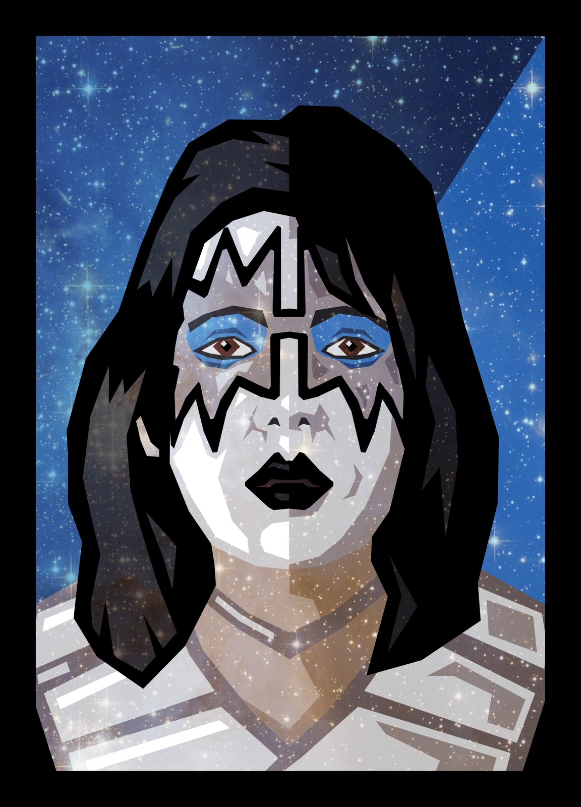
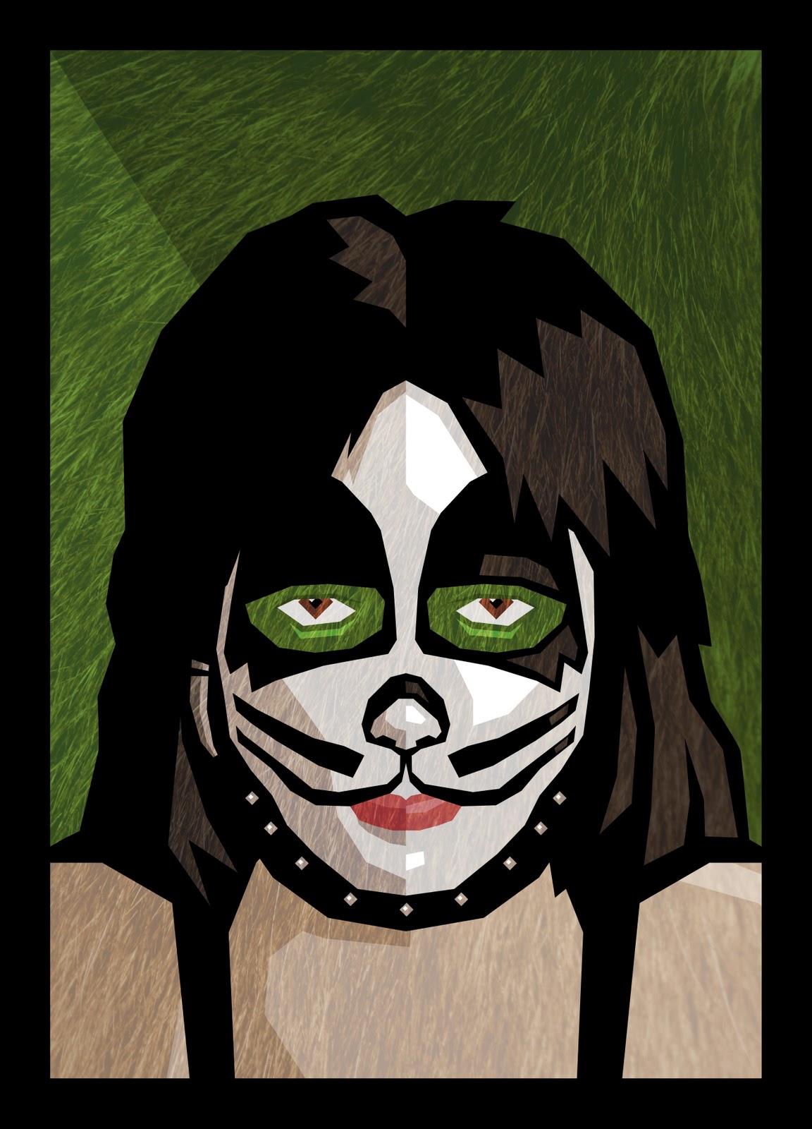


Corkboard
I've been thinking about a way to share friends' projects for a while now, and I finally went ahead and built one. Check out my corkboard.

I knew I didn't want to build a traditional portal. Whether it's a bunch of images in a grid, a combination of text and images (like blog posts), or a gallery with sequential images with one large/featured image and a bunch of thumbnails or navigation - I didn't want anything like that.
There's something interesting that happens when you have a disorganized collection of stuff. I wanted to create something closer to the physical, tactile experience hunting through a pile of old records, or photos, or a messy section of a store. Summaries are nice sometimes, but it's a different experience getting a small glimpse of something, then jumping into it with with no other preparation. That's what I wanted to make.
I searched through existing free or pay versions of this kind of this kind of interface, but none were customizable to the degree I wanted. I did find some existing drag and drop galleries, but none of them allowed the user to click on the image and open a pre-defined URL (and not a larger version of the image). Had I found a solution like that, I probably would have went with it.
Instead, I built a custom app in Flash. I've created Flash/XML galleries before, but this was more complex because it's dynamically duplicating images based on the number of items in the XML list instead of filling in a bunch of pre-defined spaces. From a technical perspective, making sure all of the elements had been loaded before the animations began was the biggest challenge. Once I had that working, the majority of the technical work was done.
I wanted a tactile experience, so I created an animation effect where the image lifts when initially grabbed - it rotates a bit, the shadow lightens and moves further away from the white border, and the tack lifts of and gets slightly larger. Subtle stuff, but it adds to the physical feeling of the app. This created some technical issues - the "drag" button is under the "view" button (the center of the image) and rotating it sometimes caused it to rotate away from the mouse, causing it to get stuck. Some careful motion tweening fixed this. A little "pop" sound helps sell the tack removal/inserting effect. I kept the description under the image really minimal - only two or three words will fit, depending on their length - and I used a handwriting font (even with a bit of a blur effect) to keep the interface looking less digital and more analog.
I photographed all of the elements on my iPhone, then assembled them in Flash. As each movie clip is duplicated, it's given a random horizontal and vertical position, rotation, and one of three possible tack images. I made the corkboard image tile in the HTML (after removing the seams in Photoshop), and enlarged the Flash file to 100% so that the elements could (if their random start positions or dragging allowed) go beyond the bounds of the window. I'd considered adding a border around the Flash file itself, and making the HTML a wall element (like wood grain) but this effect - filling the window completely - worked out closer to what I was going for.
During the development, I also discovered a bit of code that allowed bitmap (raster) images in Flash to smooth - that's always been a problem in the past. That's always been a compromise when using raster elements in Flash - when the .swf is presented at anything other than 100%, or when individual images within the file are presented at any other size or rotation than their default (100% and no rotation), the images look jagged. The new code worked great - I'm glad someone worked out a solution. Unfortunately, it's executed within the Flash application, so it doesn't help the dynamic images. I did more searching and discovered the .forceSmoothing property - not sure how I missed that before, but by adding one line of code I was able to make all the externally-loaded images look beautiful. That was very satisfying. I was worried that it would slow down performance, but after playing with the app after the update, I didn't see any noticeable slowdown.
I also randomized the depths of the elements. Initially the pieces were all coming in in the order of the XML file, so the earlier images were always buried. After trying and failing at randomizing all of the duplicated movie clips after they were created, I used the "sleep on it" method and instead randomized the order in which they were loaded from the XML-created arrays into the duplicated movie clips. That worked out much better, and now any project stands an equal chance of being at the top or bottom of the pile. And once a project is dragged, it moves to the top of the pile anyway.
After I had the basic app working for a couple days, I made a couple big tweaks. When I started the project, the images were much larger, but because the number of projects kept increasing (to 117, at the time of this posting) I had to reduce their size. I went back and created three buttons at the bottom of the page that allow the user to resize all of the elements to 70%, 100% (the default, of course) or 130% of their original size. This definitely helps when trying to dig in deeper, making sure more of the elements are visible - or, conversely, letting the user see larger images, though with much more overlap for a messier experience.
I played with the site more and added two more features. The first was stack/unstack option, turned on and off with two separate button. The stack throws everything dead center, and lets the user sort through the images one by one. The unstack button throws everything back to its initial (random) position.
I then added a categories feature. It pops in and out via a button at the bottom center. At first I didn't want to give users the ability to search too easily - and possibly ignore stuff that they might otherwise enjoy when discovering it by chance encounter. But with so many varied projects, this seemed almost necessary for people to really use the app - especially for repeat visits. Users can click All Off, then click on only what they like - or, they can start with All On (the default) and subtract out what they don't want to see.
Keeping with the minimal explanation (think Led Zeppelin IV) effect, I didn't add any extra information to the page. Just a Facebook share button and a little box linking to me for any administrative questions or issues, and it was up and running. I didn't want to give visitors the kind of navigation or explanatory elements most sites have - in the end, this is an art project, and it's designed for exploration more than traditional, sequential viewing/reading.
I may give it its on URL someday - though all the cool ones are taken. If only there was an international domain suffix for .rd, I could see if "www.corkboa.rd" was available. Ah well - have a look at the corkboard.
The Camp Out - A Jabloo Adventure
I've just finished writing and illustrating a storybook using my Jabloo characters. The story is aimed at kids 3 to 6. You can read The Camp Out online.

Since each of the Jabloo characters represents a different creative art (filmmaking, music, acting, writing, and visual art), The Camp Out is about them creating a piece of art - in this case, a monster movie. Yubi, with his video camera, is at the center of this creation, but each of the other characters contributes to the movie as well.
The story was designed as an "adventure" - meaning, it's not an introduction to the characters, so we jump right into their camping excursion. Kind of like an episode of a continuing television series rather than a one-shot, stand-alone show.
I worked backwards with the layout of the book, using Shutterfly's Photo Book sizes as the basis for my design. I went with a 7x9" book, so I opened up Freehand (the now-outdated piece of vector creation software that I used to create Jabloo - and still use daily) and set up a 7x9" document with a bleed area.
 |
| It's nice when the hard work is already done! |
Much of Jabloo was already created - the characters with different hand and mouth positions, fonts, colors, even many of the backgrounds in The Camp Out (for the as-yet-to-launch online, interactive version of the story) so I was able to move into the book's creation quickly. I'd spent months analyzing the layouts of my son's books (which contained every imaginable style of layout) and decided on a full-page image every page (with a few exceptions - the first page and a two-page spread), and a limit of two sentences of text contained within a white arc at the bottom of each page.
 |
| Dig those crazy vectors! |
I put the story together in a fairly haphazard way - writing a few pages, putting the illustrations together (which could take hours or days - even with many of the elements already created), adding a few more pages, changing the sequencing. The story itself is 24 pages, with a few additional non-story pages at the front and back.
I wrestled a bit with how much story detail to include - especially when it came to the movie the characters are putting together. I wound up showing only an indication of the story they were telling. The two-sentence limit on each page was a good natural limit, forcing me to only hint at the monster movie. The reader's imagination adds the details. I think that works nicely. It's a story about creating art, not about the creation itself.
Since Freehand is no longer a current program, and copying/pasting into Photoshop isn't viable (gradients get messed up, and there are other issues), I went through a tedious process of maximizing the Freehand pages on my 30" monitor, grabbing screenshots and shrinking them to get smaller, high-resolution images for printing. Of course, after doing this I found plenty of small things that needed revising or correcting, so I had to repeat the process for many pages. It was still a worthwhile compromise for being able to work with the beauty and elegance of Freehand.

I had a few hiccups when I began assembling the book in Shutterfly. When I was writing and laying out the book, I didn't set the pages up as two-pages spreads, so some of the images (especially the backgrounds) looked awkward when placed side-by-side. For example, some of the hills in the background seemed to run into each other, making the pages seem like they were meant as two-page spreads (that didn't quite align properly) - but with the same characters on each page. So adjustments had to be made to the backgrounds as well.

The next stage was assembling a readable version of the book online. I could have gone with a more straightforward gallery, but the effect of side-by-side pages would have been lost. I found a Picasa-based template online and, after plenty of technical issues, got the online version up and working.
The final printed book from Shutterfly looked great. The only minor drawbacks are a white area on the left of the cover (presumably the digital printing would flake off where it bends back) and the fact that you can't print a back cover (unless I missed that option), so the back of the book is plain white with a UPC code on it. But the printing itself looked great, as I expected from previous Shutterfly orders. And as much as I consider myself a digital kind of guy, I have to admit a piece like this feels different when you can hold it in your hands.


Read The Camp Out now - preferably with a kid or two.
Subscribe to:
Posts (Atom)