
This logo was created fairly quickly, and without any other options presented to the client, who had a very low budget to work with as well as a very tight timeframe. In a case like that, I do the exploration work on my own, but the client never sees it - they only get one concept with minimal adjustments allowed. Less money = more control; less time = less prep work shown to the client. In many cases, this works best - and the alternative for the client is they'd be creating their own logo (probably in Word or Paint) or using some clipart, or even not having a logo at all (which sometimes isn't the worst case).
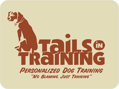
The client wanted earth tones (makes sense - dogs are pretty earthy) and a less formal look, so I used a font that had a cut-out kind of quality, and rendered the dog in similar rough shapes. I went with three colors on the main logo (something I rarely do - I'm typically a two-color guy) to give me a little more to work with the shapes in the dog illustration.

Color break, with tagline and slogan. This shows the client, and any
vendor they work with (most commonly, offset printers) how many
spot colors were used, and where they're located.
I developed a four page set of guidelines for this logo's usage, which you can view here as one long image (you may need to click once to zoom in). Because many of the logos I do are for startups, who will rarely be printing the logo using offset printing (some web-based businesses may never print the logo at all), I rarely produce these guidelines. But they are helpful, even if a big chunk of it is just a listing of what not to do. Some people need that most of all.

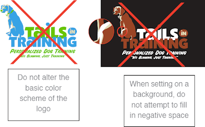
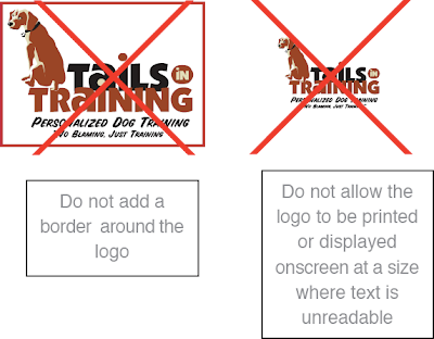
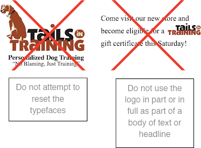
From page 1 of the logo guidelines - think of these as the logo "no-no's".
I'm always amazed, even after all the years I've been working as a designer, at the things people will do to a logo - especially people who've paid for that logo's development. I'll come off sounding like a jerk here, but I'm going to speak freely: if your instinct when working with a logo is to stretch it out horizontally or vertically to fill empty space, to cut it up, to change the colors around, to put it on a crazy background or stick it inside a shape - then you shouldn't be working with the logo. Or at the very least, you should consult a designer for some strict guidelines, and then follow them to the letterœ. Trust me, the best logo in the world will look like crap if you stick it into Word or PowerPoint, then grab one of those side handles and pull it across the page to become your header. And when people view it, they'll think less of your company instantly - whether or not they can articulate why they feel that way - and you've lost.
I'm often disappointed when I see what small businesses do with their logos. Better to not have a logo at all then to have something that degrades the image of your company each time it's used. I don't want to get too negative here, but I'll say this: working with an experienced designer will benefit your company's image in ways that you may not immediately recognize, but will pay dividends in the future. If you can't afford to hire a designer to develop your logo, check into consulting options - if anything else, for possibly a few hundred dollars, you might have someone to keep your worse instincts in check.
And since I mention Word and Paint above, I'll add this: you can't develop a logo in Word, or Paint - not even Photoshop. I mean, you can - but you shouldn't. It will be a problem in the future, if your business is to grow. You need a vector-based logo, developed in Adobe Illustrator or a similar vector-based design application. I'll tackle the reasons why in a future post, but trust me - it is a necessity. I've been hired by firms who started out with a raster-based logo, created at 72 ppi in Paint or Photoshop, and asked me to create a vector-based version. And usually, most often even, it's more time-consuming and expensive to do it that way - you have to accurately match fonts and precise shapes in a very tedious way.
As with anything, spend more time and money up front and you'll do better in the long run. When I was a younger designer, I was nicer to clients and potential clients about this. Now I'm not - I'm very direct, and I smack them around a little when I think they need it - which is often. Melodramatic as it may seem, I've seen too many people suffer over the years because they made poor decisions early on, based on money, and no one stepped in to tell them the downside to those decision. Even though as the designer I have a vested interest in getting clients to spend more money, and it may look like I'm trying to upsell them, I don't hold back - whether they use me or someone else, it'll always be an improvement over creating the logo themselves. I can live with that.
One-color version on colored background. I provided a separate version
of the logo for one-color uses like this. Besides making all the elements
one color, some shapes are removed, and pieces that overlap in the
full-color version (like the text) are given space between them. Just
printing the full-color version in grayscale wouldn't look anything
like this.

Two-color version on colored background. This version offers a little
more natural variation - the words are in two colors, so no space is
needed between them.
Back to this logo: here's one benefit of vector-based design right above. If you had created a logo in a raster-based program like Photoshop, with all the shapes and color on one layer, you would experience hell if you wanted to change the colors. You can select colors and alter them, but all the little edges would get messy and ugly. And if you wanted to lay your logo on top of a colored background, as I've done above, you'd have to cut out all the white and you'd end up with similar edge nastiness. Using Illustrator, I created color variations in literally seconds - just swapping out one color for another. It's really beautiful and efficient - when anyone who's tried to do something like this on their own sees me working in Illustrator, they say things like, "Oh man - that's how it's supposed to be done!" and also, "You won't believe how long it took me to do that - and mine still looks bad!" Vector is good.
So check out those guidelines to see all the rules and color options I provided. In the end, once the logo was handed over, the client immediately decided to drop the image of the dog altogether and just use the type. What a world!
No comments:
Post a Comment