DESIGN  |  ILLUSTRATION  |  ANIMATION  |  WRITING  |  FILMMAKING  |  MUSIC  |  GAMES

The Darjeeling Limited


Click to view the site in a new window. Some functions have been
disabled. Don't be too sad.

I was enlisted to develop the Flash website for the film The Darjeeling Limited by the same agency who'd asked me to created the Deviated Discharge game for The Heartbreak Kid. They're in L.A. and they're very specialized - they only do movie websites. Must be nice, eh?

Because of the tight deadline (about three weeks), the number of people involved in the project (including Wes Anderson himself), and the scope of the site itself, this project wound up being the most complex website I've developed - by far.

This was first movie website I developed, and I was told by the lead agency that it's very uncommon for the director to be so heavily involved in its development - but that was exactly the case with this project. Besides getting input from the studio (Fox Searchlight) and the lead agency I was working for, Wes Anderson had already contracted his favorite design studio (he apparently uses them on all his films) to develop the overall look of all the film's promo pieces, both print and online. There was also a third agency involved, developing just one section of the site ("Explore TDL"). And I was the set of hands putting it all together in Flash... and dealing with lots of questions and problems along the way. Par for the course.

I never communicated directly with Wes Anderson, but at a few key milestones in the site's development he'd go to his agent's office in New York, review the site's progress, and compose notes. His agent would forward his e-mail to the lead agency, who would then forward it to me - stripping out Wes's original e-mail address before they hit "send". I guess to prevent me from forming any direct communication with the guy. Maybe they were scared I'd add him to my famous Tuesday morning knock-knock joke distribution list. Maybe.

The website was a pretty messy affair - integrating elements provided by so many different sources, in a tight timeframe, is never going to be pretty. Working on the little music player, for example, required hours of testing and modification - especially programming it to fade out quickly when the user views the trailer, so the sounds don't overlap. I listened to the beginnings of those songs so many times that when I eventually saw the finished film, I had some strange Pavlovian reactions each time a tune began, quickly visualizing myself in front of my computer at 2 a.m. trying to debug some ActionScript. It made it kind of hard to enjoy the performances of Owen Wilson, Jason Schwartzman, et. al.

Eventually the Flash site was completed and integrated into Fox Searchlight's main site, which contained their global navigation and some additional, changeable elements below the Flash piece, like news, contests, and other press pieces about the film. The site went live a couple weeks before the movie opened, and no, I know what you're wondering - I was not invited to the premiere. I'm not bitter, though.

I almost designed another movie website for this agency a few months aftering finishing this one. They asked me if I had time to develop a simple website for what they described as a "little indie with Jason Bateman". The timeframe was initially to be two week so I agreed to take it on, but then they cut it down to one week. I had to pass on the project - that's too quick for my blood. I need to sleep a little between projects. And of course, that little indie turned out to be: Juno - a much more well-received film than The Darjeeling Limited. Grrrr.

Incident At: The Video Store


Click for larger image and this unpleasant episode from my past will be readable.

I did a lot of black and white illustrations for small press and zines (more about zines in a future post) in the 90's, and I had a lot of fun doing it. They usually didn't pay much, or anything (though you usually got a few copies of the issue your work appeared in), but that's understood when the publications are barely breaking even - or not even doing that. In return, you were given plenty of latitude in the work you were providing, if not full creative control. When you're starting to do illustration work commercially, that's a fair trade.

I did the piece above in 1995, after a somewhat depressing experience renting videos on a Saturday Night at Tower Records in my lonely single days. Man, I was lame. I drew the comic the night it happened, as I was watching whatever movie I'd rented, and inked it the next day. It looks a little rough, but hey - so was the incident itself. I don't believe I'd planned to try to get it published anywhere, but at the time I knew a guy named Brandon Stusoy, who published a great personal zine called Whitebread - that's where this comic eventually appeared.


The panel containing the core incident -
female anatomy contacting my shoulder
unintentionally.

I think I mentioned the fact that I'd drawn a few black and white single-page comics to Brandon, and he asked me if I'd send him some samples. I did, and this was the one he really related to. Whitebread was full of very candid stories from his personal life, often painful and embarrassing - so "Incident At: The Video Store" seemed to be a perfect fit for him. He asked if the piece had been published anywhere, I said "nope" and he asked if he could use it in Whitebread. I agreed - why not? I was fairly immune to humiliation at this point, and having others share my pain was always a nice way of diluting it.

I notice now that the "Incident At:" portion of the title seems to have been left open-ended on purpose - from what I remember, I was trying to give myself a chance to build a series of these comics of unpleasant personal encounters for the future. Never happened - though this was probably the seed of what would (and still will) become It Must Be Me, my book about the many weird encounters I've had in life. Though I didn't know it at the time, this video store incident was, unfortunately, only the beginning.

The Mystery of the Small Town Ruby


Click for larger image. You know you want to.

I've done a lot of work for jewelry magazines - something I never planned to do, but it just kind of happened and I ran with it. This particular jewelry-oriented article was about the history of one little ruby, which went through a series of wacky The story was kind of like The Red Violin, except you can't play the ruby, because it's a precious stone. I mean, I guess you could, but it would sound pretty bad.


Original sketch, done with a real pencil. Sickly green tone added in Photoshop.

I took a couple risks with this illustration - minor risks, maybe, but I did stray from what I might typically do. For one, because of the episodic nature of the article, I decided to include three thought balloons in the illustration. I don't believe I've ever done this in an editorial illustration before, but it seemed to call for it. So in they went, next to the fictional investigator I created to symbolize the searching element of the piece. I am all about symbolism - me and Dali.


These are lines. Thick black lines, made with ink... digital ink, that is.

Then, to emphasize these three word bubbles, and to prevent the background from competing with them too much, I gave a very heavy greenish-brown tone to the background, only letting a tiny bit of the color details there to come through. I also thought this would let the ruby itself - shown in four places - gain more emphasis. So down went the color in a fairly heavy manner.


Detail of the hapless private eye. The man has no hap.

I think it worked. The story went back to the late 1700's (where the ruby was thought to have been first sold), and I felt like the kind of dark, slightly grungy greens, yellows, and browns all lent a feeling of that era's mood. I even added a greenish-yellow layer in Photoshop over everything, which made the skin colors and other hues a little queasy-looking.

I liked it - it was a change for me, but a change determined by an unusual subject and article. However, I'm not sure if the magazine liked it. This was the last piece I did for them (back in 2007), and unlike every other piece, I never heard from the Art Director after the issue was printed. Usually he'd e-mail or call to let me know how good a piece looked printed, or how happy the editorial staff was with the illustration - but here, nada. Maybe I pushed it too far (or maybe I'm just being paranoid) but I'm still pleased with how the piece turned out.

Mistha Bleedsworthy - Storyboards


I did my first set of storyboards when I was in college. I was part of a screenwriting group, and our teacher was planning to head off to Germany to shoot a short film he'd written. Somehow it made sense for him to plan the project remotely, locating cast and crew (pre-Internet) by telephone, newspaper and letter-writing, and then fly to another continent to actually shoot the film - a fifteen-minute black and white art piece, with only two non-language-specific words spoken. But hey, it's not my place to say whether or not this was logical - not then, anyway. Maybe the movie was just a ruse for him to sample some fine Teutonic beer.

Because I was a Graphic Design/Illustration major, this teacher asked me to develop storyboards for the film. I agreed - possibly because the film was titled "Watchman", one letter away from my favorite literary work, but also because it seemed like it would be a good experience - and it was. I still have the final pieces - I'll have to photograph them sometime. I say "photograph" because my teacher, the writer/director, insisted the storyboards be rendered on humongo 30x40" boards. He wanted the cast and crew to easily be able to reference the images while they were on set. Not a bad idea. I have a VHS copy of the final film - it was a moody, arty piece, kind of like Wings of Desire, but much more entertaining because it wasn't a pretentious piece of crap (uh oh).

The other interesting fact about those storyboards is that my teacher insisted that I draw them while he was present, so he could essentially direct me as I was working. That was pretty challenging. He requested very finished-looking renderings, so it was an especially long process with me going to his house in Philly for several weekends, drawing out multiple rough versions of each panel on a small sketchpad. Once he was happy with one of those roughs, I'd redraw the panel on the board using charcoals. Sometimes we only got through a few panels in one six or so hour day. Good thing it was a short film. I think he paid me $50 for the whole project - what was I thinking?! I didn't even get any of that beer...

Anyway, those movie storyboards are not the subject of this post, but the there's a very roundabout connection. When I joined that screenwriting group, I convinced another friend of mine (also a Graphic Design/Illustration major) to join with me. My friend Allen was and still is, the most creative person I know - and I know many creative people, trust me - but it just oozes out of this guy. While our teacher was enduring my in-progress screenplay about an assassinated American ninja who's brought back to life in the future (only to fight, of course, the ninja who killed him), Allen was presenting a concept for a screenplay called Mishta Bleedsworthy which our teacher absolutely fawned over. It was a well-deserved fawning.

Mishta Bleedsworthy was Allen's concept not just for a movie, but for an entire world. The story's titular (hee hee) character was a member of The Epitomes of Stuff - an unseen group of entities in a parallel universe composed of offices sitting on interconnected tiny planetoids. The Epitomes rule over different aspects of our world using their powers, all while working through their own dense bureaucratic system.


Exterior and interior shots of the Realm of the Epitomes of Stuff.

Willoughby Bleedsworthy (referred to as "Mistha" by his four-foot Chinese Cowboy assistant Neddy, who has a serious lisp) is the "Epitome of Doors, Gateways, Various Entrances and Exits, Holes, Paths, Bridges and Links, Both Tangible and Intrinsic" (Allen's description - pretty wild, eh?). He's part Willy Wonka, part Baron Munchausen with a bunch of other fictional characters thrown in. Besides Bleedsworthy and Neddy, the cast was filled out with Kishwa (Bleedsworthy's friendly anthropomorphic tie), the Epitomes' long-suffering Headmaster Szogfn, the identically-cloned Bettys who conduct communications in the Epitomes' realm (each using their own method - semaphor, finger painting, interpretive dance), and the tyrranical Epitome E.G. Wadsworth, who hatches plans to thwart Bleedsworthy and Neddy from beneath the fish bowl in which his head is imprisoned. Yes, the story was epic - so epic that it took over fifteen years for Allen to complete the screenplay (I believe he's working on a sequel now). The final document had a Monty Phython-like irreverence and was a blast of messy fun.

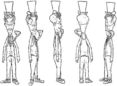
In the late 90's, while he was still working on the Bleedsworthy script, Allen surprised me by joining the U.S. Army - he's still enlisted. Right around that time, I was taking a traditional animation class. I asked Allen if I could take the Bleedsworthy concept and create a television series proposal from it, to use as a class project. He agreed, which was quite generous of him - this was his passion project. And besides being a writer, and a musician (I saw him learn to play the drums right in front of me once, over the course of a few minutes - it was like that scene from Close Encounters where we Earthlings learn to communicate with the aliens through music), Allen is an excellent cartoonist - he'd already rendered most of the Bleedsworthy characters on his own. I was a little nervous for him to see my renditions, which you can see here:


Character rotation, model sheet and prop sheet for Mistha Bleedsworthy.
His tie sticks out like that because it's alive!


He gave me permission to work up my own versions of the characters and environment, which I did over the course of about six months. I created model sheets, prop sheets, backgrounds, storyboards, a sample episode script, season overview and other materials. To my relief, Allen liked what I did with his project - I sent him drawings and other documents while he worked his way through basic training.

I then put together a package and sent it out to about fifteen production companies, who all responded by saying: no. Actually most of them didn't respond at all, or just gave their answer by sending my material back unopened with a form letter. I didn't cry, though - the idea of someone with no history in television or animation creating a full series, based on an original concept with no commercial tie-ins (comic book, novel, children's book) is beyond a long shot. But it was a great exercise - by the time I had everything completed, I had much more respect for anyone who's ever got a cartoon on the air.

So here are my Mishta Bleedsworthy storyboards for a couple interconnected scenes. You can click the image below to view them as one large image (sans dialogue or description), or view one panel at a time by clicking the interactive piece at the bottom of this post. Or don't click either - after all, I'll never know.


Click the image above for full storyboards in a new window... or click
below to view one panel at a time.

My Beloved Batman Shirt


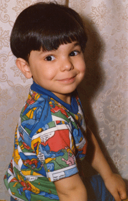
Here's another piece I wrote for my friend Rob Kelly's blog Hey Kids, Comics!, which collects readers' fond memories of discovering comics. This story features me as a mop-topped five-year-old, remembering my favorite childhood shirt. It's not an Izod - that came much later, after my lengthy and shameful Garanimals period. We all have skeletons in our closets; mine just happened to be color-coordinated kiddie clothes.

My Beloved Batman Shirt

Why Reinvent the Flex-Shaft?


Click for larger image and you'll be able to see the instructor's
five o'clock shadow in more detail. And you know how awesome that is.


I swear that I really understood what a flex-shaft was when I was working on this illustration. The magazine article was really about a few different educational programs for jewelers, but the Art Director wanted the visual to play off the title, actually depicting a class learning about the flex-shaft, a jeweler's tool used for grinding down materials. I wish they would have given me one for free - it seems cool.

A quick google search showed me all I needed. And you can see just how knowledgeable I became by looking at the text on the chalkboard, where I just scribbled lines (instead of actually using real text descriptions) for each broken-down piece of the tool. Never let it be said that I don't take the easy way out (actually, I just don't like too much text in an illustration - it's distracting).


Original sketch for the illustration. Not sure why I didn't finish drawing
the teacher's legs. That was pretty lazy of me.


Using Photoshop and my Wacom tablet, I sketched out a classroom environment. The Art Director for the magazine had requested (as he usually did) a horizontal layout, so I kept the instructor near the center and spread a few students across the environment, making them all look either frustrated or disinterested, as students should be represented. I really cheated the girl on the left, facing her away from the teacher - I wanted at least one of the student's faces to be clearly visible to the viewer, so her angry expression could be easily seen. That's just how I am.

From what I recall, I only supplied one sketch (the timeframe may have been short for this project - possibly a couple weeks) and it was quickly approved with no changes. I rendered the linework with the Wacom/Photoshop combo, tracing over the sketch layer. I always make sure to lock the sketch layer, and then the line layer when it's complete, so that elements don't get mixed up. This Art Director liked to enrich the black line by adding 30% Cyan to it - keeping the line isolated on its own layer made that super easy.

Linework for the illustration, all created digitally. The blackboard
drawing wasn't part of the this - it had its own layer with
a diffusion
effect, to give it that chalk-on-board feel.

I hadn't done a digital illustration in a while at this point. My services tend to fluctuate - sometimes I'm working on a few illustrations at once; other times, I'm doing only logo design, or website design or other types of projects, and I've got no illustrations going on. And that's not a bad thing, either, because that little dry spell made me more open to experimentation when this project came along.


Detail of the instructor. He may have been modeled after
a teacher friend of mine, but I'm not copping to it.


Some of my previous digital illustrations were too smooth in the coloring and tonal work - I felt like I was trying to replicate the look of the Prismacolor markers I'd used before "going digital", but in really examining my old and new work side-by-side, it was easy to see that the marker-colored work wasn't totally smooth, even though they're a wet media. The little imperfections - areas where one marker's color bleeds into another and creates a visible stratification - might have been aspects of hand-coloring I wanted to minimize and avoid while I was working that way, but in reviewing the older work, I couldn't deny that those touches added some depth and personality to the piece - aspects that my earlier digital illustrations usually didn't have.

So I let myself be messier on this one. I didn't create discrete layers for every little color or element (though in checking the Photoshop file, it seems the five o'clock shadow did have own layer - I guess I really wanted to control that one). I created a brush with a harder edge than usual, and just let things bleed (get it? like the way markers bleed). I liked the results - it took a little longer to build up the layers of tone and shadow, and a couple areas look like too harsh a transition to my eye now (like the gradient on the blackboard), but all things considered, it was a nice leap forward for me. I've done a couple other pieces in this style since, and I used what I learned on this one. Because I allowed myself to grow, I rewarded myself with ice cream. I think I totally deserved it.

Following Lights Into the Forest


Click for larger image - you'll be able to actually read the text.

This was a weird project. My band cuppa joe wasn't very active in 1998. We formed at college in 1991, and put out some self-released cassettes, singles and then full-length CD on Dromedary Records until 1995 - that's when Doug, our singer/guitarist/songwriter, joined the Peace Corps and went off to Kenya for a couple years. He returned in 1997, got married to another Peace Corps Volunteer, and then re-upped with his new wife and set of to Papua, New Guinea in 1998 for more fun.

In that little year or so span, we got a new bass player (our third), played some shows and recorded a few new songs. This was around the time when it was becoming more common to be able to burn your own CDs, so we decided to put together our new songs, some old unreleased tracks, demos, and a few live tunes into our own self-released "best of" collection. The CD, which wound up being packed with 24 tracks, was to be named "Following Lights Into the Forest" - a title Doug came up with, I believe, while in Africa.

The title seemed to suggest to me an old English fantasy/magic story, so I came up with a concept where the five words of the title would be "pulled" from the text of a bigger story. I laid out the title on the lower left of the CD booklet, balanced it with our logo in the upper right, and then proceeded to fill in all the surrounding text - all in Courier, for an old-style printed look.

I didn't plan this out very much - I had the vague idea of a story about a group of young travelers on a quest for a magical object. In the chunk of the story depicted on the cover, they encounter an apparition while passing through a clearing. I knew the text was going to bleed off the left and right edges, so I didn't feel the need to fully compose it beforehand - I just wrote out individual sentences, making sure the words in the title fit into the sequence. It was fun.

The varied color of the text was created by placing a photo of a lush forest scene in the background of the cover, then revealing it (at a much-reduced percentage) through the text. The swatch underlying the white-lettered title is also a chunk of the same photo - this time, at 100% opacity. I liked the effect - I don't know if a single person ever bothered to try to read more than a few words, but the fact that it was there gave the cover concept and album's theme some added depth.


The CD's tray card interior, for under-CD printing.

The final CD contained very similar imagery - the same typeface, colors, and another chunk of the forest image. The inside of the tray card - the part that goes under the CD (if you choose to use a clear tray, as we did) was a collage of band photos over the years - each picture of me with 1,000 times more hair than I currently have, though usually in a much dorkier style.

We printed covers, tray cards and CD labels, put the whole thing together ourselves and sent or hand-delivered copies to 100 or so friends and family. We even got some play - eight years later - from Jon Solomon's awesome Local Support podcast. Here's the song he chose to include: P.D.A., from Following Lights into the Forest:


Woobner


Click for larger image. Do it. You know you want to
see more of the classy lady.

Woobner was a comic idea I created in the late 90's. I say "idea" because it was never completed, and I can't remember why. I had the first issue written, the first few pages drawn, inked the first couple pages and colored the first - not the best process. I guess I was going for a "proof of concept" - I wanted to make sure it looked good before I got too far into it. Stupid.


First page inked, no color. But you could have
figured that out on your own, couldn't you?

I do like the way Woobner looks now, though, so I wish I would have finished it - at least one issue. The story was about this freakish little character (named Woobner, of course - I stole the name from some co-workers at the time who made up the term as kind of an all-purpose insult - "You're acting like a Woobner!") who, for no clear reason, was very popular with the ladies (hmm... was I projecting my own fantasies?). His personality was a lot like Pee Wee Herman's, except he was bitter - bitter and jaded.

Even though he looked like a little elf with a skate rat's hairstyle, Woobner worked as a male model (comedy), but that was actually a cover for a his sideline as a spy. He was part MacGyver, part Austin Powers, with a little bit of Maxwell Smart thrown in for good measure. He also had a sweet girlfriend who kept him in line (surely more self-projection).


Panel detail. "Frig" was to be Woobner's catchphrase... even though
it's just a single word.

Before I began the project, I'd been in touch with an editor from Fantagraphics, a great independent comics company who published two of my favorite books at the time - Eightball (which spawned the movies Ghost World and Art School Confidential) and Hate. I think I'd sent this editor Science Geek, a zine my friend Doug and I put together (he wrote it, I illustrated it and laid it out), as well as some other black and white illustration samples.

The editor, whose name I can't recall, liked my work and sent me a nice handwritten note asking me for some examples of full comic stories. I'd done some short one- and two-page comics in black and white, but nothing longer. Woobner was designed to be a full-length example to show that editor.


Another panel detail. I must have been reading a lot of
Little Annie Fanny around this time.

I used my traditional pre-digital technique - brush-tip markers over pencils, photocopy (onto 11x17" 20 lb. paper, for this piece), and color the photocopy with Prismacolor markers. I also lettered the page by hand, using the same markers, which gave the words a nice integration into the rest of the linework.

During this time, I was still experimenting with the size I'd work at - specifically, how much larger than the final piece I'd lay out the page. Sometimes I'd shoot too large, and when the piece was reduced, the linework was a little too thin and too tight. Other times I'd start too small - too close to the final size - and I wouldn't have that extra little bit of space for the smaller details. Here I think I got it just right - the linework was just chunky enough for my liking.

The colors were less blended than I was shooting for, but for the most part, I like them, too. At the time I was working on Woobner, I was aiming for a totally smooth, modeled, Richard Corben kind of look, but the different levels of color now look charming and hand-created to me - a lot of digital colorists shoot for the same "imperfect" effect. The wet edge - where the markers hit each other - looks more pleasing to my eyes now than it did then. That's what an oversaturation of digital work does to you, I suppose.

Perhaps someday Woobner will live again - or at least, maybe the first issue will be completed. It could be a one-shot. Or a web comic. Or even a musical. Hey, if The Last Starfighter can be made into a musical, I think I've at least got a shot.

Flying Spaghetti Monster - The Game


Click to play in a new window.

If you haven't heard of the Flying Spaghetti Monster internet meme, then you're fine. No, really - it was a big thing in 2005, but now it's pretty much run its course. I won't bother explaining the deeper workings of this pseudo-religion (really "parody-religion") - a guy named Bobby Henderson created it as a goof, and it took off all over the Internet. "Pastafarianism", as it came to be known, is centered around a diety made of spaghetti and meatballs. Pirates are also part of the mythos. There's even a version of Heaven containing a beer volcano and stripper factory (don't be mad at me - I didn't make this stuff up) - pretty silly stuff.

When the Flying Spaghetti Monster thing was still taking off, I contaced Bobby to see if it would be okay for me to create the official FSM game. I even worked up a sample conceptual image for Him to review. He was very enthused and gave me the go-ahead immediately, and I got to work.

Within three weeks, the game was complete, Bobby posted it on his site, and people began playing. I posted it on a couple online gaming sites, and pretty soon people began stealing the source Flash file and distributing it to gaming portals everywhere (yes, without my permission - good thing I developed it as a self-promotion, for no charge). I get dozens if not hundreds of hits to my site every day from people clicking the link embedded into the game. Web analytics are fun.

I've never created anything with as wide a reach as this thing - before or since - so it took some time to get used to all the feedback the game generated - much of it negative. I made the gameplay fairly simple - you, as the Flying Spaghetti Monster himself, float above a scenic landscape, pressing the mouse button to fire one of your "noodly appendages" down to the ground. If the tip of the appendage hits one of the 25 people roaming the land, they are converted to a pirate. Convert all 25, and you win the game. There's a timer, a couple bonuses, and evil darkly-clad administrators roaming amidst the people - points are deducted if you hit them.

And that's it. But for some reason, the game play stumps the majority of people who play it - at least initially. See, you move the mouse left and right and the Flying Spaghetti Monster moves across the screen - the screen scrolls as well. But if you move up and down, your character also moves up and down - and your position in the sky determines where vertically on the ground the tip of your appendage will strike, which in turn determines whether or not it actually hits the people on the ground.

Most people who play for the first time don't consider this vertical positioning (your shadow moves with you, as an additional targeting tool. People get very frustrated with this, often posting comments like, "This game is IMPOSSIBLE!" and "I can't convert ANYBODY!!! HELP!!!" until some nice person (not me) comes along and advises them to consider their up and down movement when they're playing. It would have been way too simple a game if you only had to move left and right, align yourself with the people below and press the button - but for whatever reason, that doesn't occur to people. Maybe I should hold a press conference or something. Ah, too late for that.

And speaking of player feedback, the comments the game has generated (currently at 558 on the official Flying Spaghetti Monster site) have ranged from really positive...

"I love this game, and enjoy the challenge of converting the non-believers while simultaneously attempting to improve my score and skills" (sounds like it was written as a school assignment)

"Bravo on the game. I thoroughly enjoyed it."

"This is heaven on earth! Thank tou (sic) FSM for giving us the wisdom and knowledge to create this wonderful game!" (hmmm... I didn't know "we" created it)

...to the moderate...

"Quite amusing and decently challenging without being impossible. I just wish there were more levels or the game was longer."

"Great game, but it needs more levels. It`s great fun, and really improves your eye-hand-coordination. " (okay, so I probably should have made more levels - quite a few people mentioned that - of course, many more were happy the game was short and able to be completed)

"i thought it was a little hard. then again, i suck at video games so who knows?"

...to very, very negative...

"This game sucks!!!! While the rest of the site aint bad the game needs improvement. I will sodomize the monster" (that seems a little unnecessary)

"IT DOSNT (sic) WORK FOR ME THIS GAME SUCKS!!!!!!" (read the instructions, bud)

"wtf that is the most retarded thing i have seen in my life who ever made this should kell (sic) themshelfs (sic)" (I'll take it under consideration... mmm, no - not gonna do it)

I even got this private message sent to my Newgrounds account, where I also have the game hosted:

"Your addiction to the so-called oh-so-glorius (sic) Flying Spaghetti Monster, or FSM for short, plain disgusts me. Sure, you're allowed to make up your own religion [wasn't me, bud], sure you're allowed to follow this twisted immage (sic) of a wannabe god, sure I can't stop you... And so on and so forth. [he got a little lazy there]

FSM is a lie. If you think different, please prove his existance, (sic) the reason of the religion, some stories behind the creation of life... Stuff like that. I'm waiting, Steve. Waiting in excitement.

~Dottorius Sigma, mouthpiece of Ender."

For the record, the opening of this piece seems lifted from the Star Wars quote about "your sad devotion to that ancient religion...". I took it as a joke, but I still held off on responding.

Ever since the game came out, I've been receiving screenshots and even videos of people completing the game and getting into "Heaven". That's pretty fun - reminds me of my own youthful video game fascination (some people even send me screenshots and videos of them not winning, which is a little harder to get excited about).

The game was featured on an episode of Attack of the Show, though I never got to see it. From what I heard, they got a good laugh out of it and talked about the game for a good fifteen seconds - but I'm not complaining. Oliva Munn wound up contacting me to develop a Flash game for her. Okay, not really. That would have been pretty awesome, though. But that show, and some online publicity the game received, helped me get a few paid Flash game projects. So you see? It was all worth the abuse.

And the only nearly unanimous feedback I received was on the game's music, which I composed in GarageBand early one Saturday morning. Even people who hated the game loved its theme song. That softened the impact of some of the harsher feedback and death threats. People asked for an .mp3 file and I obliged, making the song available publicly to appease the Pastafarians who hungered for it. It's not as satisfying as a good marinara sauce, but then again, you can't dance to sauce.

A Gift From Scotland


An excerpt from my forthcoming book, "It Must Be Me":

I have a sister and two brothers, all significantly older than me - seventeen to nineteen years. Yes, I was not created on purpose. Some call it an "accident"; I refer to it as "unintentional conception". It makes for some interesting familial situations.

Because of this, when I was a little kid, my siblings were all off doing adult things like drinking soda straight out of the bottle, wearing deodorant, and joining the armed forces. The younger of my brothers, Mike, did the latter and entered the U.S. Navy, who sent him off to Scotland.

No, he did not locate Nessie (though he did spend a day of his shore leave trying to her), nor did he develop a taste for haggis with a whiskey chaser (unless he kept it hidden). He did, however, purchase a child-size kilt and tam (a Scottish hat), which he sent home for me, his little brother. Mike probably thought it would be cute. Instead, it traumatized me for years.

I never wanted to wear the foreign clothing. I think my father protested as well, but mt mother explained that Mike had been nice enough to buy these things for me and to send the package across the planet, so the least we could do was to get some photos for him. So my parents and grandparents (who lived with us) trotted me out for an improvised photo shoot in our back yard. It became another opportunity for me to be exposed to public ridicule.

The problem was that a kilt looks a whole lot like a dress... oh wait – it IS a dress, except it comes from Scotland, where it is commonly worn by men. That's fine if you live in that particular country, but while I was old enough to know that the difference between a dress and a kilt was negligible at best, I had not quite reached the age of understanding about what a country is, or how social mores differ in other lands. That would be asking a bit much of a five year old.

It was no surprise to anyone that I started crying once I put on the exotic attire. My mother kept insisting, "Every boy in Scotland wears a kilt like you are, Stevie!". Maybe if she'd pulled out a globe or a Mercator Projection, that would have helped. A travel book with large illustrations may have even done the trick. But instead, I was struggling with the concept that my parents were trying to turn me into a girl, and simultaneously having a hard time grappling with the idea of different nations and their customs. The tears kept flowing.

The vultures got their precious photos, but that wasn't enough for them. For some reason, my mother wanted to parade me in front of the house – ostensibly for the amusement of the neighborhood. I was still sobbing, but she told me everyone would love my new outfit. Her words did not prove to be true.

The older people in the neighborhood said I looked adorable, and that calmed me down a bit. But then my "friends" – some older kids I looked up to – walked by. They were not especially receptive to my freshly imported clothing, especially the kilt, which to them was not very different from what they called it - my dress. They openly taunted me, asking "Who's the new girl?" while t pointing and making me cry even more. I quickly decided that I should probably stop looking up to these cretins.

After an interminable period of time, my parents brought me back inside the house. Unable to contain my indignation any longer, I yanked off the kilt and threw it on the floor. My father told my mother I'd never be wearing "that thing" again. I was happy, though the photos still survive. Years later, my brother heard the story from me, and apologized. If only he'd had better luck at Loch Ness... a package from Scotland containing Nessie (or at least a photo of her) would have made me so much happier.


The horrible evidence. If only they'd taken a closeup, you'd be able to see the tears.

Love Is In The Air - Part Two


Click image for larger version. You can even see a fancy animation
showing the sketch fading into the final image!


I've finished my wedding invitation piece, and the client was delighted with it, as was her fiance. I was a little worried that the fanciful color scheme - especially the trees - would cause her concern, but she really liked the effect. The only revision she requested (actually, it came from her fiance) was that the flowers get more definition - the original version of the bouquet was more amorphous, but in the final version I defined the shapes as roses.

In my first pass vectorizing the piece (using the long-defunct but much-loved Freehand and my trusty Wacom tablet), some of the pieces in the front - the stone pilings and stand for the sculpture - were gray, and the ground was kind of a concrete color (which is what it really looks like - see comparison below) but those literal colors were boring and didn't convey the kind of romantic, whimsical feel my client was going for - so I deviated.

I kept a jazzy, loose feel to the structures - it didn't make sense to create totally perfect perspective and angles for a piece like this. I think that kind of treatment would have come off as looking too technical and less artistic. Elements were simplified into mostly monochromatic versions of their real-world counterparts. I also reduced the width of the water so it could fit completely into my piece - I didn't want anything to overshadow the couple. I considered adding the fountain's spume, but it was another element that might have competed with the bride and groom - and I really needed the sky color to provide contrast behind the bridal gown - a light or white fountain shooting up there would have been a problem.

My only regret is, because of the bride's dress and the shape of the letter, the L is pretty heavily obscured. I couldn't find a way out of that one, so I've got assume that the ubiquity of the landmark, combined with the fact that people know how to spell the word "love", will help the viewer's mind complete the image.

And here's a comparison - my version versus reality. I've already designed the invitations and RSVP cards, using a couple different croppings of the piece. Maybe I'll even get invited - if not, hey - I'll just print an extra invitation. Don't tell.


Gator Wrasslin'


In the mid-90's, pre-internet, I was trying to get my illustration career going. Because I did a lot of simple pen and ink (actually brush-tip marker) work at this point, and because digital printing was still fairly uncommon, expensive, and not the quality it is today, I did a lot of black and white promotions for my work. This one - "Gator Wrasslin'" - was one of those pieces.

While some may question the logic of representing yourself in an illustration sample (hey, it is a self-promo), I was so happy with the line quality on this one after I did it (originally with no intention of showing it to anyone) that I added my name and some rough-hewn text that said "Gator Wrasslin'", printed it on a postcard, and sent it off to magazines, newspapers, and other publications that I thought really wanted to see a drawing of me in a tank top, rubbing a reptile's belly. It was a short list, but a good one.


I think I toyed with the idea of coloring the piece, but thought better of it. For one thing, I spotted the blacks a little more thoroughly than I'd done on previous pieces, and that made me more confident that it would stand on its own. That also would have made it tougher to color - filling in those areas, all surrounded by solid black, tends to look like an afterthought to me. So colorless it remained.

I did manage to get a few magazine projects from this. One Art Director told me I had a "sensitive line style". That was a very nice compliment, but seemed slightly creepy when I thought about it too much. Eww...

If I were to do this again, I'd have kept the gator's belly white and not filled it in. I may have also removed the machete from my teeth - it looks kind of cool on its own, but I'm not sure if it really goes with the theme - am I wrestling the alligator, or preparing to fillet it? And I definitely would have given myself long pants and at least a t-shirt. No one needs to see all of that body hair, no matter how nicely rendered it may have been.

Last Time You Took Me Back - Restraining Order CD Cover


My band Restraining Order put out our first CD in 2001. It was a collection of mostly hard rock songs, with a few lighter acoustic tracks and even a ska and punk tune mixed in. That's what happens when you have four guys writing songs. We went through a bunch of proposed album titles, and my suggestion was "Last Time She Took Me Back". I liked the title because it could be taken as, "The last time this happened, she took me back" but also, "This is absolutely, positively the last time she'll ever take me back." See how that works?

The other guys seemed to warm to it as well, though our guitar player Phil suggested making it more generic (and less gender-specific) by changing "She" to "You". It was a good suggestion, making the phrase even more ambiguous. Since we weren't on a label and would be self-releasing the disc, we locked down the title between the four of us - "Last Time You Took Me Back" it was. And, since I was the lone designer/illustrator in the band, I agreed to put together a cover image that would illustrate the concept.

About a year earlier, I'd first started using a graphics tablet - A Wacom Graphire, which you could get back then for $99 in any CompUSA or similar store. The tablet's working area was only 4x5", but it turned out that was plenty for me. I loved it immediately. Going from doing digital illustration with a mouse or trackball (which seems insane now) to using a pressure-sensitive tablet was a huge leap, and I was doing all sorts of experiments in Photoshop, learning to sketch, apply color, render linework and do other illustrative and photographic techniques in a whole new way. It didn't take long to get used to my new tool.

So a Wacom-inspired illustration was a natural for the Restraining Order album cover. I don't believe I even did a sketch first (digital or traditional) - I think I filled the screen with what was then our theme color - a magenta-heavy purple - and started dodging and burning like a fiend.


I'm not big on using a wide range of colors for an illustration or design - I tend to use a very limited color scheme whenever possible, often just working on tints and shades of just one hue. That's where I started with the Last Time piece, and I never varied. It can drive some people crazy - "Why is it only one color?!" - but it creates instant cohesion in the elements, pretentious as that sounds. A realistic, full-spectrum color scheme can come off looking generic and boring. Using limited colors brings everything together in a brute force kind of way.

I showed the partially-completed piece to the band - an impressionistic image of what is ostensibly the character who's thinking the album's title, dressed in a shirt, tie, and overcoat, carrying flowers in one hand and an umbrella in the other. I lived alone in a small apartment at this point, so I modeled the image on my front porch and the parking lot across the street. My aim was to make the illustration vague enough so that it didn't hit you all at once, but once you stared at it for a minute, you start seeing more of the scene. I added rain for dramatic effect (the umbrella seemed to call for it) and showed it to the band.

They all liked the piece, and seemed to think it conveyed the kind of doomed/failed relationship theme our songs were typically about (don't worry; we're all happily married now, despite our lyrics). I prepped the artwork for the rest of the album - the other five panels of the insert, the on-disc printing and the tray card interior and exterior, all using this same magenta-purple color scheme. I like to beat the viewer into submission as much as possible. It's all worth it when someone sees your album and says, "It's really purple" or "You sure like purple!" I consider that to be my reward as a visual artist.

Once the album was out, we'd managed to place a small quantity in a few local music stores on consignment. Months after they'd stocked our CD, I went into the Cherry Hill Tower Records (now an empty shell) to shop for a gift. I was crouched in an aisle, flipping through CDs, when I realized I knew the song playing over the store's sound system very well - I was subconsciously tapping the beat, and getting it right. Yes, they were playing our CD in the store. I looked from person to person, perhaps hoping to see that movie-like moment where everyone starts tapping their feet, maybe dancing around a little, and - of course - demanding the employees tell them, "Who IS this band?!" It didn't happen. I tried to call my bandmates on my then-new cell phone, so they could hear the big moment - none of them were around. It sucked. This is not how things happen in movies.

I guess that wasn't punishment enough, so when I made my way through the line to pay, I asked the cashier (a young girl with bluish-black hair filled with more butterfly barrettes than you'd expect to find on a five-year-old's head), "Hey, who's this band playing?" To my surprise, she said, "Oh, it's Restraining Order. They're like, well not totally hard but they have some fast songs and a couple slower ones." I think she may have even added, "They're cool" or "I like them", but I can't be sure. I was happy enough that she had some idea of who we were, and seemed to have listened to the CD previously. I left well enough alone, and walked out of the store feeling pretty cool. If only I could have known then that when I'd return to the store more than a year later to close out our consignment, they'd have sold only one of the five CDs we gave them - I think to one of our friends, too. Maybe they should have played it more in the store.

We went on to put out two more CDs (EPs, actually), both of which I designed the covers for, though not using illustrations or the Wacom. I'm now using a bigger tablet - the Intuos (which is nice - it's bigger and has more functionality)- and maybe someday I'll splurge for the amazing Cintiq, which lets you draw directly on the monitor. I could probably lay down even more purple with that thing.


Last Time You Took Me Back on Amazon

"She's My Girl", the song that even people who don't like us seem to enjoy:


I Am All These Things And More


This piece started out as a client project that just didn't pan out. Once of the agencies I work with wanted to rebrand themselves, or really to create a secondary site that they could show to people in the video game industry that they were trying to woo as clients - a site that would be much more fun and irreverent than their existing site, which was traditional-looking and catered to their more conservative clients.

The agency described their plant to me, and I began working on the piece without any kind of formal agreement, which was not smart. It was a handshake kind of deal - "Here's what we'd like to do - an Otaku-influenced site - do you have anything you can show us in this style?" I didn't, but just thinking about it inspired me, so I started drawing in my favorite vector program, FreeHand. Within half an hour, I had a ninja, and I liked that ninja. I kept building from there.

I was working on my It Must Be Me book illustrations during this same period, and I enjoyed the challenge of working in that style - conveying the different characters in simple geometric shapes. Sometimes I feel almost guilty, creating pieces like this with so little detail - but whatever speed comes from the lack of complexity is often made up for in the time required to get the shapes that are there just right. I kept these colors desaturated as well, and I gave each of them a radial gradient in one or two places, to give their forms a sense of dimension. Background strips were added, each a little thinner than the characters' widths, so the six dudes could pop forward a bit.

And then nothing happened. The agency absolutely loved the images, which originally didn't have their descriptions beneath them. Each of the six characters were meant to be animated, and when clicked the backgrounds were to expand, bringing up one of six different areas of this new website. But the agency wasn't ready to commit to launching the new site (and as far as I know, three years later, they never did), and though I was disappointed, it was my fault - they were so enthused to get started, that I let myself get sucked in, moving forward without good reason. My bad.

A year or so later, I started putting up my Zazzle store, and revisited the image. I thought it would make a fun t-shirt idea, and since no one had paid for or used the piece, it was mine to use however I wished. I came up with the title "I Am All These Things And More" to tie the six characters together, added the descriptions below, and posted it for sale. I think I sold my first shirt in an hour. I should have known - people like ninjas, people like pirates, but combining those two characters with the other four seemed to be a winning combination. Lesson learned. It's now one of my top selling items. I've even sold one to someone named Esmaeil in Falun, Sweden. I hope he/she is wearing it - maybe even right now - and feeling like a Pirate, Clown, Viking, Robot, Ninja and Monster, all at once.


I Am All These Things And More on Zazzle

Jabloo - An Introduction


Jabloo is the biggest project I've ever undertaken, and for that reason, I'll be breaking it down into a bunch of different entries, each focusing on different aspects of the project (which is still far from fully launching).

I had the idea for the then-unnamed project in 2006, after reading Seth Godin's Free Prize Inside (more on that book later). I started thinking, in a purely analytical way, that I'd benefit from creating a project that exploited what I believe to be my strongest skills - vector character design, animation and Flash programming.

A lot of graphic designers don't have strong Flash skills, and even if they do their programming abilities are often limited. Something about the freedom of art, and the unforgiving nature of code, don't seem to mix often or well. But I was a Commodore 64 programmer in middle and high school (a badge of honor forever, even though I never got past BASIC back then) and entered college as a Computer Science major, with the plan to develop my own video games. Not a good idea, as I quickly realized the video game industry had already begun moving away from the lone programmer/graphics/animator/music guys I admired from the Atari 2600 and Commodore 64 realms, and each separate discipline was being broken down to different people with different (very different) skills. I found myself sitting in classes with high-functioning science and math guys with an understanding of the deeper aspects of computing that I knew I'd never approach (I'm still not clear on stacks and heaps), so I moved on over to the Graphic Design major, which was a much better fit. Still, though, I had the foundation of programming in me, and it only took another ten years to actually be able to use that skill set again - in Flash.

Back to 2006: I started to think about the different things that were inspiring me at that time. I'd recently read an interview with the Homestar Runner guys, detailing how their fun little project had moved from a diversion they worked on in their spare time to a full-time business that sustained them and a couple employees, all based on the products from their growing product line. That's very impressive in the online world - unprecedented, maybe, at least in this area (an original animated series). They even turned down opportunities for a Homestar Runner television series because they didn't feel they'd have the ability to control the quality of the website's content and a TV series at the same time. I'd have loved to see a Homestar show, and I admired their integrity, but I was especially impressed that they had the focus to foresee where their primary efforts should go - into their online presence, which they could completely control. They really were truly living off their creation - which is about as silly as it gets, by the way. Awesome.

And as this nebulous idea for some kind of interactive, animation-centered project continued forming, I thought of the things that inspired me from childhood as well. My wife Sharon had recently bought me a Captain Zoom CD because I'd told her about the Captain Zoom flexi-disc I had as a kid. These cheaply-made records contained the same fun little song that was made special by the fact that the fictional Captain would sing your name several times throughout the tune. That personalized quality was impressive - they had a library of hundreds of names, and in pre-digital days, that must have been an incredibly labor-intensive process. But the benefit was, kids got to hear their very own name in their birthday song, and they loved it (check out some of the fond memories this site has collected). So that was swirling around now, too - "individual name spoken by a character". Remember that.

I also kept thinking about a personalized children's book my aunt had ordered for me when I was about six or seven. The way it worked was, you ordered this book and sent in your child's first name, age, and a few other facts about them, and in a month or two, you had (from what I recall) a fairly nicely printed, bound book, with the child's name inserted throughout. The story also contained other facts ("Steve went into the jungle with his favorite toy - his Pet Rock!"). I know the book my aunt choose for me featured me, Steve, following my new friend "Evets" through a jungle environment, to get to a birthday party. Get it? They flipped the name around. But that means, I would guess, some kind of primitive computer was involved.

As a pre-teen (the last time I can remember still having that book), I decided they must have printed the pages blank, with no text, first - the final text had an almost typewriter quality. The text was clear, but left very slight indentations in the page. I'm sure that's the best they could do in that decade. The problem with these "personalized" books, though, was the fact that they could never show you, the actual kid, in the illustrations. You were always a hand or leg peeking out from behind a bush or rock or something - colored a brownish-peach (they didn't want to betray race by showing a specific skin color), not looking fat, thin, feminine, masculine, toddlerish, older or anything else specific. So the fun was limited. I don't even remember if they had a variable for the gender - I think the book may have avoided personal pronouns completely - "Steve ate Steve's favorite food in Steve's back yard!" - or maybe not. Either way, you really had to use your imagination in the 70's. I began looking around online for some of these bits of 70's ephemera, but I was never able to find one of those original books (though there are, of course, plenty of modern versions). Still, that concept was swirling too - another instance of "child's name in the story", like the Captain Zoom song.

Another favorite memory from childhood was the Choose Your Own Adventure book series. If you're not familiar with them, they were very popular Young Adult books that had stories whose plots you could vary by making a choice at the end of each section. You'd read about how you, maybe as a knight or space explorer or just a regular kid in way over your head in some nutty situation, were stuck in some situation, and then at the bottom of the page would be at least two options: "If you want to betray your friends and run into the cave, go to page 31. If you'd rather not be such a jerk, go to page 37." Not really like that, but hey - you had options.

Before I'd even played Zork or any other text or graphical adventure on a computer, I loved the story possibilities the Choose Your Own Adventure books gave you. In fact, the only thing I ever "stole" (from a library, though) was one of these books. Shame. It's not that I just wanted to have the book - I wanted to possess the story possibilities it contained (if that makes sense). So that added one more swirling childhood memory as I worked on my "big idea" - it's nothing new in the online world these days, but the idea of a story that a child could control, and explore, making each visit slightly different - I wanted that to be part of whatever it is I was planning.

In the midst of all this thinking, Sharon and I went to Grounds For Sculpture in Hamilton, NJ. It wasn't my first trip there, or even the first time we went together, but being in this creatively-inspiring place - specifically, hanging out in their water garden on a cool summer day, being spritzed from a fountain when the wind pushed a little harder, let my brain really open up, locking in on the overall tone I wanted for my project - that warm childhood feeling of friendship, adventure, exploring, creativity - and having unbounded fun.

And I'll leave it there for now. Lots of ideas swirling, looking for a home - a home which would eventually have a very silly name: Jabloo (rhymes with "canoe", by the way).

Stage Sweeper Game from The Family Values Tour

Stage Sweeper was developed to promote the 2006 Family Values tour. The lead agency developed the basic concept for the game (which tied into the tour's website and other promotional efforts), and contacted me to do the actual Flash development.


Click to play in a new window (some functions have been disabled).

On a project like this, where the main elements are already created and approved by the client before I'm even involved, my creative input is fairly limited. The agency provides the static layouts, individual elements (like the animations of the player himself - one of their employees, if I'm remembering correctly) and ideas on the game play - though that tends to evolve over the course of the project. Then it's my job to take those pieces and put them together, structuring and programming the game in Flash. My right brain takes a bit of a rest for these kinds of projects.

The game is pretty simple: the player must jump over obstacles on stage without being tripped up, collect bonus items, and perform tricks using the arrow keys while diving off the edge (some lower-scoring examples are provided in the instructions). There was (though it's been disabled) a high score function which tied into a database to collect player information for a contest the agency created. It was a nicely integrated campaign.

It would have been nice to include visual representations of each band during their respective level, but you'll only see a few shadowy figures holding instruments (and not even animated) in the background. Creating animated versions of each member of five different bands would have been as much if not more work than the developing the game itself, and it may have even been a distraction to see them right behind the player - but still, that would have been pretty sweet.

Figuring out the scoring system was, as expected, the most tedious part of the project. I created a complex formula, based on the level (1 through 5), the player's speed, and the jump angle (which determines the final jump). Then that number gets multiplied by another factor and becomes the "Jump Quality Bonus" - which is then added to a "Passes Left Bonus" (the number of lives remaining) and a "Jump Style Bonus" (the final trick, based on the key combination). Lots of testing on that one - by me and the agency.

And to this day, Stage Sweeper remains the only project I've worked on that allowed me to include the term "Smacked Ass" (it appears when your player burns to cinders after failing to jump over a flashpot). The agency and client loved that one. I've got to find ways to use it more often.

The Dimness Interval - Main Theme Music


Because I am a weirdo, when I'm working on one of my own projects, I tend to use one creative medium to inspire me in another. So if I'm working on an animation project, I may write biographies on the characters. If I'm working on a short film piece, I might create storyboards or a title sequence. In this case, I've been working on a screenplay, "The Dimness Interval", for a number of years, and I decided to compose a main title theme to help me focus on the tone of the story, and to generally inspire me to keep plotting and writing.

The story, revolving around a teenager who invents a revolutionary medical process, is pretty epic in scope - a dark, sweeping, and ultimately tragic tale. I had a few main themes from the story that I knew I wanted to convey - concepts like the price of power, betrayal, and familial regret. Yeah, big stuff. I was also thinking a lot about Joseph Campbell's "The Hero's Journey", and specifically two stages - Call to Adventure and Refusal of the Call. With all that floating around in my head, I opened GarageBand, selected a few instruments from the Orchestra Jam Pack and just started fiddling around.

I got lucky. With no forethought, I laid down the ominous violins in the intro, and that immediately set the tone I was going for. A little tympani came next, and then the primary melody line with some legato violins. My fingers tapped out those notes almost instantly, and once I had them worked out, I had the basis for the song in under fifteen minutes.

Other instruments worked their way in - a tight, reverby snare drum for the military subplot. Sleigh bells to represent the main character's home town. A soft, high English horn for his mother, and her warning. Trumpets for that Call to Adventure feel. Tubular bells for the religious opposition. I let the story elements dictate the sounds - seems like the way to do it.

This isn't a testament to hard work (though I did spend many more hours putting together the rest of the song, tweaking the instrumentation, effects and arrangement), because it came so quickly. And it certainly isn't a result of my music composing prowess, which is quite limited - I'm a hunt-and-pecker when it comes to the keyboard. No, I really just had a near-perfect moment of creation, and the final piece wasn't just a song I liked, or was happy to have written - it was the one-and-only theme song for the movie in my head. And now when I listen to it, it sets the mood for me and helps me write. How weird is that?

The Dimness Interval - Main Theme:


The story begins with the main character and three of his teenage friends riding a snowmobile down a dreary, rural Michigan mountain. A university, closed for winter break, lays below them (and factors into the story). This is where I visualize the song being used - opening credits, aerial shots of the mountain and sprawling landscape below. The photo below is the closest I've found yet to what I've written - and it was actually taken in Michigan.


Now if I can only get past 32 in the latest draft of the screenplay.

Fossil Hunter


A hand-drawn illustration from a simpler time. This piece was for a feature article in "The Lapidary Journal", a gem and jewelry magazine, about the dangers that online fossil purchases were causing to the field of paleontology. Amateurs were purchasing fossils at high prices (they didn't know any better), and it was driving up the market. Who knew? I drew a dinosaur purchasing a bone via the internet, because that, my friends, is comedy.

This was one of the last illustrations I drew in a completely non-digital style. Back when this piece was done (the late 90's), I would mail the original art off to the magazine's Art Director, who would scan it, adjust colors, and send me back my original. That seems so quaint now, as does the idea of laying down color and not being able to adjust it ad infinitum on its own layer in Photoshop.


Look at all that sweet natural color variation from the markers.

Of course, because of the limited tweakability of the art, these analog illustrations were turned around much faster than they would be today. Back then it was sketch (and approval, or changes), line work, and color. Now the color stage can go on for days as I keep adjusting.

There are certainly many illustrators who still work completely on paper. Sometimes I envy their process. There's something to be said for committing something once and for all to the page. On the flipside, though, I was a lot more hesitant when selecting colors back when I worked this way - I used to do little color studies on another sheet of paper first. And I was much more likely to be unhappy with the final result in one way or another. I remember asking an Art Director if he could "make the green less green" on another piece. It's nice to have that level of control on my end now.

I'm not sure what dates this illustration the most - the big, beige monitor, the flip-out card Rolodex, or the image of a dinosaur eating fast food. Dinosaurs are much healthier these days than they were a decade ago. Thank The Discovery Channel for that.


Fossil Hunter on Zazzle

Inspiration Source: Jon Gnagy Learn to Draw Kit


Yesterday, illustrator Mark Zingarelli posted a few photos and memories on Facebook about Jon Gnagy, and his famous (to me, anyway) "Learn to Draw Kit". Now, I'm one of those people who's saved as much as possible from childhood, but even though I was a proud owner of The Kit from a young age, I can't remember having it in my possession past my early twenties. I'd nearly forgotten it - or at least, I haven't thought about it in many years, and that's a shame because it really was a big part of my youthful desire to be an artist.

My grandfather gave me the Learn to Draw Kit sometime in the mid-70's, when I was around five or six. He was an artist (and a barber, and an amateur inventor), and as the only real-life artist I knew at that age, he was my idol. My grandparents lived with us, so there was rarely I day when I wouldn't run downstairs and beg my grandfather to draw and paint for me. Usually I'd succeed - I was a pretty cute kid, plus I threw a mean temper tantrum when I didn't get my way. Having been formally trained as an artist, I'm sure my grandfather wasn't enthralled at the prospect of recreating a certain Spider-Man image from one of my comics, for example - but, following the rule of grandparents spoiling their grandchildren, he gave in every time.

My memories of the actual kit (which contained drawing tools plus a lesson book) are a little vague, though the more I read and see about Jon Gnagy now, the more memories come flooding back. I do remember his lesson on drawing the core shapes (shown on the kit's box cover - cone, sphere, cube and cylinder) and how he claimed they were the foundation for all real-world objects, though I think I doubted this fact - or, at least, sought out exceptions ("What about The Blob, Jon, huh?! Didn't think of that one, did you?!")


The Jon Gnagy Learn to Draw Kit, in one of its many incarnations.

I don't think I actually gave much of a shot to the lessons themselves - I enjoyed reading the book and experimenting with the pencils, charcoals, erasers and blending stumps (what a term) on my own, but from what I recall I was too stubborn to go through Jon's step-by-step process to create a scene. I was probably too easily discouraged when my pieces didn't turn out exactly like the final results in the book. I remember the writing having a simple, straightforward style that I liked. Jon's targeted audience was broad - he wasn't aiming at artists, or even just people who'd considered being an artist. Jon seemed to be reaching out to people who simply believed, "I can't draw", giving them the opportunity to push themselves and to enjoy the activity of art.

And this open attitude comes across in all his television art lessons. You know, it probably said something about Jon having a TV show on the box, but I was oblivious to that fact until yesterday. Silly me. That's how his drawing kit became so popular - it was an offshoot of his successful show. Since the show began in the 50's (and was shot in black and white), I doubt it aired much when I was a kid in the 70's, but it's great to be able to check it out now. I can easily see the appeal - Jon's voice was not what I imagined; he was casual and yet authoritative. I should have expected as much, based on the stylish portrait of Jon that adorned the kit's cover:


Gnagy the badass.

Now that I have more perspective on the man, he seems like the Jack London of art teachers. I wish I could have watched Jon's show back when I was starting to draw - besides the benefit of the actual lessons, it would have been nice just to see and hear this guy who was a working artist. Hmmm... I wonder if that would have conflicted with my image of my grandfather - maybe I'd have invited Jon over and had them both battle on paper in an intense "draw-out". Or maybe they'd have just punched each other around a little.

Check out Jon's Seaport Village lesson.

And apparently the kits are still being produced - a full sixty years after their inception. What a testament to the man. Looks like it's time for me to take another trip down childhood memory lane via eBay. With that and the lessons on YouTube, I'll be set.